Reusable Widgets
Widget Creator
Widgets are versatile, reusable modules equipped with distinct functionalities, rules, and input-output capabilities. Within DronaHQ, users have the capability to craft these widgets, incorporating an array of controls, rules, and connector integrations. These widgets can subsequently empower users to construct diverse micro apps with ease and efficiency.
Creating Widgets
To create widgets in DronaHQ, follow these steps:
Access your DronaHQ account and navigate to the
Appssection. Within Apps, you'll find theWidget Section.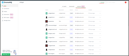
Widget Creator
- Click on
+ WIDGETto create a new widget or select an existing widget to edit. In both cases, you will be directed to the widget creator.
New Widget
When creating a new widget by clicking on App > Widget > + WIDGET, you will need to provide the following details:
- Name: Specify a name for your widget.
- Description: Add a description for your widget.
- Widget Icon: Choose an icon to represent your widget.
Click Open once the widget is successfully created.
Widget Builder
Upon clicking Open after creating a new widget or selecting an existing one, a new tab will open for the widget builder. Here, you can construct your widget using various controls, connectors, rules, and input/output data variables.
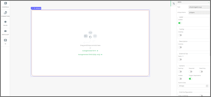
Widget Screen Properties
In the widget screen properties, you'll find the following:
Info
- Unique Name: This name uniquely identifies the widget in your app. It is auto-generated based on the widget's label.
- Label: Displayed text to help users understand the control's purpose.
- Tooltip: Add a tooltip as a user hint.
- Description: Provide a description for the control.
- External CSS: Customize controls using CSS.
- Caching: Enable caching for LOOKUP formula results.
- Hidden: Hide controls from users.
- Trigger Dependents: Optimize control evaluation.
- Hide on Desktop: Hide the control in the desktop view.
- Hide on Mobile: Hide the control in the mobile view.
- Dynamic Height: Adjust control height based on content.
- Maintain Space When Hidden: Maintain space between controls when one is hidden.
Properties
Background:
- Color: Set the widget's background color.
- Image: Add an image to the widget background.
- Image Fit: Define how the image should fit (cover or contain).
- Opacity: Adjust the background's opacity.
Box Shadow: Add or remove a shadow to the container box.
Border
Customize the widget's border:
- Border: Choose the type of border (all borders, top, right, bottom, left).
- Width: Specify the border width.
- Style: Select the border style (solid, dashed, dotted, or none).
- Color: Set the border color.
- Radius: Adjust the border's edge radius.
Building a Widget
Let's build a widget from scratch:
Create a widget from the app section and open the widget builder.
Drag and drop the controls you want to use in your widget. For example, you can use display and input controls to create a form widget.

Widget Builder Controls Bind connectors and apply rules to the controls, similar to building a microapp and binding connectors.
Widget Input/Output Variables
DronaHQ widgets support Input and Output variables, enabling data interaction within widgets and with other controls. Here's how they work:
Widget Input
Use Widget Input to obtain external input, allowing internal widget interactions.
After creating input variables, bind them to controls using keywords and formulas to utilize the input data.
Widget Output
Widget Output grants widget controls access to other controls in the builder.
Output variables can pass result values or input variables as keywords. These values can later be accessed when using the widget in microapps.
In the example above, the output of the "widgetautocrud" widget is bound to the data in a text input control using the keyword {{widgetName.OUTPUTS.outputVariableName}}.
This comprehensive widget creation and management system in DronaHQ allows for flexible and efficient app development.
Control Section - Widget
Within DronaHQ, the app builder provides a list of controls categorized under different sections. Among these sections, you'll find the Widget section, which contains all the widgets created within your DronaHQ account.
Widget - Data Binding
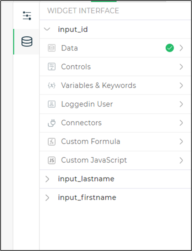
Data binding for widgets relies on the number of input variables created for the widget:
Under the variable name, various methods for data binding are available:
Data: Static data that remains constant over time and serves as default values in your app.
Controls: Retrieve data from one of the app's controls.
Variables & Keywords: Assign values from variables and keywords defined in the app.
Query String: Bind data from available query strings.
Logged-In User: Display properties related to the Logged-In User, such as username, usermail, Admin status, and more. Select a single property only.
Connectors: Select a configured connector and invoke its API to fetch and bind values returned by the API. Multiple keys can be chosen to display values.
Custom Formula: Apply formulas and store their output.
Custom JavaScript: Incorporate custom JavaScript to fetch and use data for app operations.