Grouping of controls into containers
In DronaHQ, the grouping of controls in containers is a valuable feature that allows users to organize and manage controls within their app efficiently. Containers are essentially visual elements that act as wrappers for other controls, helping to group them together logically. This use case is especially useful when designing complex and interactive app interfaces.
Overview
DronaHQ offers a versatile container control feature that enables users to group related controls together within their app. Containers serve as visual containers, encapsulating other controls, and enhancing the overall organization and user experience of the app interface.
Benefits
Enhanced Organization: Containers allow users to visually organize controls into logical groups. This simplifies app design and improves the app's usability.
Streamlined User Interface: By grouping controls within containers, the user interface becomes more structured and intuitive, helping end-users navigate the app with ease.
Simplified Control Management: Containers make it easier to manage and manipulate multiple controls simultaneously, reducing development time and effort.
Improved User Experience: The use of containers creates a more cohesive and visually appealing app layout, enhancing the overall user experience.
Key Features
Container Types
- Vertical Containers: These containers stack controls vertically, allowing for a linear arrangement of controls within the container. More useful for Advance screen.
- Horizontal Containers: These containers arrange controls horizontally, facilitating side-by-side positioning of controls. More useful for Advance screen.
Nesting Containers
- Users can nest containers within other containers, allowing for hierarchical grouping of controls. This enables more complex and structured app designs.
Custom Styling
- Containers can be customized to match the app's theme and branding, ensuring a consistent look and feel throughout the application.
Responsive Design
- Containers are designed to be responsive, adapting to different screen sizes and orientations, making the app accessible across various devices.
Customizations in Container Control
| Properties | Explanation |
|---|---|
| color | we can select background color for container control. |
| image | we can select background image for container control. |
| image fit | we can select image fit as cover or contain as per our requirement. |
| opacity | we can set css opacity here which can be used to change look and feel of background image and color. |
| Box shadow | if toggled on container will show a box shadow. if toggled off container will not show any shadow. |
| border | we can set border for container control using this property. |
| width | we can set border width for container control using this property. |
| style | we can set border style using this property options are none, solid, dashed, dotted. |
| color | we can set border color for container control using this property. |
| radius | we can set border radius for all 4 side separately for container control using this property. |
Use Case Scenario
Case 1
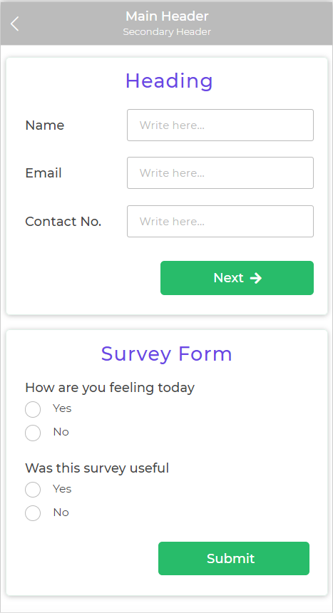
Let's consider a form-building app that allows users to create custom surveys. The app has multiple form controls, such as text inputs, radio buttons, checkboxes, and dropdown menus. Without containers, all these controls might be displayed randomly on the page, making the app interface cluttered and confusing.
By using containers, the app developers can group related controls together. For example, they can place all the radio buttons within a horizontal container, neatly arranging them side by side. Similarly, they can use vertical containers to group related questions and their corresponding text inputs.
The use of containers in this scenario simplifies the form creation process for end-users, allowing them to easily navigate and understand the survey structure. It also makes it easier for the app developers to manage and maintain the app's codebase.
Case 2
Let's consider a Tray type of screen where showing a screen loader as per users need is bit tricky.
To achieve this case user can use two container controls one for loader and one main container for the actual controls they wish to display as a condition is met. So they can keep the container with loader screen visible and all other containers hidden by default and configure hide or show conditions for this containers.
The use of containers in this scenario simplifies the logic of writing hide and show conditions for each and every individual control.
Conclusion
The grouping of controls in containers feature in DronaHQ provides a powerful solution for organizing and managing controls within app interfaces. By effectively utilizing containers, developers can create more structured, user-friendly, and visually appealing apps, enhancing the overall user experience.