Custom Control IDE (Deprecated)
In DronaHQ, we have the following two methods for building custom controls:
- Using Custom Control IDE (Deprecated)
- Using Custom Control in an Iframe. (Recommended)
- Your custom control’s code runs in a separate iframe which provide complete flexibility to use React or vanilla javascript as per your needs.
Basics
To Start with any new control in Dronahq you should first focus on 2 sections: Builder section and preview section.
To create a new control we use control editor , so every time we create a new control we get a ready made basic structure for our control
Builder Screen
we can drop our control to the builder screen to use it in our app.
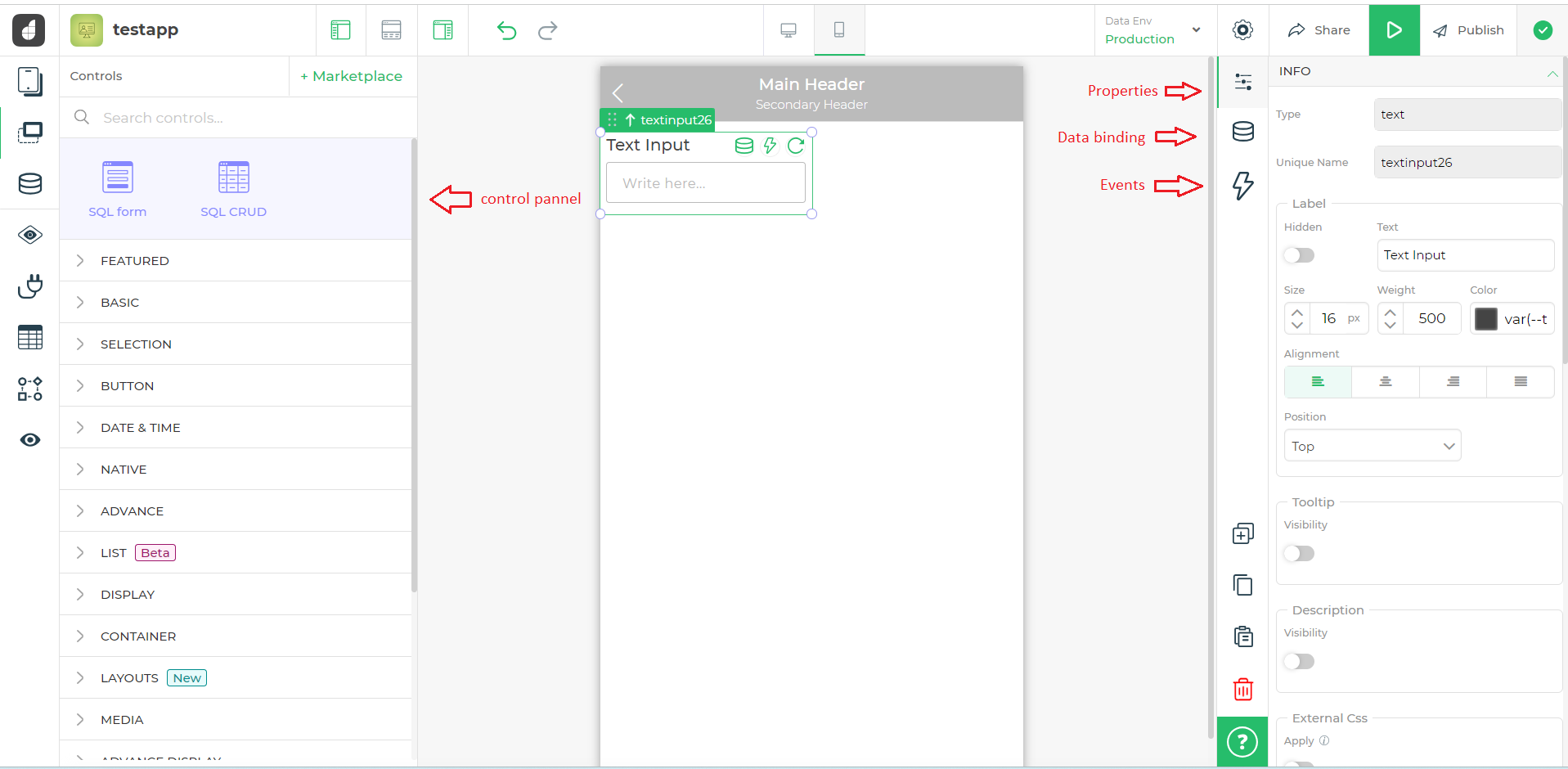
Controls :- our control will be visible here in the custom section.
A control basically comprises 3 things :-
- Properties :- Here we can see the properties that can be used to configure our control. eg :- we can set the background colour of our control from here.
- Data Binding :- Here we can bind data to our control from different sources.
- Events :- Here we can see the Actions that we can bind to our control.
INFO part of properties is provided by default we cannot edit it.
Preview Screen
we can also check how our control and app will look when deployed.
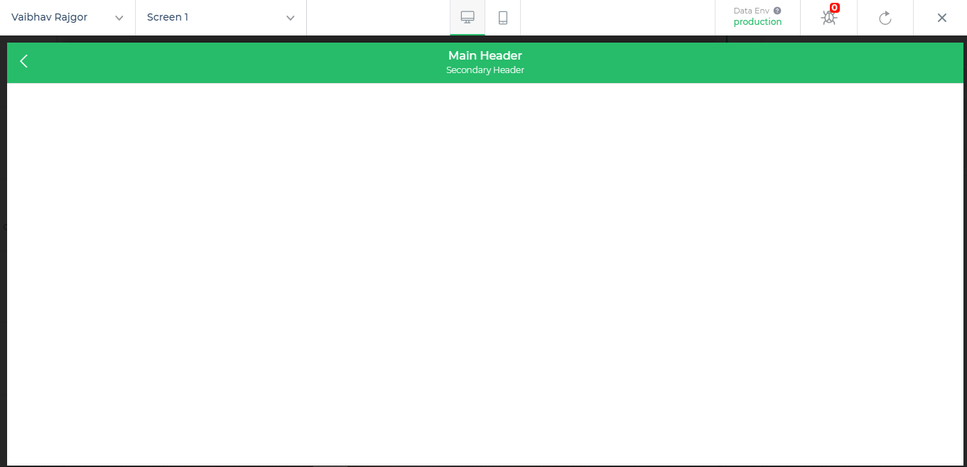
So first of all we have to decide the look and feel for your control on these screens. Control UI has to be configured for both screens separately .
To develop any new control we have to use Control Editor.
How to open the control editor ?
On Console window Go-to Profile -> Extensions -> Control Editor
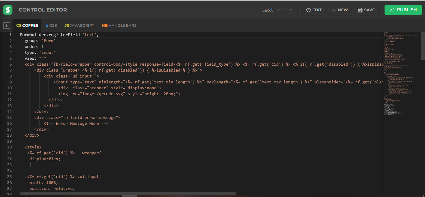
Control editor
This is how the control editor looks.
Control editor top panel
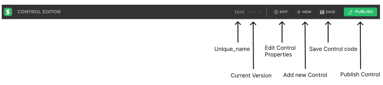
| Button | Explanation |
|---|---|
| Unique_name | Controls unique_name will be displayed here. |
| Current_version | current published version of control will be displayed here. |
| Edit | Edit button is used to edit properties defined at the time of creating new control. |
| New | New button is used to create new controls. |
| Save | save button is used to save our code. We can also use CTRL + S to save code. |
| Publish | Every time we make changes to our code we have to publish the control so every app using our control will have the updated code. |
 | By clicking on this icon we can see a list of controls and navigate to code of different controls |
Basically Control Editor is divided into 4 parts :-
- COFFEE
- CSS
- JAVASCRIPT
- HANDLEBARS
For Builder screen code has to be written in COFFEE section
For Preview screen code has to written in following sections :
- Handlebars
- CSS
- JAVASCRIPT
Building Reusable Controls
New :-
To Start with a new control click on the + NEW button in the control editor.
After that new control dialog will be visible like this
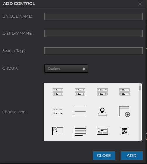
| Field | is_mandatory | Explanation |
|---|---|---|
| Unique name | yes | It will be the unique name for our control. It cannot contain spaces also once added we cannot change this name. |
| Display Name | yes | This name will be visible on the controls section of the builder screen. It can contain spaces. |
| Search tags | yes | This input can be used while searching for control in the Control section of the builder screen. |
| Group | yes | it is used to specify in which group of controls sections this control will be grouped. we cannot change the group while creating a new control. |
| Choose icon | yes | the icon we choose from here is visible on the controls section of the builder screen with the display name. Click on ADD and a new control will be added in the custom section of controls on the builder screen. |
To see any changes made in the control editor on app screens we have to refresh the app.
Edit :- if you wish to edit any control properties use the Edit button.
After that Edit control dialog will be visible like this
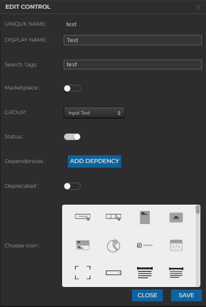
| Field | Explanation |
|---|---|
| Marketplace | if this toggle is turned on our control will be visible in the marketplace of controls list. + Marketplace we can click on this and add control to the controls section. |
| Group | now we can change the group of control from here. |
| Status | if this toggle is turned on the status of control will be changed to active. |
| Dependencies | if we wish to add any library or dependency it can be done from here. On click of ADD DEPENDENCY button a popup will be displayed - So we can select checkboxes for dependencies we wish to add. |
| Deprecated | if this toggle is turned on the control will not be visible in the control section and if you have already used this control in an app then it will show status as deprecated in properties. |
If you wish to use any other dependency or library not available in list , please feel free to connect with Dronahq and we will do the needful. or we can use import library from Config -> Custom Script -> Library Import
Control Types
Control can be of 2 types
- input :- this controls take input and give an output. eg :- Text Input
- non_input :- this are also known as display controls. eg :- Table Grid
Architecture of Control editor
Control Editor Coffee Section
Coffee section code is applicable for Builder Screen only.
to write any code in coffee we have to follow CoffeeScript syntax. Refer to coffeescript docs
Coffee is strict with indentation like python.
So in Coffee section we get a ready made Structure for your control and we have to write code in that structure only and also every section have some code predefined in it :-
Formbuilder.registerField :- will show the display_name of control.
group :- for back-end use never edited
order :- for back-end use never edited
type :- here we can define type of our control i.e input or non_input
Basically coffee section is divided into many sub-sections
- view
- edit
- addButton
- viewJs
- onResolutionChange
- sudoComponentFunctions
- gridConfiguration
- defaultAttributes
Explanation for each section
- view :- This section is also further divided into 3 sub sections,
HTML :- as we can see some tags this is the part where we have to write our controls HTML logic. To guide us there are comments given like
<!-- Your code goes here –>

….

….

<!-- Your code ends here-->
So we should always write our HTML logic inside this.
As discussed in do's and don'ts if the preview part is completely ready we can directly copy code inside the wrapper class from the handlebars file and use it here.
Style :- here we have to write css for our control , to write css we have follow certain rules , like before writing css for any selector we have to follow this syntax as .<%= rf.get('cid') %> .selectorName . example given for wrapper class.
cid stands for Control id it is a dynamically generated unique id for every control.
here also we can directly copy paste code from css file we just have to change the syntax here accordingly.
Script :- here we can write our javascript logic here. But for most of the cases we do use it instead we use the viewJS section.
if we find it difficult to convert our javascript file logic to coffee script.
We can use IIFE (Immediately Invoked Function Expression) function.
Eg :- (function(){ })()
here we can directly copy paste our javascript file logic with minimal changes.
Changes needed are
Add the following as the first line for this.$el scope :-
this.$el = $('body').find(".response-field-<%= rf.get('field_type') %>.<%= rf.get('cid') %>");
And to access any variable accessed using model in javascript file use :-
builderComponents["<%= rf.get('field_key_name')%>"].backBoneModel.get("variable_name");
At the end we have to call the function to execute it like we do in ViewJS.
we never bring our click or different events to the coffee section because it will make the builder slow and performance will be affected.
- edit :- This section is used to define properties for our control. This section also provides us with some predefined code.
Here also we have comments to guide us exactly where we have to write our code.
To add any new property we have to add this block of code accordingly -
<%= Formbuilder.templates['edit/text_input']({
   "label": {name:"textfield", position:"left", width:"one_col"},
   "name": "placeholder",
   "isDisabled": false
}) %>
Output :-

Explanation :-
Formbuilder.templates['edit/text_input'] :- this defines that our property will be an input box.
"label" :- here we have label attribute divided in 3 parts :
- name :- text to be displayed on the label.
- position :- where we want to place this label mostly values are left or top
- width :- we can specify the width of the label default is one_col, possible values are one_col, two_col, three_col only.
"name" :- this is the variable that must be present in defaultAttributes, so once we write variable name here we have to add that variable in defaultAttributes simultaneously.
"col_width" :- this is the width that will be provided to the text input field here also possible values are one_col, two_col, three_col only.
we have to add , (comma) before writing the next attribute. We can create different accordion for different sections by following the given structure.
Adding new properties in Coffee file's edit section - Overview
- addButton This method is used to add the icon and label for control shown in the control list. These values come automatically and are never changed.
addButton: """
  <span class="symbol">
      <span class="symbol-icon-box">
          <img src="app/src/images/controls/text.svg" />
      </span>
      <span class="clabel">Text Input</span>
  </span>
"""
- viewJS This section is mainly used for declaring the body of your sudo functions. Here we can write logic that we want for our control mostly setValue of javascript file.
we have to write a body for our functions and also we have to make function calls as well to execute it.
Also , we can access variables of defaultAttributes as model.get("cid").
No need for this keyword here like the javascript file.
we can write javascript file logic setValue and other functions here for our control here but we have to follow coffee syntax accordingly.
some changes which will be needed, Javascript syntax Coffee replacement
| JavaScript | Coffeescript |
|---|---|
| `` | """ """ |
| ${} | #{} |
| ? : | If … then … else … |
| this. | @ |
- sudoComponentFunctions This section is used to define setValue and getValue for the builder and set the parameter values for these functions. This section is commented by default. We have to uncomment it if we wish to use it.
if we wish to return only 1st value or 1st object from the data binded then we can ignore getValue() from here as it will be handled by the system. Same goes with setValue() but if we wish to use schema formatting then we have to write setValue accordingly.
- gridConfiguration This section is used to provide default grid size whenever a new control is dropped.
gridConfiguration:
  minWidth: 1,
  maxWidth: 24,
  minHeight: 5,
  maxHeight: 0,
  defaultHeight: 8,
  defaultWidth: 12,
  isWidthResizable: true,
  isHeightResizable: true
Setting values to 0 (zero) means no limit
In dronahq Width ranges from 0 - 24
minWidth and minHeight are used to specify that control can not be shrinked beyond these values.
Last two variable are used to set is control size changeable by dragging the edges of control
size here is not in pixels it is in grid counts.
- defaultAttributes In this section we have to write attributes or variables we want to use on both the builder as well as the preview screen.
This section also has some predefined code as :-
defaultAttributes: (attrs) ->
  attrs.label = 'MyControl'
  attrs.label_hidden = false
  attrs.label_value = "Sample Label"
  attrs.data_type = "string"
  attrs.field_composition_type = "single"
  attrs.field_available_in_database_editor = false
  attrs.field_editable_in_database_editor = false
  attrs.field_database_editor_data_format = "single_line_text"
  attrs
Declaring variable in this section :- we have to add attrs before every variable name and follow the indentation.
Eg :- attrs.font_size = 14.
We can declare our variables that we have used in properties and then access them in coffee, css, javascript and handlebars file by following their respective syntax.
There are also some system defined variables so we can use them for our control to work accordingly.
Attributes for a control
| attribute | description | Example |
|---|---|---|
| label | To specify the value we want to show on the label of our control. any string value | attrs.label = 'MyControl' |
| label_hidden | To specify if we want the label hidden when new control is dropped. Values true/false | attrs.label_hidden = false |
| data_type | To specify what data we want for our control ,Mostly string. | attrs.data_type = "string" |
| LiveData | this variable is used to store the data binded to our control and if we wish to show some data when control is dropped on the builder screen. We have to provide that data in this variable. Data can be a string or array or array of objects. | attrs.LiveData = "Data" |
| field_database_editor_data_format | This variable is used to set data format as single_select or multi_select ,Mostly it is single_select only. | attrs.field_database_editor_data_format = "single_select" |
| Any user defined attribute | We can add sour user defined attributes that we need to store the values that are provided in properties section | attrs.fontSize = 14 |
Very Important attributes for a control are
| Attribute | Explanation |
|---|---|
| field_composition_type | this variable is used to define what kind of data our control will accept . possible values for this variable are single, composite, list, composite_list. Bind Data will change according to different values. |
| field_datatypes | this variable is used to provide default values in case of dropdown in properties section. |
| is_master_control | this variable accepts only boolean values (true or false). If we wish to bind data from different controls like DataStore with multiple columns then we have to make our control as master control. Recommended for Display/non_input Controls. |
| allowSchemaFormatting | this variable accepts only boolean values (true or false). If we wish to provide this option in bind data then we have to set this variable to true. To enable this we have to make our control as master control and we get schema from the second variable of setValue(obj,schema,datasource) method. We have to handle all the cases of schema to make this feature working. |
| action_items | this variable is used to provide bindable events to our control. |
| dhq_formula | if we wish to bind data as default whenever a new control is dropped , it has to be of string data type. |
| field_data_model_binding_manual_query | this variable is used to define where to add these values given in dhq_formula when a new control is dropped. Eg :- attrs.field_data_model_binding_manual_query = "DATABUILDER()" |
| field_data_model_binding_manual_query_with_id | this variable is used to provide id where we should place the dhq_formula mostly it has same value as field_data_model_binding_manual_query. Eg :- attrs.field_data_model_binding_manual_query_with_id = "DATABUILDER()" |
| field_data_model_binding_type | as we have provided above 2 variables this variable value will be manual_query. Eg :- attrs.field_data_model_binding_type = "manual_query" |
| dhq_keywords_mapping | this variable is used to map keywords dynamically. We just have to add this variable as an empty array ( [] ) and it will be handled dynamically by the package. Eg :- attrs.dhq_keywords_mapping = [] |
Detail Explanation for each above attribute :-
field_composition_type
- single :- in this Bind Data will look like bind data in Text Input control. It will always give data in string format. It is the default value for new control. Recommended to use when we are building controls that take strings as data input.
- composite :- in this Bind Data will look like bind data in Address control. It accepts data as string.
- list :- in this Bind Data will look like bind data in Dropdown control. It accepts data as Array. Recommended to use with controls like dropdowns, checkbox, etc.
if we use attrs.field_composition_type = 'composite' or attrs.field_composition_type = 'list' we have to add 1 more attribute as attrs.field_datatypes = [] otherwise our control will give an error.
- composite_list :- in this Bind Data will look like Table Grid control. It accepts data as Array of objects / json objects. Recommended to use with Display / non_input controls.
action_items We have to follow this structure for adding events :-
attrs.action_items = {
  "button_click": {
    "events": ["click"],
    "selector": ".control-button"
  }
}
Explanation :-
"display_name":{
"events":["event_name"],
"selector" : ""
}
- display_name :- this name is visible at the builder screen in the actions section.
- event_name :- this is the event name we wish to give.
display_name and event_name can be the same. by adding these actions will be just visible we have to add code in javascript file to handle these events.
| Combination of attributes | control's to see for example |
|---|---|
| field_composition_type = "single" Is_master_control = "false" (default) | Text input |
| field_composition_type = "list" Is_master_control = "true" If single select :- Data_type = "string" field_database_editor_data_format = "single_select" If multi select :- Data_type = "list" field_database_editor_data_format = "multi_select" | Dropdown |
| field_composition_type = "composite_list" Is_master_control = "true" allowSchemaFormatting = true data_type = "string" field_client_side_get_data_enabled = true | Table Grid |
| data_type = "list" field_composition_type = "list" field_database_editor_data_format = "multi_select" | Checkbox |
| attrs.field_datatypes = [ field: 'title' display_name: 'title', data_type: 'string' field_database_editor_data_format: 'single_line_text' , field: 'subtitle' display_name: 'subtitle', data_type: 'string' field_database_editor_data_format: 'single_line_text' , field: 'action_value' display_name: 'action_value', data_type: 'string' field_database_editor_data_format: 'single_line_text' ] attrs.field_available_in_database_editor = false attrs.field_editable_in_database_editor = false | Label |
To debug our coffee script code we can visit this link and paste our full coffee section code on the left hand side and we will be able to see the transformed javascript code on the right hand side so we can verify our code using this method.
If we get an error message on reload after adding some code then the best way to debug it is using debugger keyword and keeping inspect window on while next reload.
Control Editor CSS Section
Css section code is applicable for Preview Screen only.
So in css section we also get some ready made code as :-
.{{cid}} .component-head-container {
  font-size: {{label_font_size}}{{label_font_size_unit}};
  font-weight: {{label_font_weight}};
  color: {{label_text_color}};
  text-align: {{label_text_alignment}};
}
Explanation :-
.{{cid}} is compulsory to add before any selector we wish to write css for.
cid stands for Control ID every time we drop a new control a unique cid is automatically generated by the package.
After .{{cid}} we can write any css selector and provide css for it.
There are two ways of providing values to css keys.
- Static values :- We can directly provide values as we normally do any css file.
Eg :-
.{{cid}} .Selector_name {
  font-size : 14px;
  color : #26BC6A;
}
- Dynamic Value :-
If we have provided configuration in properties and we wish to use that variable here so it can done by writing variable in double curly braces {{variable_name}}
Eg :-
defaultAttributes: (attrs) ->
  attrs.font_size = 14
  attrs.color = "#26BC6A"
This are the variables used to store font size and color and they can be accessed as
.{{cid}} .Selector_name {
  font-size : {{font_size}}px;
  color : {{color}};
}
All other things are similar to any other css file.
Control Editor Javascript Section
Javascript section code is applicable for Preview Screen only.
So in javascript section we also get some ready made code as :-
BSCOMPONENTS["sample"] = function() {
  this.default = {
      customVariable: "",
  };
  this.initComponent = function () {
      //Initialize your components here, if needed.
  };
  this.beforeSubmitValidation = function (obj) {
      //Control validation will be done here.
        return true;
  };
  this.setValue = function (obj) {
      //Your control will get data from DronaHQ here.
      let $valueWrapper = this.$el.find('.label');
      if(obj){
          $valueWrapper.text(obj);
      }else{
          $valueWrapper.text("");
      }
  };
  this.reset = function (obj) {
      //Reset your control here.
  };
  this.getValue = function (forSubmit) {
      //Your control should return value to DronaHQ here.
      let $valueWrapper = this.$el.find('.label');
      let response = $valueWrapper.text() || "";
      //the data should be returned in the following structure with your data inside the "response" key
      return { 'question': this.model.label, 'value': response, id: this.model.field_key_name, name: this.model.field_display_key_name };
  };
  this.gridLayoutUpdated = function(model,$el){
      // this callback function will trigger once the layout of a freeflow page updated
      // you can get control availble height on free flow page by using the following function
      //getAvailableControlHeight(model)
  }
};
BSCOMPONENTS["sample"].prototype = BaseComponent;
Javascript File is used to handle javascript events for your control.
All method and variable declarations must be inside
BSCOMPONENTS["ControlName"] = function () { };
It provides six basic methods
this.initComponent = function () { } :- if we wish to have any kind of initialization for your control then we have to write code for it here. Also binding of all the click events or different events goes in this function.
This function is called First and only once in the current execution life cycle.
this.beforeSubmitValidation = function (obj) { } :- this function is empty in normal scenario but if on a page if we have the bpm flow button , and when we click on that button then beforeSubmitValidation function of all controls used on that page is called, so if we wish to use our control with an bpm flow we need to write that logic here.
this.setValue = function (obj, schema, source) { } :- this is the method where we get our binded data in the obj parameter and we have to use it as per our control logic.
this.reset = function (obj) { } :- this method is used to bring control to its default state . In Most of the cases this function is empty.
this.getValue = function (forSubmit) { } :- this method is used to set the return value of our control. It returns the value in a specific format only as :-
return {
  'question': this.model.label,
  'value': response,
  'id': this.model.field_key_name,
  'name': this.model.field_display_key_name
};
Here we only need to set the 'value' property and all other things will remain as it is.
this.gridLayoutUpdated = function(model,$el){ } :- this method is mainly used to detect view change, when we want our control to be displayed differently on mobile view and desktop view.
views are desktop, tablet , mobile landscape , mobile portrait.
If we wish to add our user defined functions we can do that but that has to be inside BSCOMPONENTS["ControlName"] = function () { }; this function only.
Syntax to access variable defined in defaultAttributes :-
To access any defaultAttributes variable value we can it from model class as:-
this.model.variable_name
Eg :- if we to access cid or font_size stored in defaultAttributes the it can be done as
this.model.cid or this.model.font_size
Syntax for user defined functions :-
this.FunctionName = function(parameters){
  // function body;
}
Here parameters are completely optional.
Calling of user defined functions :- we can call our user defined functions in any of the basic functions like
this.FunctionName();
Sometimes calling a function inside another function we may not get proper scope of this keyword and we may get an error as FunctionName is undefined so to overcome this we can save scope of this in another variable and use it.
Eg :- calling user defined function in setValue
this.setValue = function(obj){
  var self = this;
  …
  …
  self.FunctionName();
}
If we wish to add a global variable we have to follow the same rule as function.
Syntax for global variable :-
this.variableName;
Some logic for accessing this global variable.(using self)
Package functions to call getValue() and action flow on click events or any other events.
To call getValue you have to use package function
this.initConditionalVisibility(this.model.field_key_name);To bind and trigger any click event or any other event
triggerAction(this.model.field_key_name, 'display_name', 'event_name', e);
display_name and events_name must be the same as provided in the coffee file.
here display_ name and event_name must be same as mentioned in coffee's
attrs.action_items.
Eg : - for example take a simple click event on a button
this.$el.on('click','#button_id',function(e){
  self.initConditionalVisibility(self.model.field_key_name);
  triggerAction(self.model.field_key_name, 'button_click', 'button_click', e);
}
More functions that are available in package and we can use them as per our need
this.refreshData() :- this function is used when we have a refresh button in our UI or we want to refresh data in our control we have to use this method.
this.startComponentLoader() :- if we have a logic in our control to wait for a certain event to happen and till that time if we wish to show a loader we can use this method it takes no parameters.
If we wish to have code for this directly in control than we can add this code :-
this.startComponentLoader = function () {
  if (this.$componentLoader) {
    this.$componentLoader.removeClass("hide");
  }
  this.$el.addClass('component-loading');
};
- this.stopComponentLoader () :- if we have started the component loader then when a certain condition is matched we have to use this method to stop the component loader it also takes no parameters.
If we wish to have code for this directly in control than we can add this code :-
this.stopComponentLoader = function () {
  if (this.$componentLoader) {
      this.$componentLoader.addClass("hide");
  }
  this.$el.removeClass('component-loading');
};
- this.hide() :- we have to add this function and write the logic for hiding the control if a certain condition is matched.
If we wish to have code for this directly in control than we can add this code :-
this.hide = function () {
  this.$el.addClass("hide");
};
- this.show() :- we have to add this function and write the logic for showing the control if a certain condition is matched. (reverse of hide).
If we wish to have code for this directly in control than we can add this code :-
this.show = function () {
  this.$el.removeClass("hide");
};
- this.showError(msg) :- In the handlebars and Coffee file view section we have an fb-field-error-message class to show error messages. We just need to call this function and pass the error message we want to show in the parameter.
If we wish to have code for this directly in control than we can add this code :-
this.showError = function (msg) {
  var $errorMessage = this.$el.find(">.fb-field-error-message");
  if ($errorMessage) {
      this.$el.addClass("fb-field-has-error");
      $errorMessage.html(msg);
  }
};
Eg :- calling it as per our need - this.showError("no data found");
- this.appendError(msg) :- if we want to handle multiple error cases and show all the error messages we can use this method by passing the error message in the parameter and it will be appended automatically.
If we wish to have code for this directly in control than we can add this code :-
this.appendError = function (msg) {
  var $errorMessage = this.$el.find(">.fb-field-error-message");
  if ($errorMessage) {
        this.$el.addClass("fb-field-has-error");
        var previousError = $errorMessage.html();
        $errorMessage.html(previousError + "\n" + msg);
  }
};
- this.clearError() :- this function is used to clear the error message already visible on the screen it takes no parameters.
If we wish to have code for this directly in control than we can add this code :-
this.clearError = function () {
  var $errorMessage = this.$el.find(">.fb-field-error-message");
  if ($errorMessage) {
          this.$el.removeClass("fb-field-has-error");
          $errorMessage.html("");
  }
};
Control Editor Handlebars Section
Handlebars section is used to write HTML content for Preview screen only.
Please refer Handlebars guide for basics of handlebars.
So in Handlebars section we get a ready made structure like this :-
We should always write our html logic inside
only and please do not remove any code present outside the wrapper class because it may cause unnecessary errors. Eg :-
<div class="wrapper">
  <div class="main">
    Any HTML logic for our control.
  </div>
</div>
In-depth knowledge of handlebars is not necessary, just basic HTML knowledge is required, we can add or remove DOMElements directly using the javascript file.
In the javascript file using JQuery we can easily find DOM Element and manipulate it as per our need.
Eg :- this.$el.find('.main'); // this will return a DOM Element with class main.
So we can use it anyway we want , we can also use Vanilla JS as well for this manipulation.
Control Life Cycle
Builder View
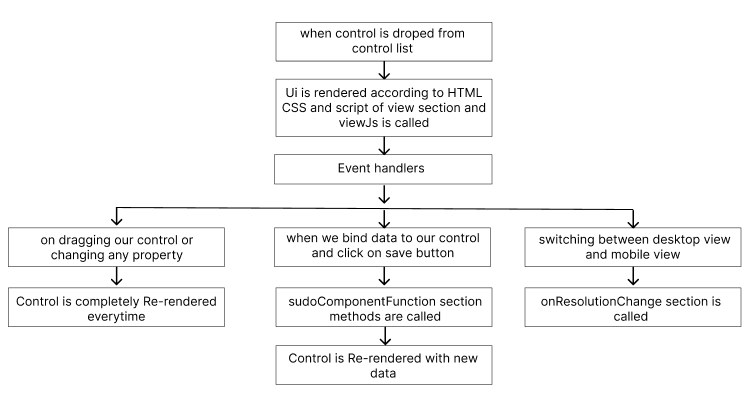
Control will be rendered as per the HTML,CSS and Script written in the view section and viewJs is called once.
When we switch between desktop view and mobile view, the onResolutionChange section is called.
When we bind data from different sources and click on save button is clicked sudoComponentFunctions section is called and control is re-rendered again.
When we drag control or change any property from the properties section the full control is re-rendered , so this is the reason we don’t bring any control related event to the builder screen.
Preview / package
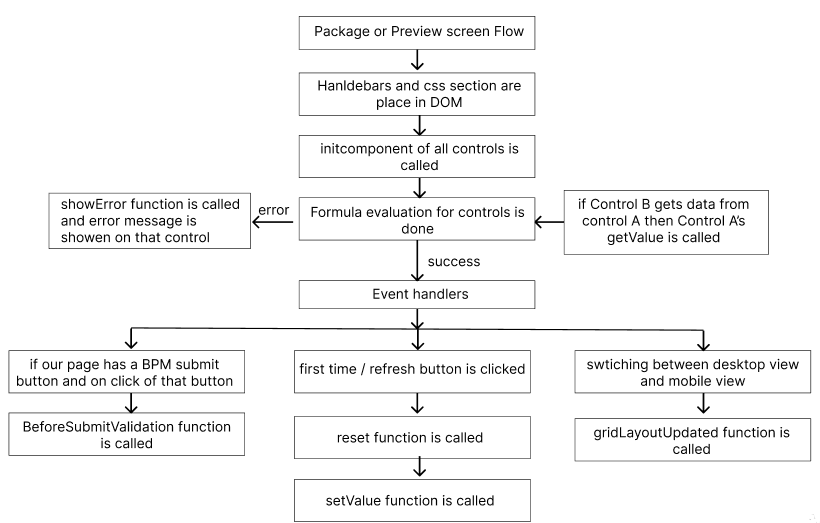
The UI will be rendered as per the Handlebar and Css file.
- this.intComponent() method is called first and it will be called only once during the whole life cycle.
- this.setValue(obj) method is called after this.reset() method and obj will contain the data that you have binded to your control and you have to handle your data in this function if there’s any error in the data this.showError() can be called.
- this.getValue() if you want your control to return some value that can be binded to any other control you have to set that data in the value parameter by following the syntax of return in this function never called if control is not binded to any other control.
Do’s and Don’ts
- Always start with the Preview part of control and just to start with write basic HTML in handlebars and relevant css in css file by following the syntax.
- Add all the properties that you feel are needed for the smooth functioning of the control.
- It is not always necessary to replicate everything on the builder view as well. You can keep this part with default code as well , so the look and feel of control will not be visible on builder view but it will not affect the performance of your control.
- If you wish to bring the same look and feel to the builder view as well then you have to follow coffee script convention.
- If you wish to debug your code you can use the "debugger” keyword in coffee or javascript.
Never bring your controls click or any such events to the builder view because it will make your builder view heavy and performance may get affected.
Debugging Control while building
There are many ways to debug our control while building
- Using basic
console.logoralertmethods in the javascript file. - Using
debuggerkeyword inside the function we wish to debug, For this as soon as we run the code we have to keep inspect screen on so the debugger will stop the execution flow where er have placed the debugger keyword. - Advance debugging - (always select screen that we wish to debug code on like this)

For Preview :- First select the screen as previewFrame (preview), then in the console of the inspect window write Components.ControlName.FunctionName and press Enter , click on the function code that is opened. Click on line number to apply debugger and right click in the preview screen and click on reload frame and your code will stop at that line number.
We can hover mouse over variables to see what values they contain till this line is executed.
ways to open inspect window pressing F12 key or ctrl + i on keyboard or right click inside builder or preview screen and click on last option inspect.