Control Designer
At the core of the DronaHQ studio, controls play a pivotal role as they are the visible components that enable users to interact with the system. These controls are instrumental in tasks such as data visualization, user input, and event-based actions. However, there are instances where users may want to customize or build their own controls to achieve a more visually appealing and unique user interface. Understanding this requirement, we present the Control Designer feature, which empowers users to effortlessly create non-input controls without the need for coding skills. With Control Designer, users can easily design visually stunning and functional controls that enhance their overall user experience.
Creating control using Designer
To create Designer control within the DronaHQ platform, you will need to navigate to the Control Designer, to do that follow these simple steps:
- Click on the
Profile Menulocated in the top-right corner of the screen. - From the dropdown menu, select
Extensions. - Within the
Extensionssection, navigate to theControl Designer. - Once you click on the
Control Designerit will open Control Designer in new tab.
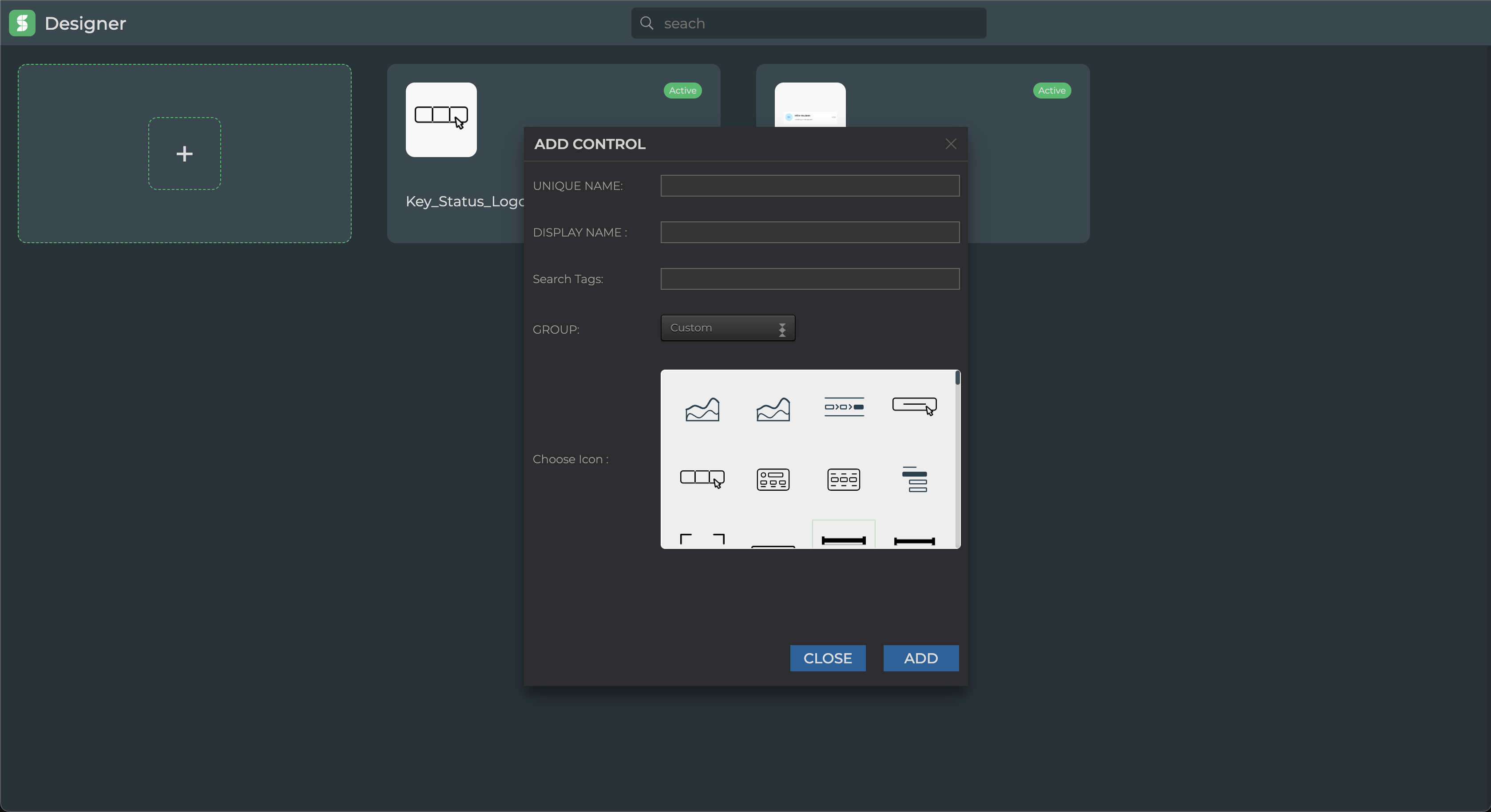
Once you open the control designer you will see list off all controls that you created on designer, click on the first card with plus icon to create a new control. once you click on that card you will see a form with few input fields as visible in the image below.
Unique name: unique name of the control that should not conflict with other controls including the one's provided by the DronaHQ, and also should not contains special character and space.
Fields Description Display name This name is going to be visible to every place where controls are listed. Search tag Search tag help you search the controls in builder control listing. You can provide multiple search tag seperated by ',' group When you create control, group cannot not be modified. It specified the group in which your control will be visible. Choose Icon Icon of the control that will be visible on the builder control listing screen.
once you field all the field you can press add and new control will be created and you will be navigated to the control building canvas.
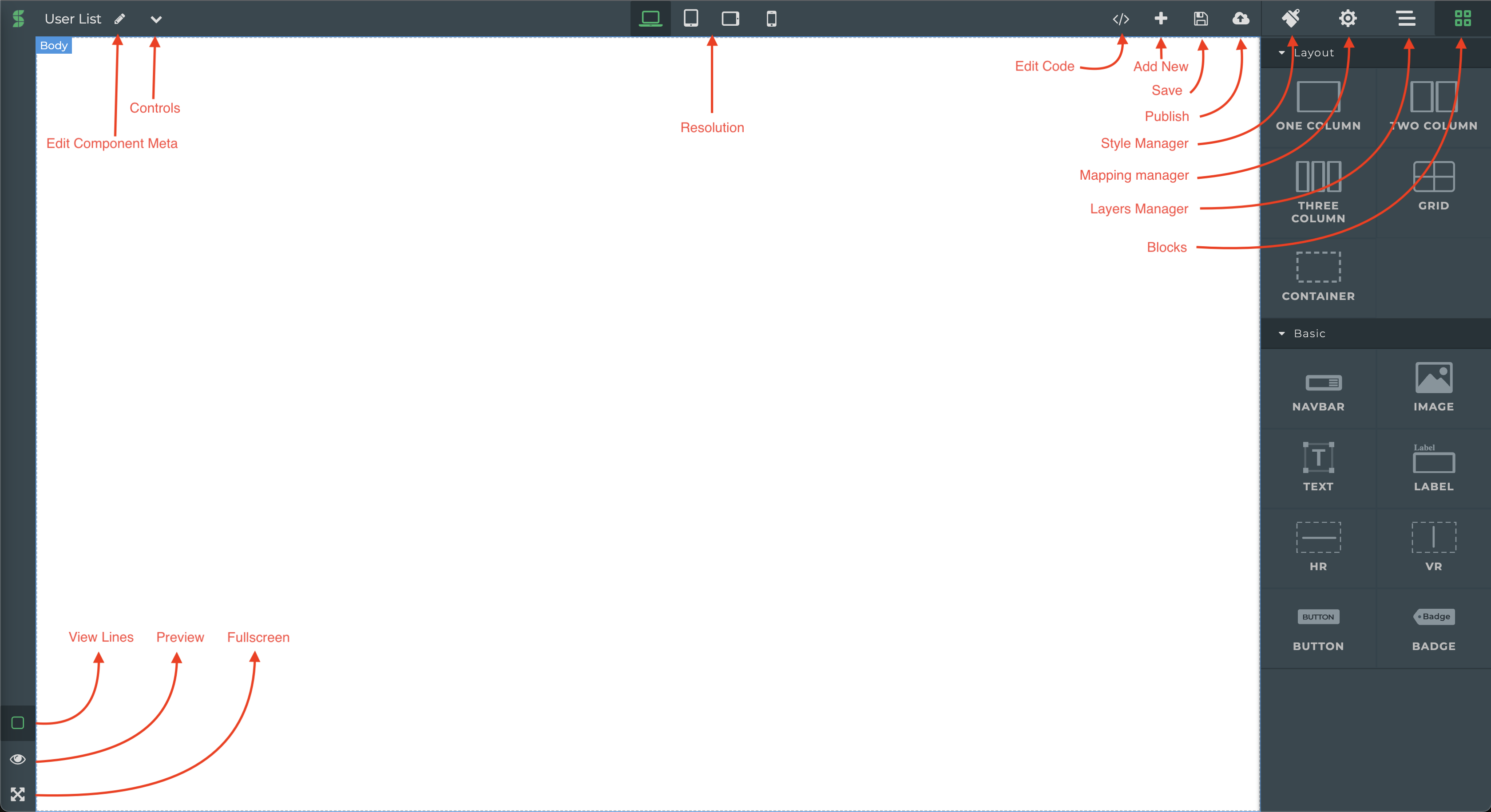
| Components | Description |
|---|---|
| Edit Components Meta | This will open a popup which will allow you to edit controls meta data which you defined at the time of creating the control as well as switch control between live and draft mode. |
| Controls | Opens the list of all controls list created on the designer. |
| Resolution | Allows you to configure how your controls will look on each devices sizes. |
| Edit Code | Control UI generated in the canvas is converted automatically to a html and css code which can be edited using this option, editing code will affect the ui and vice versa. |
| Add new | Opens up the add new control modal. |
| Save | Saves the current control being edited. |
| Publish | Publishes the current control. |
| Style Manager | Allows you the apply css styles to components of your controls. |
| Mapping Manager | Allows you to map which component is actionable and which can have its own formula box for dynamic data binding inside your control. |
| Layers Manager | Allows you to navigate between components and see hierarchy of the components based on how they are placed inside canvas to create control. |
| Blocks | Blocks are the basic building block components using which user can create their desired ui for their controls. |
| View Lines | Toggles the outline of the components on the canvas. |
| Preview | Preview The control ui created on the canvas. |
| Fullscreen | Makes the editor in fullscreen mode. |
Above table explains the basic layout the the control builder canvas. let us understand in detail about how control is created using blocks, how style manager helps us to style our control and how mapping mangers help us define how data will be binded to control and what action will be available.
Blocks
Blocks are components that are used to create the ui of control they are mainly divided in two section:
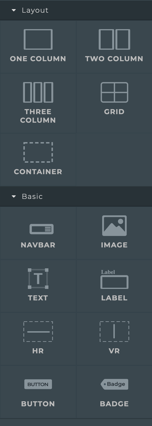
Basic section has components that are used to define content of your control like text block, image, button, they also have some styles pre-applied to them
Style Manager
Style manager allows you to apply css styles to blocks components through and interactive ui interface as portrayed in the below image.
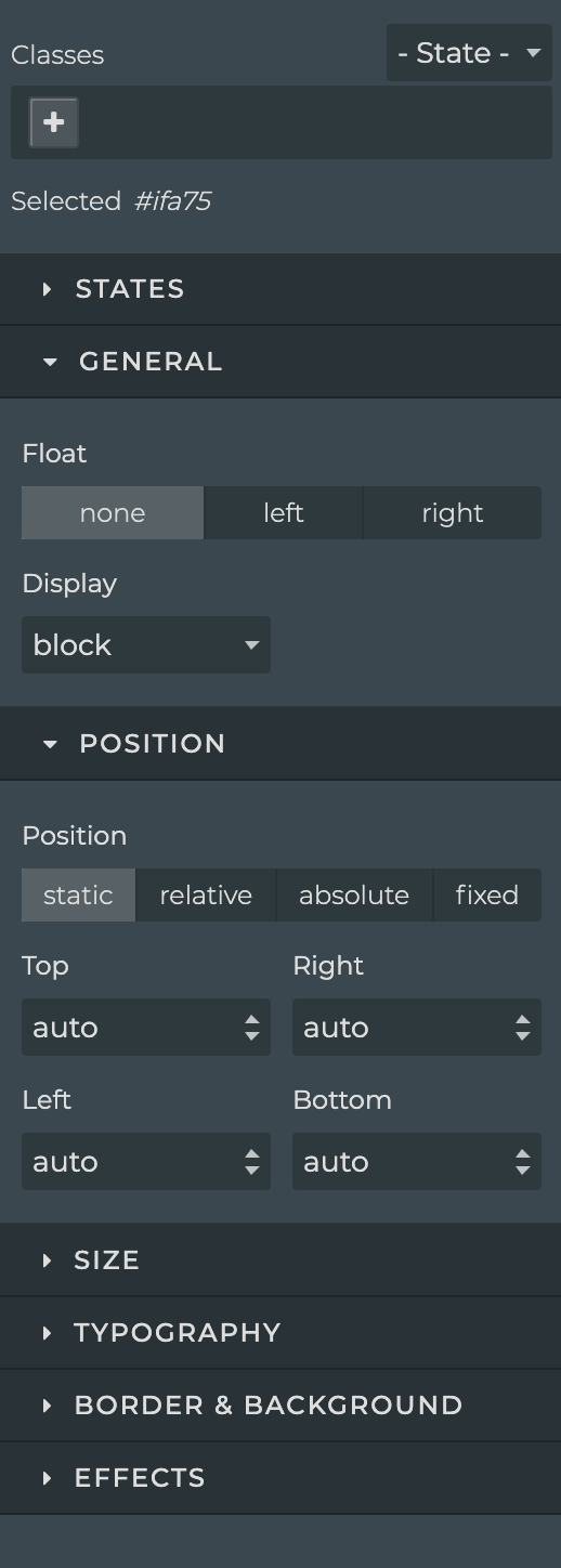
you will get almost all the css property available here and we have added few extra custom properties like State. State allows you to configure different ui states of your control and then change those state of your control in DronaHQ using rules for example you can create a custom info control which will have different states like warning, error, and info these states can be switched using rules on builder at runtime resulting id different ui in same control.
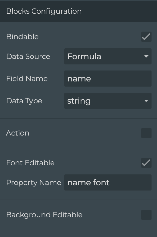
Mapping Manager
Mapping Manager allows you to configure you control's block components for data binding and Actions to trigger action flows in DronaHQ