Custom Fx Functions and Action IDE
Basics
To create Custom Actions and Functions in DronaHQ we have to use Function Editor.
we can create Custom Functions , Custom Actions or Custom Function and Action all using the Function Editor provided by DronaHQ.
How to open the control editor ?
On Console window Go-to Profile -> Extensions -> Control Editor.
Function Editor
This is how the Function editor looks.
Function editor top panel
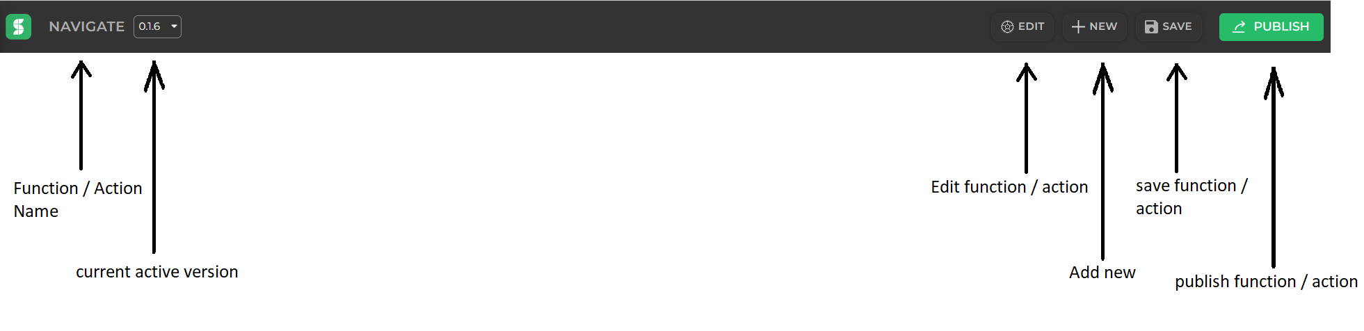
| Button | Explanation |
|---|---|
| Function/Action Name | Function / Actions unique_name will be displayed here. |
| Current_version | current published version of Function / Actions will be displayed here. |
| Edit | Edit button is used to edit properties defined at the time of creating new Function / Action. |
| New | New button is used to create new new Function / Action. |
| Save | save button is used to save our code. We can also use CTRL + S to save code. |
| Publish | Every time we make changes to our code we have to publish the Function / Action so every app using our control will have the updated code. |
 | By clicking on this icon we can see a list of Function / Action and navigate to code of different Function / Action |
Building Custom Functions or Actions
New :- To Start with a new Function/Action click on the + NEW button in the function editor.
After that add new function dialog will be visible like this
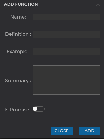
| Field | is_mandatory | Explanation |
|---|---|---|
| Name | yes | It will be the unique name for our function/action. It cannot contain spaces also once added we cannot change this name. |
| Definition | yes | This is basic definition in short what this function / action will do. |
| Example | yes | How to use this function a small example can be written here it will be visible as suggestion guide when we use it in fx section of data binding. |
| Summary | yes | This summary is also visible as suggestion guide when we use it in fx section of data binding it will help user to understand functionality in better way. |
| is_Promise | no | we can turn this toggle on if the function returns a promise. Click on ADD and a new function will be added. |
Edit :- if we wish to edit any function/action properties we have to use the Edit button.
After that Edit function dialog will be visible like this
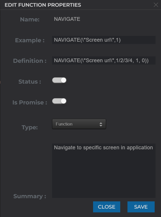
| Field | Explanation |
|---|---|
| Name | It will be the unique name for our function/action. It cannot contain spaces also once added we cannot change this name. |
| Example | How to use this function a small example can be written here it will be visible as suggestion guide when we use it in fx section of data binding. |
| Definition | This is basic definition in short what this function / action will do. |
| Status | when we want to make this function available in every app then we need to toggle this on. |
| is_Promise | we can turn this toggle on if the function returns a promise. Click on ADD and a new function will be added. |
| Type | This type can be of three types Function, Action, Function & Action as per our requirements. |
| Summary | This summary is also visible as suggestion guide when we use it in fx section of data binding it will help user to understand functionality in better way. |
What can be created using Function Editor
we can create Functions, Actions or Function & Action using the same function editor.
Functions
For creating a new function we have to follow this specific syntax :
For Normal Function
STUDIOFUNCTIONS["Sample"] =  function () {
    // actual logic
    return output;
}
For Promise Functions
STUDIOFUNCTIONS["Sample"] =  function() {
    var promise = new Promise(function(resolve, reject) {
        if(some_condition){
            resolve(data)
        }else{
            reject("Please provide an valid data.");
        }
    });
    return promise;
}
Example
here is the code for DATESTR function that is commonly used in Data binding for converting Date to String.
STUDIOFUNCTIONS["DATESTR"] = function(value, format, local) {
    var fmt = format || "YYYY-MM-DD";
    var isLocal = local || false;
    if (Array.isArray(value) && typeof value[0] == "number") {
        value.forEach(function (element, index) {
            if (isLocal) {
                value[index] = moment(value[index]).format(fmt);
            } else {
                value[index] = moment.utc(value[index]).format(fmt);
            }
        });
        return value;
    } else {
        if (isLocal) {
            return moment(value).format(fmt);
        } else {
            return moment.utc(value).format(fmt);
        }
    }
}
This functions will be available for use inside fx section of data binding in a control.
Actions
For creating a new function we have to follow this specific syntax :
STUDIOACTIONS["Test"] = {
    "group": "on-screen",
    "sub_group": "Test",
    "active": true,
    "type": "Test",
    "label": "Test",
    "description": "To Test",
    "icon": "app/src/images/action/test.svg",
    "show_wait_till_completion_toggle": false,
    "default_wait_till_completion": false,
    "dual_output_action": true,
    "positive_actions_text": "SUCCESS",
    "negative_actions_text": "FAIL",
    "fields": [],
    "outputs": [],
    "definition": function (actionInput, output = {}) {
        // actual logic
        return output;
    }
}
| Field | Explanation |
|---|---|
| group | for group key we generally have two values our action is divided into two tabs On-Screen Actions and Server-side Actions so this keys helps us to decide where our action will be visible by providing values as on-screen or server-side respectively. |
| sub_group | for sub_group we can provide value as per our choice if we want this new action to be visible in any of the existing sub-groups we have to use values as Edit, Logic, Native, App, Dialogs, Navigation, etc. If we provide some other sub-group name which is not present already it will be created as a new group. |
| active | for active key value has be to Boolean i.e true or false. This will decide whether to show action or not. |
| type | for type key the value is generally same as the action name for example if action name is Test then type will also have value as Test. |
| label | for label key value can have any string value, as it will be the text displayed on the actions sidebar. |
| description | for description key value can have any string value, as it will be the text displayed when hovered on the respective action. |
| icon | for icon key value has to path of an .svg or .png as this will be the icon visible on action sidebar for the respective action. |
| show_wait_till_completion_toggle | for show_wait_till_completion_toggle key value has be to Boolean i.e true or false. This will decide whether to show a toggle on last configuration screen as Don't wait for response. |
| default_wait_till_completion | for default_wait_till_completion key value has be to Boolean i.e true or false. This will decide whether to wait till execution of current block is completed. |
| dual_output_action | for dual_output_action key value has be to Boolean i.e true or false. This will decide whether our action will have dual outputs as positive and negative. |
| positive_actions_text | for positive_actions_text key value can have any string value, as it will be the text displayed on the right side of the action. Not necessary if dual_output_action is false. |
| negative_actions_text | for negative_actions_text key value can have any string value, as it will be the text displayed on the left side of the action. Not necessary if dual_output_action is false. |
| fields | for fields key value has to be array of object this will help to define ui elements in our action like dropdown or single line js as per our requirements. refer Structure for fields key here. |
| outputs | for outputs key value has to be array of object this will help to define outputs in our action as per our requirements. refer Structure for outputs key here. |
| definition | for definition key value has to be function with 2 parameters as function (actionInput, output = {}) with the help of first parameter we can access the fields that we have configured as actionInput.fields.<fileld_name> and if we have more than 1 one field then we can loop through actionInput.fields array. |
Fields
for fields key we have to follow this specific structure to display our ui components and take required values for our action to work accordingly.
Structure :-
{
    "key": "string",
    "label": "string",
    "showHelpText": boolean,
    "helptext": "string",
    "placeholder": "string",
    "data_type": "string",
    "field_type": "string",
    "show_suggestions": boolean,
    "mandatory": boolean,
    "default": "string",
    "values": [],
    "preselect_formula": [],
    "comma_separated_values": boolean
}
| Fields | Explanation |
|---|---|
| key | for key value will be string which has to be unique and it will be used to access the values in definition section. |
| label | for label key value will be string which will be visible as label UI for configuring this action. |
| showHelpText | for showHelpText key value has to boolean true or false. |
| helptext | for helptext key value will be string and It will be visible as description below the dropdown or input box as per requirement. |
| placeholder | for placeholder key value will be string and it will be shown as placeholder for input or dropdown as per requirement. |
| data_type | for data_type key value can be string or boolean as per requirement. |
| field_type | for field_type key value can be singleline_text, multiline_text, singleLine_js, multiLine_js, sql_editor, single_select, multi_select, toggle, richtext and according to this field_type key different UI will be available for taking inputs while configuring the action. |
| show_suggestions | for show_suggestions key value has to boolean true or false. it will be most helpful with field_type singleLine_js or multiLine_js it will show a quick select above the Input Box. |
| mandatory | for mandatory key value has to boolean true or false. This can be used to decide that input or dropdown is mandatory or not. |
| default | for default key value be the initial or default_value that we want for the field. we can keep it as empty string if want nothing to be set as default. |
| values | for values key value has to be array of objects most commonly used for single_select and multi_select dropdowns it will have the set of values that will be available for selection in dropdown, Best structure to follow in this case is [{"name": "TRUE", "value": "true"},{ "name": "FALSE", "value": "false" }]. name key will be used for display and value key will be the actual value that this field will hold. |
| preselect_formula | for preselect_formula key value has to be array of objects similar to values key. this will create a dropdown and a singleLine_js type structure for the field. preferably use with singleLine_js. |
| comma_separated_values | for comma_separated_values key value has to boolean true or false. this will help to give values in comma separated fashion. preferably use with singleLine_js. |
Outputs
for outputs key we have to follow this specific structure to return output from action and use it accordingly.
Structure :-
{
    "key": "string",
    "value": "string",
    "default": boolean
}
| Fields | Explanation |
|---|---|
| key | for key the value has to be string as the output key will be an object. This key has to be unique if we have more than one object as output. |
| value | for value value key has to be string and it should be same as above key. |
| default | for default key we have to provide value that will available as output if we have not modified it in our definition logic. |
Example for output structure :-
"outputs" : [{
    "key": "ISALLVALID",
    "value": "ISALLVALID",
    "default": true
},{

    "key": "INVALIDSCREENS",
    "value": "INVALIDSCREENS",
    "default": []
},{
    "key": "VALIDSCREENS",
    "value": "VALIDSCREENS",
    "default": []
}]
Example
here the code for Alert action that is commonly used to show alerts on screen.
STUDIOACTIONS["ALERT"] = {
    "group": "on-screen",
    "sub_group": "Dialogs",
    "active": true,
    "type": "ALERT",
    "label": "Popup",
    "description": "To show alert message",
    "icon": "app/src/images/action/alert.svg",
    "show_wait_till_completion_toggle": true,
    "default_wait_till_completion": true,
    "fields": [
        {
            "key": "type",
            "label": "Select Type",
            "helptext": "",
            "placeholder": "Type",
            "data_type": "text",
            "field_type": "single_select",
            "mandatory": true,
            "default": "success",
            "values": [{
                "name": "Success",
                "value": "success"
            },{
                "name": "Info",
                "value": "info"
            },{
                "name": "Error",
                "value": "error"
            }]
        },
        {
            "key": "title",
            "label": "Title",
            "helptext": "",
            "placeholder": "Title",
            "data_type": "text",
            "field_type": "singleline_text",
            "mandatory": false,
            "default": "Perfect!"
        },{
            "key": "message",
            "label": "Message",
            "helptext": "",
            "placeholder": "Message",
            "data_type": "text",
            "field_type": "singleLine_js",
            "mandatory": true,
            "show_suggestions":true,
            "default": "Good work, as always."
        },
        {
            "key": "confirmButtonText",
            "label": "Button Text",
            "helptext": "",
            "placeholder": "Button text",
            "data_type": "text",
            "field_type": "singleLine_js",
            "mandatory": true,
            "show_suggestions":true,
            "default": "Done"
        },
    ],
    "outputs": [],
    "definition": function (actionInput, output = {}) {
        return new Promise(function(resolve, reject) {
            var message = actionInput.fields.message;
            var title = actionInput.fields.title;
            var confirmText =  actionInput.fields.confirmButtonText;

            var messageType = Object.prototype.toString.call(message);
            var titleType = Object.prototype.toString.call(title);
            var confirmType = Object.prototype.toString.call(confirmText);

            if(message && (messageType == "[object Object]" || messageType == "[object Array]")) {
                message =  JSON.stringify(message);
            }
            else {
                message = message.toString();
            }
            if(title && (titleType == "[object Object]" || titleType == "[object Array]")) {
                title =  JSON.stringify(title);
            }
            else {
                title = title.toString();
            }

            if(confirmText && (confirmType == "[object Object]" || confirmType == "[object Array]")) {
                confirmText =  JSON.stringify(confirmText);
            }
            else {
                confirmText = confirmText.toString();
            }

            Swal({
                title: translateText(title),
                text: translateText(message),
                type: actionInput.fields.type,
                showCancelButton: false,
                confirmButtonText: translateText(confirmText),
                cancelButtonText: translateText('No, keep it')
            }).then(function (result) {
                resolve(true);
            });
        });
    }
}
This actions will be available in action-flow sidebar for using.
Function & Action
to create and function & action both for the same utility we have to follow this specific syntax :
STUDIOFUNCTIONS["Sample"] =  function () {
    // actual logic
    return output;
}
STUDIOACTIONS["Test"] = {
    "group": "on-screen",
    "sub_group": "Test",
    "active": true,
    "type": "Test",
    "label": "Test",
    "description": "To Test",
    "icon": "app/src/images/action/test.svg",
    "show_wait_till_completion_toggle": false,
    "default_wait_till_completion": false,
    "fields": [],
    "outputs": [],
    "definition": function (actionInput, output = {}) {
        // actual logic
        return output;
    }
}
Basically it will be a combination of both function as well as action syntax and functions logic will be similar to actions definition key.
Example
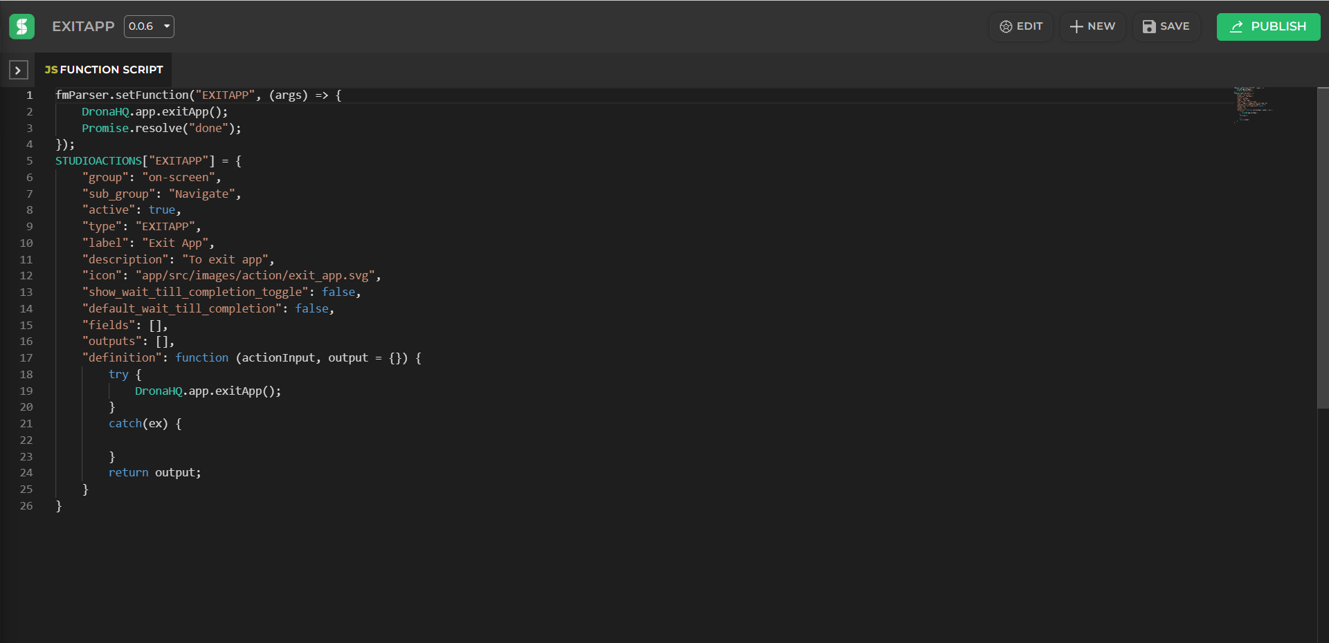
here is the code for Exit App action and function that can be used as both action as well as function.
STUDIOFUNCTIONS["EXITAPP"] = function (args) {
    DronaHQ.app.exitApp();
    Promise.resolve("done");
};

STUDIOACTIONS["EXITAPP"] = {
    "group": "on-screen",
    "sub_group": "Navigate",
    "active": true,
    "type": "EXITAPP",
    "label": "Exit App",
    "description": "To exit app",
    "icon": "app/src/images/action/exit_app.svg",
    "show_wait_till_completion_toggle": false,
    "default_wait_till_completion": false,
    "fields": [],
    "outputs": [],
    "definition": function (actionInput, output = {}) {
        try {
            DronaHQ.app.exitApp();
        }
        catch(ex) {
            console.log("Exit App attempt failed.");
        }
        return output;
    }
}
To reflect any change made in code of function or action it needs to be published again.