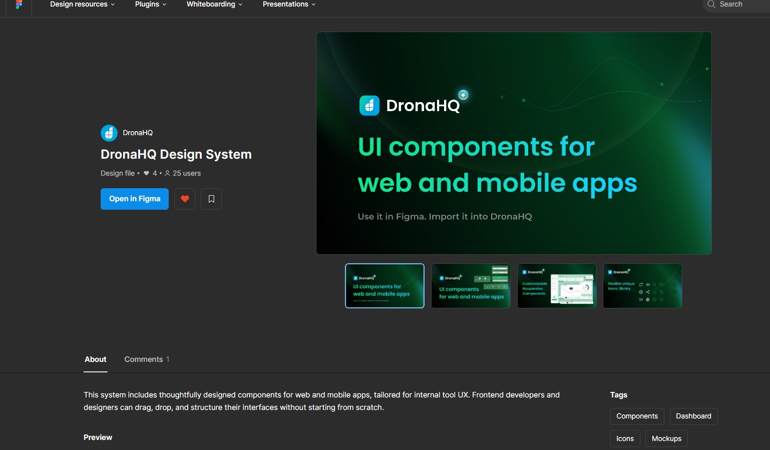
Building with the DronaHQ Design System
The DronaHQ Design System is a comprehensive, Figma-based UI library tailored specifically to streamline and enhance the process of building internal tools, admin panels, CRUD interfaces, and business apps using DronaHQ. It empowers designers and developers to work from a common visual language, ensuring consistency, reusability, and rapid prototyping — all while tightly integrating with the DronaHQ platform.

Whether you're a product designer looking to wireframe quickly, a developer building apps with minimal UI churn, or a cross-functional team aiming to ship consistent experiences faster, this design system gives you the foundations and flexibility to do just that.
Core Components of the Design System
The DronaHQ Design Kit on Figma is structured with clear categories of UI elements that reflect the platform's native builder environment.
Key Elements Include:
- Basic Components: Buttons, Inputs, Text areas, Headings, Paragraphs, Badges
- Selection Inputs: Dropdowns, Radio groups, Checkboxes, Toggles
- Featured Controls: Table Grid, Charts, Files, QR Scanner
- Native Inputs: Date picker, Time picker, Date range selector
- Typography & Color Styles: Predefined font styles, button states, brand and neutral colors
- Icon Library: Includes interface, state, functional, and social media icons organized by hue and style
All components are built following atomic design principles — enabling you to scale from the smallest icon to full-page layouts with consistency.
Designing in Figma with the Kit
Getting Started:
- Duplicate the kit to your Figma account
- Organize frames using the provided page structure (components, patterns, templates)
- Use predefined variants for things like button states, icon positions, and input validations
Layout & Spacing:
- Align to an apt spacing system
- Use auto layout for responsiveness
- Stick to typography hierarchy and modular scale (Heading, Subheading, Body, Label)
Design Tips:
- Use templates for faster mockups
- Detach components only when absolutely necessary (e.g., for visual experiments)
Output Structure
The DronaHQ Design System supports multiple types of output structures — all seamlessly compatible with the platform’s app builder.
Screens: Entire UI layouts for CRUD, Login, Dashboard, etc.Containers: Grouped UI elements like Card components, Form groups, Table blocksComponents: Atomic UI elements such as Buttons, Icons, Text FieldsIcons: Exportable SVG-ready icons, optimized for usage in DronaHQ’s builder
Whether you're building a full screen or a single component, the system ensures consistency across every layer of your design-to-development workflow.
AI-Enhanced Design to App Flow
One of the most powerful enhancements to the DronaHQ Design System is its integration with DronaHQ AI - Build With AI.
How It Works:
- Upload an image (mockup, sketch, or screenshot) in
JPGorPNGformat - The AI analyzes the layout and identifies relevant controls
- It then generates a ready-to-edit screen using appropriate DronaHQ components: text fields, dropdowns, buttons, etc.
This feature drastically reduces the time spent manually recreating UI from visuals. Instead, the platform turns your visual into a functioning screen that is editable, themable, and connectable to data.
Read more about AI-powered UI generation
Output Scope:
- Upload a full layout → Get a full screen
- Upload a section mockup → Get a container block
- Upload a component sketch → Get a styled control
The AI understands nested hierarchy and auto-maps elements to their best-fit counterparts in the builder.
Workflow Best Practices
To make the most of the design system:
- Always start from a base template or component
- Review with the engineering team before finalizing UI
- Use spacing and alignment as per system standards
- Make use of the AI chatbot for faster conversions and suggestions
- If working with external design files, align the exported outputs with native controls wherever possible
Manual UI Building vs. System-Driven Flow
| Feature | Manual Design | Design System + AI |
|---|---|---|
| Time to UI | High | Low |
| Consistency | Varies | High |
| Maintenance | Tedious | Simplified |
| Team Collaboration | Manual handoff | Unified standards |
| Integration | Needs adjustment | Native-ready |
The combination of prebuilt components, clear design language, and AI integration means DronaHQ reduces the friction that typically exists between design and development.
HTML/CSS-Based Import with Control Designer
For design teams using HTML output tools like Anima, DronaHQ also supports importing HTML/CSS content into its Control Designer.
Flow:
- Export HTML from Figma via Anima
- Paste/Upload to DronaHQ Control Designer
- Apply interactivity using native control properties
This method is especially useful for pixel-perfect interfaces where strict styling is required.
You can know more about Importing Your Figma Designs Directly into DronaHQ using HTML/CSS here.