Adding new properties in Coffee file's edit section
All the properties need to be written inside
To show new property you need to add attrs.show_new_property = true in defaultAttributes section
  <% var newProperty = rf.get('show_new_property') ? rf.get('show_new_property'): false
  <!-- you can add sbval if you want to add property Submit Data -->
    var sbval = Formbuilder.DHQ_SUBMISSION_OPTIONS.map((data) => {
        p = {}
        p[data.name] = data.value;
        return p;
    })
    %>
  <% if(newProperty == true && Formbuilder.templates && Formbuilder.templates['edit/prop_heading_section']) { %>
    <!-- All new  properties are written here -->
  <%}else{%>
    <!-- All old properties are written here -->
  <%}%>
For new property :-
<div class="revamp-category-section">
  <!-- Need to add heading template for each category section , basically we have 4 categories Content, Interaction, Appearance, Advanced -->
  <%= Formbuilder.templates['edit/prop_heading_section']({
      "type": "main",
      "name": "Content",
      "show_advanced_sec": true
  }) %>
    <div class="adv-setting-section">
      <%= Formbuilder.templates['edit/prop_heading_section']({
          "type": "advance"
      }) %>
      <div class="adv-grp-body">
          <%= Formbuilder.templates['edit/revamp_text_input']({
              "label": {name:"Type"},
              "name": "field_type",
              "col_width": "three_col",
              "isDisabled": true,
          }) %>
      </div>
  </div>
  <div class="child-prop-sec">
    <div class="data-bind-section"></div>
    <%= Formbuilder.templates['edit/revamp_text_input']({
        "label": {name:"Text input"},
        "name": "placeholder"
    }) %>
  </div>
</div>
Formbuilder.templates['edit/prop_heading_section'] :- this defines the heading of category
"type" :- you need to add this to differenciate between which heading you need to add here type can be -
main -> for category heading
advance -> to show advance heading
add-on -> for adding add-on heading
"name" :- text to be displayed on category section , basically we have 4 categories Content, Interaction, Appearance, Advanced
"show_advanced_sec" :- it has boolean value true, false whether you want to show advance section or not
"show_advanced_sec" :- You can add this whether you need to show advance section or not If "show_advanced_sec" is true you need to add this
<div class="adv-setting-section">
    <!-- to show up the heading of the advance section , just add type type ->advance -->
    <%= Formbuilder.templates['edit/prop_heading_section']({
        "type": "advance"
    }) %>
    <!-- and then add this div to add advance section properties -->
    <div class="adv-grp-body">
        <!-- here you can add templates -->
        <%= Formbuilder.templates['edit/revamp_text_input']({
            "label": {name:"Type"},
            "name": "field_type",
            "col_width": "three_col",
            "isDisabled": true,
        }) %>
    </div>
</div>
  <!-- Add this div to add further properties for particular category -->
  <div class="child-prop-sec">
  </div>
If you want to add databind section you can add below div in any category section, generally we add in Content category section
<div class="data-bind-section"></div>
If you want to add action section you can add below div in any category section, generally we add in Interaction category section
<div class="actionflow-section"></div>
Creating add on
You can add this template to create add-on
You must add type:"add-on" and values key in Formbuilder.templates["edit/prop_heading_section"]
values -> It accepts array of objects like this [{"label":"Tooltip","name":"show_tooltip","hideOn":"model.show_tooltip"}]
- label : label is mandatory
- name : prop_name (variable to store this property value)
- hideOn/showOn: this will notify when you want to show or hide this
<!-- Add this div to create add-on property -->
<div class="add-on-grp">
  <!-- Add this heading section for creating add-on header -->
   <!-- Add type : "add-on" and provide values -->
  <%= Formbuilder.templates['edit/prop_heading_section']({
      "type": "add-on",
      "values": [{"label":"Tooltip","name":"show_tooltip","hideOn":"model.show_tooltip"}]
  }) %>
  <!-- Add this div to further add properties for add-on -->
  <div class="grp-body">
    <!-- You can now add your properties -->
     <!-- Add "add_on_feature": true in all properties inside add-on -->
      <%= Formbuilder.templates['edit/revamp_text_input']({
          "label": {name:"Tooltip"},
          "name": "tooltip",
          "showOn":"model.show_tooltip",
          "col_width":"three_col",
          "add_on_feature": true,
      }) %>
  </div>
</div>
Creating a group
You can add this template to create group
You must add type:"add-on" and group: true in Formbuilder.templates["edit/prop_heading_section"]
  <div class="add-on-grp">
  <!--  you can add this template to create heading-->
  <%= Formbuilder.templates['edit/prop_heading_section']({
        "type": "add-on",
        "group": true,
        "name": "Mapped options"
    }) %>
    <div class="grp-body">
      <!-- Inside this div you can add your property templates for e.g. -->
      <%= Formbuilder.templates['edit/revamp_text_input']({
            "label": {name:"Type"},
            "name": "field_type",
            "col_width": "three_col",
            "isDisabled": true,
        }) %>
    </div>
  </div>
Nesting property
You can add this template to create nesting
You must add "nested_prop":true in Formbuilder.templates["edit/revamp_text_input"]
<!-- Add this div for creating nesting property  -->
<div class="nested-prop-section">
  <!-- Add this template and also add nested_prop to true -->
    <%= Formbuilder.templates['edit/revamp_text_input']({
        "label": {name:"Label"},
        "name": "label",
        "hideOn": "model.label_hidden",
        "col_width":"three_col",
        "add_on_feature": true,
        "nested_prop": true,
    }) %>
    <!-- Add this div to add further properties which you want inside nested -->
    <div class="nested-prop-sidebar">
      <!-- Add this to template for creating header , give "label" key a value and rest will be same -->
        <%= Formbuilder.templates['edit/nested_heading_section']({
            "label": "label",
            "name": "model.field_display_key_name"
        }) %>
        <!-- Now further you can add all other properties -->
        <%= Formbuilder.templates['edit/revamp_text_input']({
            "label": {name:"Type"},
            "name": "field_type",
            "col_width": "three_col",
            "isDisabled": true,
        }) %>
    </div>
</div>
Popup property
You can add this template to create popup property
You must add "popup_prop":true in Formbuilder.templates["edit/revamp_text_input"]
<!-- Add this div fro creating popup property -->
<div class="popup-prop-section">
  <!-- Add this template and also add popup_prop to true -->
    <%= Formbuilder.templates['edit/revamp_text_input']({
        "label": {name:"Search bar"},
        "name": "search at",
        "popup_prop": true,
        "add_on_feature": true,
        "showOn": "model.searchable"
    }) %>
    <!-- Add this div to add further properties which you want inside popup -->
    <div class="popup-prop-sidebar">
      <!-- Add this header template and mention type to "popup" and give name as well -->
        <%= Formbuilder.templates['edit/prop_heading_section']({
            "type": "popup",
            "name": "Search bar",
        }) %>
        <!-- You can further all all your properties here which you want inside popup -->
        <%= Formbuilder.templates['edit/revamp_toggle_prop']({
            "label": {name:"Search at"},
            "name": "showServerSidelSearch",
            "values" :[{"Server":true},{"Client":false}],
            "info": "Table Grid-Display- Server Side Search",
        }) %>
    </div>
</div>
For old property :- All the properties need to be written inside
<div class="edit_view_ctrl_prop">
    <!-- All properties are written here -->
</div>
Property Width
By default column width is 1 unit i.e 'one_col'
To increase the width to 2 units add 'two_col' class to prop_item
To increase the width to 3 units add 'three_col' class to prop_item
property width cannot be increased more than 3 units.
Creating a group

For creating a group 'prop_group' class needs to be added to 'edit_view_ctrl_prop' and a label containing the group name needs to be written.
<div class="edit_view_ctrl_prop prop_group">
    <label class="prop_group_label">GROUP</label>
    //PROPERTY 1
    //PROPERTY 2
</div>
Nesting
Use edit_view_prop_nested class instead of edit_view_ctrl_prop while nesting inside prop_group to avoid overflow
<div class="edit_view_ctrl_prop prop_group">
    <label class="prop_group_label">HIGHLIGHTED</label>
    <div class="edit_view_prop_nested three_col">
        //properties
    </div>
</div>
Common attributes
- "Label" : {name:"Label_display_name", position="top", width:"two_col"}
- Name is compulsory
- Default position of label is top
- Position values {"top","left"}
- Width is only applied to label if position is left
"name" : prop_name (variable to store this property value)
"hideOn" : "model.toggle"
If we wish to hide a particular property if toggle is on (toggles value is also stored in defaultAttributes) this can be applied to a single property.
- data-rv-hide="model.toggle"
If we wish to hide a particular property div if toggle is on (toggles value is also stored in defaultAttributes) this can be applied to a full property div.
- "showOn" : "model.toggle"
If we wish to show a particular property if toggle is on (toggles value is also stored in defaultAttributes) this can be applied to a single property.
- data-rv-show="model.toggle"
If we wish to show a particular property div if toggle is on (toggles value is also stored in defaultAttributes) this can be applied to a full property div.
- "col_width" : "three_col"
- Default value is "" (one_col) for new property it is three_col
- Col_width possible values for old property {"one_col","two_col","three_col"}
- Col_width possible values for new property {"one_col","two_col","three_col","four_col"}
- "inside_repeat" : true/false
- Set as true if we are using the template inside a repeat using rv-each
- Default is false
- "placeholder" : "write your placeholder here",
- Can add placeholder on property such as → text,textarea
Font Size

// for old property
<%= Formbuilder.templates['edit/font_size']({
   "label": {name:"Font Size", position:"top"},
   "name": "font_size",
   "disableUnit": true,
   "hideOn":"model.toggle",
}) %>

//for new property
<%= Formbuilder.templates['edit/revamp_font_size']({
   "label": {name:"Font Size"},
   "name": "font_size",
   "disableUnit": true,
   "hideOn":"model.toggle",
}) %>
disableUnit : for disabling the unit picker dropdown
- Default value is false (False means enabled and True means disabled)
For units we just need to add this “attrs.font_size_unit” in defaultAttributes no need to add anything in properties specifically.
Font Weight

// for old property
<%= Formbuilder.templates['edit/font_weight']({
    "label": {name:"Font Weight"},
    "name": "font_weight",
}) %>

//for new property
<%= Formbuilder.templates['edit/revamp_font_weight']({
    "label": {name:"Font Weight"},
    "name": "font_weight",
}) %>
- Min,Max,Steps : 0,600,100 like number picker
Number picker with unit

// for old property
<%= Formbuilder.templates['edit/numberPickerWithUnit']({
    "label": {name:"SIZE"},
    "name": "size",
    "disableUnit": false,
    "steps": "200",
    "max": "1000",
    "min": "10",
}) %>

// for new property
<%= Formbuilder.templates['edit/revamp_numberPickerWithUnit']({
    "label": {name:"SIZE"},
    "name": "size",
    "disableUnit": false,
    "steps": "200",
    "max": "1000",
    "min": "10",
}) %>
steps : the increment or decrement on clicking the arrow
- Default value =1
max : upper range of number picker
- Default value=1000000
min : lower range of number picker
- Default value=0
disableUnit : for disabling the unit picker dropdown
- Default value is false (False means enabled True means disabled)
Number picker

// for old property
<%= Formbuilder.templates['edit/numberPicker']({
    "label": {name:"Number Picker"},
    "name": "font_sizeC",
    "steps": "2",
    "max": "100",
    "min": "10",
}) %>

//for new property
<%= Formbuilder.templates['edit/revamp_numberPicker']({
    "label": {name:"Number Picker"},
    "name": "font_sizeC",
    "steps": "2",
    "max": "100",
    "min": "10",
}) %>
steps : the increment or decrement on clicking the arrow
- Default value = 1
max : upper range of number picker
- Default value=1000000
min : lower range of number picker
- Default value=-1000000
disableUnit : for disabling the unit picker dropdown
- Default value is false (False means enabled True means disabled)
Color Picker

//for old property
<%= Formbuilder.templates['edit/color_picker']({
   "label": {name:"pick color", position:"top", width:""},
   "name": "color_test",
   "col_width":"two_col",
   "solid_color_only" : true
}) %>

//for new property
<%= Formbuilder.templates['edit/revamp_color_picker']({
   "label": {name:"pick color"},
   "name": "color_test",
   "col_width":"three_col",
   "solid_color_only" : true
}) %>
Solid_color_only : true
- true : removes gradient
- Default false
Alignment (Select bar)

// for old property
<%= Formbuilder.templates['edit/selectbar']({
   "label": {name:"alingment", position:"top"},
   "name": "text_align",
   "icon_type":"text",
   "icon_labels":[{"L":"left"},{"R":"right"},{"C":"center"}],
   "col_width":"two_col",
}) %>

//for new property
<%= Formbuilder.templates['edit/revamp_selectbar']({
   "label": {name:"alingment"},
   "name": "text_align",
   "icon_type":"text",
   "icon_labels":[{"L":"left"},{"R":"right"},{"C":"center"}],
   "col_width":"three_col",
}) %>
Icon_type : text/icon
- Default value is icon
Icon_labels : users custom labels
- {displayName : Actual Value}

For using icons set values as : {“icon-cass”:”Left”}
Eg :- {“fas fa-align-left”:“left”}
Dropdown

// for old property
<%= Formbuilder.templates['edit/dropdown_new']({
   "label": {name:"dropdown", position:"left"},
   "name": "Dropdown",
   "values" :[{"Option1":"opt1"},{"Option2":"opt2"}],
   "col_width":"two_col",
   "isMultiselect":true,
   "maxSelections":"6",
}) %>

//for new property
<%= Formbuilder.templates['edit/revamp_new_dropdown']({
   "label": {name:"dropdown"},
   "name": "Dropdown",
   "values" :[{"Option1":"opt1"},{"Option2":"opt2"}],
   "col_width":"three_col",
   "isMultiselect":true,
   "maxSelections":"6",
}) %>
// if you have 2 to 3 options then you can use this
<%= Formbuilder.templates['edit/revamp_toggle_prop']({
   "label": {name:"dropdown"},
   "name": "Dropdown",
   "values" :[{"Option1":"opt1"},{"Option2":"opt2"}],
   "col_width":"three_col",
   "isMultiselect":true,
   "maxSelections":"6",
}) %>
Values : {“display_text”,”value”}
isMultiselect : converts single select dropdown to multiselect dropdown
- Default value is false (single select)
maxSelections : “An Integer”
- Works only for multiselect dropdown
- Allows a limited number of selection
- Does not work for 0 or negative numbers
rv-each-part
//for old property
<%= Formbuilder.templates['edit/dropdown_new']({
   "label": {name:"dropdown", position:"left"},
   "name": "Dropdown",
   "each": "model.jsonvalues",
   "display_text" : "display_name",
   "display_val" : "value",
}) %>

//for new property
<%= Formbuilder.templates['edit/revamp_new_dropdown']({
   "label": {name:"dropdown"},
   "name": "Dropdown",
   "each": "model.jsonvalues",
   "display_text" : "display_name",
   "display_val" : "value",
}) %>
each : this works as forEach loop so it iterates over all the values given.
display_text : key name for fetching display-text. (compulsory if each is present)
Display_val : key name for fetching values (compulsory if each is present)
Create Dynamic variable using dropdown multiselect :
“dynamicFields” : takes true/false, default is false. If set to true it will generate data according to the variables specified in the following key.
“variable” : Generate the array variable in control model, according to the values selected in multiselect suppose you have selected 3 values in multiselect then the variable will have thee values by default defined by the variableDefault key
“variableDefault” : Variabledefault specifies the default structure of data which will be used to populate the array variable specified in the variable key.
If default structure of data in variable is like
{“key1”:”value1”,”key2”:”value2”}
Two more keys will be automatically added in above default structure
{“map_id”:”dropdown_value_at_index”, ”name”:”dropdown_value_at_index”, “key1”:”value1”,”key2”:”value2”}
//for old property
<%= Formbuilder.templates['edit/dropdown_new']({
   "label": {name:"dropdown", position:"left"},
   "name": "Dropdown",
   "each": "model.field_datatypes",
   "display_text" : "display_name",
   "display_val" : "display_name",
   "isMultiselect": true,
   "dynamicFields":true,
   "Variable":"output",
   "variableDefault":"outputDefault"
}) %>

//for new property
<%= Formbuilder.templates['edit/revamp_new_dropdown']({
   "label": {name:"dropdown"},
   "name": "Dropdown",
   "each": "model.field_datatypes",
   "display_text" : "display_name",
   "display_val" : "display_name",
   "isMultiselect": true,
   "dynamicFields":true,
   "Variable":"output",
   "variableDefault":"outputDefault"
}) %>
Input Field (Text Field)

// for old property
<%= Formbuilder.templates['edit/text_input']({
   "label": {name:"textfield", position:"left", width:"one_col"},
   "name": "placeholder",
   "isDisabled": false
}) %>

// for new property
<%= Formbuilder.templates['edit/revamp_text_input']({
   "label": {name:"textfield"},
   "name": "placeholder",
   "isDisabled": false
}) %>
By default “isDisabled” value is “false”
File Upload

// for old property
<%= Formbuilder.templates['edit/file_upload']({
   "label": {name:"File Upload"},
   "name": "URL_link",
   "col_width":"tow_col",
   "multipleFiles":false,
   "maxlimit":"1",
}) %>

// for new property
<%= Formbuilder.templates['edit/revamp_file_upload']({
   "label": {name:"File Upload"},
   "name": "URL_link",
   "col_width":"three_col",
   "multipleFiles":false,
   "maxlimit":"1",
}) %>
multipleFiles : default value is false
maxLimit : default value is 1
Toggle

// for old property
<%= Formbuilder.templates['edit/toggle']({
   "label": {name:"toggle Me", position:"left", width:"two_col"},
   "name": "toggle",
}) %>

//for new property
<%= Formbuilder.templates['edit/revamp_checkbox']({
   "label": {name:"toggle Me", width:"three_col"},
   "name": "toggle",
   "position" : "right"
}) %>
Icon Picker

// for old property
<%= Formbuilder.templates['edit/icon_picker']({
   "label": {name:"Icon Select", position:"left"},
   "name": "icon",
   "col_width":"two_col",
}) %>

// for new property
<%= Formbuilder.templates['edit/revamp_icon_picker']({
   "label": {name:"Icon Select"},
   "name": "icon",
   "col_width":"two_col",
}) %>
TextArea

// for old property
<%= Formbuilder.templates['edit/textarea']({
   "label": {name:"textArea",position:"left"},
   "name": "textarea",
   "col_width": "two_col",
   "rows":5,
}) %>

// for new property
<%= Formbuilder.templates['edit/revamp_textarea']({
   "label": {name:"textArea"},
   "name": "textarea",
   "col_width": "three_col",
   "rows":5,
}) %>
Default value of “rows” is 10
Rich Text Editor

// for old property
<%= Formbuilder.templates['edit/richTextEditor']({
   "label": {name:"richText",position:"left"},
   "name": "richtext",
   "col_width": "two_col",
   "in_option": true,
}) %>

// for new property
<%= Formbuilder.templates['edit/revamp_richTextEditor']({
   "label": {name:"richText"},
   "name": "richtext",
   "col_width": "two_col",
   "in_option": true,
}) %>
Default value of “in_option” is TRUE
Margin & Padding
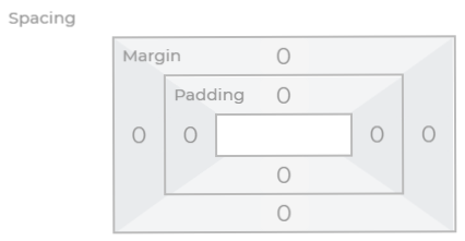
// for old property
<%= Formbuilder.templates['edit/margin_padding']({
   "label": {name:"Spacing"},
   "name": "marginpaddingValue",
   "info": "info-icon-example",
   "disable_padding": false,
   "disable_margin": false,
}) %>

// for new property
<%= Formbuilder.templates['edit/revamp_margin_padding']({
   "label": {name:"Spacing"},
   "name": "marginpaddingValue",
   "info": "info-icon-example",
   "disable_padding": false,
   "disable_margin": false,
}) %>
Set default value of margin & padding template by using array of object like below Example:
attrs.marginpaddingValue = {
   margin: {top: "0", bottom: "0", right: "0", left: "0"},
   padding: {top: "0", bottom: "0", right: "0", left: "0"}
}
Default values of “disable_padding” and “disable_margin” are FALSE.
Label position by default is TOP and can not be configurable.
Width of the margin & padding template is “THREE_COL” and can not be configured.