Creating Example controls using Control Editor
Configuring a header control
Let’s create 1 sample control Before that, get to the control list and see the heading control its properties , data binding and actions. We will also replicate the same.
Step 1 :- Create a new control
Open control editor → click on new → provide unique name , display name , search tags and choose an icon and click on Add button.
Click on left arrow icon and navigate to sample control (display name).
Click on save button or press CTRL + S once.
Now open an app (or refresh app if already open) and check for sample control (display name) we can use the search tag provided at time of control creation (our control will be inside the custom section).
Click on the control or drag it to the builder view and see the output.

Please check the output on the preview screen as well and in properties we are able to see only one property edit value of that property and see the changes on both screens.
Step 2 :- Changes in Handlebars
Let’s understand and edit the code for Handlebars first
Here we always have to put our code inside the wrapper class div. Here we can see the value of the label_value attribute variable is displayed.
Let’s edit this code :- (copy and paste this code inside wrapper)
<h1 class="header_body">
   {{label_value}}
</h1>
So this is the small logic for a HTML heading tag. Save the code and again refresh the app and open preview screen and we are able to see the value in as HTML H1 tag output.
Output :-

No change will be visible on the builder screen.
Step 3 :- Adding static css
Let’s add css for header_body class in css file Add this code to css file (please do not remove any existing code)
.{{cid}} .header_body{
    font-weight: 500;
    text-align: left;
    color: #26BC6A;
    line-height: 32px;
    letter-spacing: 1px;
}
Again save the code , refresh the app and see the output on the preview screen.
Output :-

Step 4:- Adding properties
Now as we have made a structure for control with static values let’s convert this structure as dynamic by adding different properties. So, lets go to edit section of Coffee file and here we will add properties that we need.
Please add one property at a time and examine the output for the same.
So let’s add a new property,
Already existing Code :-
<!-- your code here -->
    <% var newProperty = rf.get('show_new_property') ? rf.get('show_new_property') : false %>
    <% if(newProperty == true && Formbuilder.templates && Formbuilder.templates['edit/prop_heading_section']) { %>
        <div class="revamp-category-section">
            <%= Formbuilder.templates['edit/prop_heading_section']({
                "type": "main",
                "name": "Content",

            }) %>
            <div class="child-prop-sec">
                <%= Formbuilder.templates['edit/revamp_text_input']({
                    "label": {name:"Label value"},
                    "name": "label_value",
                    "col_width":"two_col"
                })%>
            </div>
    <%}else{%>
        <div class="edit_view_ctrl_prop">
            <%= Formbuilder.templates['edit/text_input']({
                "label": {name:"Label value", position:"left", width:""},
                "name": "label_value",
                "col_width":"two_col"
            })%>
        </div>
    <%}%>
<!-- your code ends here-->
Output :-

Add this code in the above section before closing of tag.
// New property
<%= Formbuilder.templates['edit/revamp_ext_input']({
   "label": {name:"Text"},
   "name": "heading_text",
   "col_width":"three_col",
}) %>

// Old property
<%= Formbuilder.templates['edit/text_input']({
   "label": {name:"Text", position:"left", width:""},
   "name": "heading_text",
   "col_width":"two_col",
}) %>
Structure should look like this ,
<!-- your code here -->
    <% var newProperty = rf.get('show_new_property') ? rf.get('show_new_property') : false %>
    <% if(newProperty == true && Formbuilder.templates && Formbuilder.templates['edit/prop_heading_section']) { %>
        <div class="revamp-category-section">
            <%= Formbuilder.templates['edit/prop_heading_section']({
                "type": "main",
                "name": "Content",
            }) %>
            <div class="child-prop-sec">
                <%= Formbuilder.templates['edit/revamp_text_input']({
                    "label": {name:"Label value"},
                    "name": "label_value",
                    "col_width":"two_col"
                })%>
                <%= Formbuilder.templates['edit/text_input']({
                    "label": {name:"Text"},
                    "name": "heading_text",
                    "col_width":"two_col",
                }) %>
            </div>
    <%}else{%>
        <div class="edit_view_ctrl_prop">
            <%= Formbuilder.templates['edit/text_input']({
                "label": {name:"Label value", position:"left", width:""},
                "name": "label_value",
                "col_width":"two_col"
            })%>
            <%= Formbuilder.templates['edit/text_input']({
                "label": {name:"Text", position:"left", width:""},
                "name": "heading_text",
                "col_width":"two_col",
            }) %>
        </div>
    <%}%>
<!-- your code ends here-->
Now as we have used a new "heading_text" variable to "name" we have to add the same variable to defaultAttributes as well . Current Structure of default attributes,
defaultAttributes: (attrs) ->
    attrs.label = 'MyControl'
    attrs.label_hidden = false
    attrs.label_value = "Sample Label"
    attrs.data_type = "string"
    attrs.field_composition_type = "single"
    attrs.field_available_in_database_editor = false
    attrs.field_editable_in_database_editor = false
    attrs.field_database_editor_data_format = "single_line_text"
    attrs
We can add our variables anywhere between the first and last line means our default attributes should always end with attrs.
Let’s add our variable as attrs.heading_text = "".
Also we have to provide default value every time we introduce a new variable (if no default value then give "" only 2 double quotes). So structure after will look like,
defaultAttributes: (attrs) ->
    attrs.label = 'MyControl'
    attrs.label_hidden = false
    attrs.label_value = "Sample Label"
    attrs.data_type = "string"
    attrs.field_composition_type = "single"
    attrs.field_available_in_database_editor = false
    attrs.field_editable_in_database_editor = false
    attrs.field_database_editor_data_format = "single_line_text"
    attrs.heading_text = ""
    attrs
we have to always maintain this structure
Output after adding this (To see the changes always remember to save the code and refresh the app)

So like this add all other required properties as,
For old property -
<%= Formbuilder.templates['edit/dropdown_new']({
    "label": {name:"Size", position:"left", width:"two_col"},
    "name": "label_size",
     "values" :[{"H1":"h1"},{"H2":"h2"},{"H3":"h3"},{"H4":"h4"},{"H5":"h5"},{"H6":"h6"}],
     "col_width":"",
     "isMultiselect":false,
}) %>
 <%= Formbuilder.templates['edit/numberPickerWithUnit']({
     "label":  {name:"Letter Spacing",position:"left",width:"two_col"},
      "name": "letter_spacing",
      "disableUnit": true,
      "steps": "1",
      "max": "1000",
       "min": "0",
}) %>
<%= Formbuilder.templates['edit/numberPickerWithUnit']({
       "label":  {name:"Line Height",position:"left",width:"two_col"},
        "name": "line_height",
        "disableUnit": true,
        "steps": "1",
        "max": "1000",
        "min": "0",
 }) %>
</div>
<div class="edit_view_ctrl_prop prop_group">
   <label class="prop_group_label">FONT</label>
    <%= Formbuilder.templates['edit/font_weight']({
        "label":  {name:"Weight"},
        "name": "header_font_weight",
    }) %>
    <%= Formbuilder.templates['edit/color_picker']({
        "label": {name:"Color", position:"top", width:""},
        "name": "header_font_color",
        "solid_color_only" : true,
        "col_width":"two_col"
    }) %>
    <%= Formbuilder.templates['edit/selectbar']({
        "label": {name:"Alingment", position:"top"},
        "name": "header_text_alignment",
        "Icon_type":"icon",
        "col_width":"three_col",
   }) %>
</div>
Please see the number of opening and closing div tags. and variable in defaultAttributes as,
 attrs.header_text_alignment = 'left'
 attrs.header_font_color = '#444'
 attrs.header_font_weight = '500'
 attrs.label_size = 'h2'
 attrs.textarea_rows = '2'
 attrs.heading_text = 'Heading'
 attrs.line_height = "32"
 attrs.line_height_unit = "px"
 attrs.letter_spacing = "1"
 attrs.letter_spacing_unit = "px"
Step 5 :- Making control dynamic
As we have stored these values in variables we can now make our control dynamic. So, let’s make changes in the handlebars file first.
Now the heading tag will be rendered as per the value selected in the dropdown. Changes in css file
.{{cid}} .header_body{
    font-weight: {{header_font_weight}};
    text-align: {{header_text_alignment}};
    color: {{header_text_color}};
    margin:auto;
    line-height: {{line_height}}{{line_height_unit}};
    letter-spacing: {{letter_spacing}}{{letter_spacing_unit}};
}
How our control will respond to changes made in the properties section.(changes only visible in preview).

As we want to band text data only to this control so we do not change
attrs.field_composition_type = “single”
Step 6 :-Showing binded data
let’s show binded data in our control.
So we have to write this logic in the javascript file. We have to write this logic in the setValue function.
this.setValue = function (obj) {
    //Your control will get data from DronaHQ here.
    if(obj){
        this.$el.find('.header_body').text(obj);
    }
};
After adding this we can check our control by binding data from different sources.
Step 7 :- Adding Actions
let’s add action to our control. To add action to our control we have to add one attribute in the coffee file defaultAttributes section and handle it in the javascript section. In the coffee file defaultAttributes we need to add this code.
attrs.action_items = {
   "button_click": {
    "events": ["click"],
    "selector": ".header_body"
   }
}
please check the indentation properly otherwise when we reload the app it will not load properly and will give us errors. Final default attributes will look like this,
defaultAttributes: (attrs) ->
    attrs.label = 'MyControl'
    attrs.label_hidden = false
    attrs.label_value = "Sample Label"
    attrs.data_type = "string"
    attrs.field_composition_type = "single"
    attrs.field_available_in_database_editor = false
    attrs.field_editable_in_database_editor = false
    attrs.field_database_editor_data_format = "single_line_text"
    attrs.header_text_alignment = 'left'
    attrs.header_font_color = '#444'
    attrs.header_font_weight = '500'
    attrs.label_size = 'h2'
    attrs.textarea_rows = '2'
    attrs.heading_text = 'Heading'
    attrs.line_height = "32"
    attrs.line_height_unit = "px"
    attrs.letter_spacing = "1"
    attrs.letter_spacing_unit = "px"
    attrs
To handle this event we have to add the following code in javascript file initComponent function as ,
this.initComponent = function () {
    //Initialize your components here, if needed.
    var self = this;
    this.$el.find(".header_body").on('click',function(e){
        triggerAction(self.model.field_key_name,'button_click','click',e);
    });
};
Step 8 :-Replication on Builder
Now we have completed our control and will work perfectly for the preview screen. If we find it difficult to write code in a coffee script we can also ignore this step.
So now we can bring the same look and feel of the preview screen to the builder screen as well.
we should never bring our event's logic to the builder screen. So let’s first build the same UI for the builder screen.
First we have to make changes in Coffee file view section, Here also we have the same wrapper class div as handlebars so we just have to put the same logic as handlebars but using coffee script syntax.
<div class="wrapper">
    <<%= rf.get('label_size') %> class="header_body">
        <%if(rf.get('LiveData')){%><%= rf.get('LiveData') %><% }else{%><%= rf.get('heading_text') %><%}%>
    </<%= rf.get('label_size') %> >
</div>
Here , the LiveData variable is used to get data binded from any data source using the BindData section. And for css we have to add use same logic as in css file but we coffee script syntax,
.<%= rf.get('cid') %> .header_body{
    font-weight: <%= rf.get('header_font_weight') %>;
    text-align: <%= rf.get('header_text_alignment') %>;
    color:<%= rf.get('header_text_color') %>;
    line-height:<%= rf.get('line_height') %><%= rf.get('line_height_unit') %>;
    letter-spacing: <%= rf.get('letter_spacing') %><%= rf.get('letter_spacing_unit') %>;
}
So finally our style tag will look like this
Now we can see our control will work the same as the preview screen.
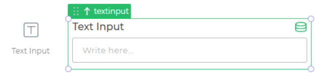
For reference here is the code of 1 input and 1 non-input control.
Input control :- Text input
Code :-
Coffee File
Formbuilder.registerField 'text',
 group: 'Form'
 order: 1
 type: 'input'
 view: """
   <div class="fb-field-wrapper control-body-style response-field-<%= rf.get('field_type') %> <%= rf.get('cid') %> <% if( rf.get('disabled')) { %>isDisabled<% } %>" data-requiredfield = "<%= rf.get('required') %>">
       <div class = "wrapper <% if( rf.get('disabled')) { %>isDisabled<% } %>">
           <div class="ui input">
               <input type="text"
                       minlength="<%= rf.get('text_min_length') %>"
                       maxlength="<%= rf.get('text_max_length') %>"
                       placeholder="<%= rf.get('placeholder') %>"
                       data-content="<%= rf.get('tooltip') %>"
                       class="tooltip">
               <div  class="scanner" style="display:none">
                   <img src="images/qrcode.svg" style="height: 28px;">
               </div>
           </div>
       </div>
       <div class="fb-field-error-message">
           <!-- Error Message Here -->
       </div>
   </div>

   <style>
   .<%= rf.get('cid') %>  .wrapper{
       display:flex;
       }

   .<%= rf.get('cid') %> .ui.input{
       width: 100%;
       position: relative;
   }
   .<%= rf.get('cid') %> .scanner{
       position: absolute;
       right: 0;
       padding: 6px;
   }

   .<%= rf.get('cid') %> input {
       font-weight: <%= rf.get('input_font_weight') %> !important;
       color: <%= rf.get('input_font_color') %> !important;
       font-size: <%= rf.get('input_font_size') %> !important;
       height: <%= rf.get('input_control_height') %> !important;
       border-color:<%= rf.get('formbuilder_theme') %> !important;
   }
   .<%= rf.get('cid') %> input::-webkit-input-placeholder
   {
       font-weight: <%= rf.get('input_placeholder_font_weight') %> !important;
       color: <%= rf.get('input_placeholder_text_color') %> !important;
       font-size: <%= rf.get('input_placeholder_text_size') %> !important;
   }
   .<%= rf.get('cid') %> .isDisabled .ui.input > input {
       background: #eee !important;
       color: #666 !important;
       border-color: #ddd !important;
       opacity: 1 !important;
   }

   .<%= rf.get('cid') %> .isDisabled .ui.input > input::-webkit-input-placeholder {
   color: #bbb !important;
   }
   .<%= rf.get('cid') %> .isDisabled .component-head-container{
   color:#666 !important;
   }
   </style>
   <script>
       (function() {
           let $el = $('body').find(".response-field-<%= rf.get('field_type') %>.<%= rf.get('cid') %>");
           let $input = $el.find('.wrapper .ui.input input');
           let liveData = builderComponents["<%= rf.get('field_key_name')%>"].backBoneModel.get("LiveData");
           $input.val(liveData);
       })()
   </script>
 """
 # VIEW JS IS FUNCTION WITH TWO PARAMETER $el, model
 viewJs: ($el, model, opts) ->
   # console.log("js file updated", this);
   if opts.RegisterResChangeCallback
     resChangeCallBack = (resData)->
       console.log("res updated")
     opts.RegisterResChangeCallback(resChangeCallBack)

 edit: """
 <% var newProperty = rf.get('show_new_property') ? rf.get('show_new_property') : false %>
    <% if(newProperty == true && Formbuilder.templates && Formbuilder.templates['edit/prop_heading_section']) { %>
        <div class="revamp-category-section">
            <%= Formbuilder.templates['edit/prop_heading_section']({
                "type": "main",
                "name": "Content",
            }) %>
            <div class ="child-prop-sec">
            <%= Formbuilder.templates['edit/revamp_color_picker']({
                       "label": {name:"Theme"},
                       "name": "formbuilder_theme",
                       "solid_color_only" : true
                   }) %>
                   <%= Formbuilder.templates['edit/revamp_text_input']({
                       "label": {name:"Placeholder"},
                       "name": "placeholder",
                   }) %>
                   <%= Formbuilder.templates['edit/revamp_new_dropdown']({
                       "label": {name:"Input Type"},
                       "name": "input_type",
                       "values" :[{"Text":"text"},{"Url":"url"},{"Email":"email"},{"Password":"password"}],
                       "info": "Text-Properties-Input Type",
                       "isMultiselect":false,
                   }) %>
                   <%= Formbuilder.templates['edit/revamp_numberPicker']({
                       "label":  {name:"Min Character"},
                       "name": "text_min_length",
                       "disableUnit": false,
                       "steps": "1",
                       "max": "1000",
                       "min": "0",
                   }) %>
                   <%= Formbuilder.templates['edit/revamp_numberPicker']({
                       "label":  {name:"Max Character"},
                       "name": "text_max_length",
                       "disableUnit": false,
                       "steps": "1",
                       "max": "1000",
                       "min": "0",
                       "col_width":"three_col",
                   }) %>
                   <%= Formbuilder.templates['edit/revamp_numberPicker']({
                       "label":  {name:"Debounce Time (In ms)"},
                       "name": "debounceEventTime",
                       "disableUnit": false,
                       "steps": "100",
                       "max": "1000",
                       "min": "0",
                       "col_width":"",
                       "info": "Text Input - Properties - Debounce Time (In ms)",
                   }) %>
                    <%= Formbuilder.templates['edit/revamp_checkbox']({
                       "label": {name:"Show Raw Data"},
                       "name": "dhq_show_rawdata",
                       "info": "Text-Properties-Show Raw Data",
                   }) %>
                   <%= Formbuilder.templates['edit/revamp_checkbox']({
                       "label": {name:"Show Barcode Scanner"},
                       "name": "isqrvisible",
                   }) %>
            </div>
        </div>
    <%}else{%>
   <div class="category-section">
       <div class="ui edit-accordion accordion">
           <div class="title active header-accordion">
               Properties<span class="caret"></span>
           </div>
           <div class="content active">
               <div class="edit_view_ctrl_prop " >
                   <%= Formbuilder.templates['edit/color_picker']({
                       "label": {name:"Theme", position:"left", width:""},
                       "name": "formbuilder_theme",
                       "col_width":"two_col",
                       "solid_color_only" : true
                   }) %>
                   <%= Formbuilder.templates['edit/text_input']({
                       "label": {name:"Placeholder", position:"left", width:""},
                       "name": "placeholder",
                       "col_width":"two_col"
                   }) %>
                   <%= Formbuilder.templates['edit/dropdown_new']({
                       "label": {name:"Input Type", position:"left"},
                       "name": "input_type",
                       "values" :[{"Text":"text"},{"Url":"url"},{"Email":"email"},{"Password":"password"}],
                       "info": "Text-Properties-Input Type",
                       "col_width":"two_col",
                       "isMultiselect":false,
                   }) %>
                   <%= Formbuilder.templates['edit/numberPicker']({
                       "label":  {name:"Min Character", position:"left", width:""},
                       "name": "text_min_length",
                       "disableUnit": false,
                       "steps": "1",
                       "max": "1000",
                       "min": "0",
                       "col_width":"two_col",
                   }) %>
                   <%= Formbuilder.templates['edit/numberPicker']({
                       "label":  {name:"Max Character", position:"left", width:""},
                       "name": "text_max_length",
                       "disableUnit": false,
                       "steps": "1",
                       "max": "1000",
                       "min": "0",
                       "col_width":"two_col",
                   }) %>
                   <%= Formbuilder.templates['edit/numberPicker']({
                       "label":  {name:"Debounce Time (In ms)", position:"left", width:"two_col"},
                       "name": "debounceEventTime",
                       "disableUnit": false,
                       "steps": "100",
                       "max": "1000",
                       "min": "0",
                       "col_width":"",
                       "info": "Text Input - Properties - Debounce Time (In ms)",
                   }) %>
                    <%= Formbuilder.templates['edit/toggle']({
                       "label": {name:"Show Raw Data", position:"left", width:"two_col"},
                       "name": "dhq_show_rawdata",
                       "info": "Text-Properties-Show Raw Data",
                   }) %>
                   <%= Formbuilder.templates['edit/toggle']({
                       "label": {name:"Show Barcode Scanner ", position:"left", width:"two_col"},
                       "name": "isqrvisible",
                   }) %>
               </div>
           </div>
       </div>
   </div>
   <%}%>
 """

 addButton: """
     <span class="symbol">
       <span class="symbol-icon-box">
         <img src="app/src/images/controls/text.svg" />
       </span>
       <span class="clabel">Text Input</span>
     </span>
 """

 gridConfiguration:
   minWidth: 1,
   maxWidth: 24,
   minHeight: 6,
   maxHeight: 0,
   defaultHeight: 8,
   defaultWidth: 12,
   isWidthResizable: true,
   isHeightResizable: true

 defaultAttributes: (attrs) ->
   attrs.label = 'Text Input'
   attrs.placeholder = 'Write here...'
   attrs.min_length = ''
   attrs.max_length = ''
   attrs.debounceEventTime = 3000
   attrs.text_max_length =''
   attrs.text_min_length =''
   attrs.action_items = {
       "value_change": {
           "events": ["value_change"],
           "selector": ""
       },
       "enter_press": {
           "events": ["enter_press"],
           "selector": ""
       }
       "focus_out": {
           "events": ["focus_out"],
           "selector": ""
       }
   }
   attrs.LiveData = ""
   attrs.value = ''
   attrs.input_type = "text"
   attrs.length_unit = 'characters'
   attrs.field_responsive = true
   attrs.disabled = false
   attrs.data_type = "string"
   attrs.isqrvisible = false
   attrs.field_composition_type = "single"
   attrs.field_available_in_database_editor = true
   attrs.field_editable_in_database_editor = true
   attrs.field_values_source = ""
   attrs.field_database_editor_data_format = "single_line_text"
   attrs.field_datatypes = []
   attrs.formbuilder_theme = '#BBBBBB'
   attrs
CSS File
.{{cid}} .component-head-container {
    font-size: {{label_font_size}}{{label_font_size_unit}};
    font-weight: {{label_font_weight}};
    color: {{label_text_color}};
    text-align: {{label_text_alignment}};
}
.{{cid}} .wrapper{
   display:flex;
}

.{{cid}} .ui.input{
   width: 100%;
 position:relative;
 }
.{{cid}} .scanner{
   position: absolute;
   right: 0;
   padding: 6px;
}
.{{cid}} .ui.input > input {
    font-weight: {{input_font_weight}};
    color: {{input_font_color}};
    font-size: {{input_font_size}};
    height: {{input_control_height}};
    border-color:{{formbuilder_theme}};
}
.{{cid}} .ui.input > input::-webkit-input-placeholder{
    font-weight: {{input_placeholder_font_weight}};
 color: {{input_placeholder_text_color}};
 font-size: {{input_placeholder_text_size}};
}
.{{cid}} .isDisabled .ui.input > input {
    background: #eee !important;
    color: #666 !important;
    border-color: #ddd !important;
    opacity: 1 !important;
}
.{{cid}} .isDisabled .ui.input > input::-webkit-input-placeholder {
    color: #bbb !important;
}
.{{cid}} .isDisabled .ui.basic.label {
background: #eee !important;
    color: #666 !important;
    border-color: #ddd; !important;
}
.{{cid}} .isDisabled .component-head-container{
 color:#666;
}
.{{cid}} .textarea-control{
    -webkit-appearance: none;
-moz-appearance: none;
    appearance: none;
    border-radius: 3px;
    border:1px solid {{formbuilder_theme}};
    font-size: {{input_font_size}};
    color: #444;
    padding: 10px;
      font-weight: {{input_font_weight}};
    color: {{input_font_color}};
    font-size: {{input_font_size}};
    min-height: {{input_control_height}};
    border-color:{{formbuilder_theme}};
}
.{{cid}} .textarea.textarea-control.isDisabled {
        background: #eee !important;
        color: #666 !important;
    border-color: #ddd !important;
    opacity: 1 !important;
}
.{{cid}} .textarea.textarea-control.isDisabled > .textarea::-webkit-input-placeholder {
    color: #bbb !important;
}
.{{cid}} .textarea.textarea-control {
    display: block;
    width: 100%;
    overflow: hidden;
    resize:none;
    line-height: 20px;
    outline: none;
}
.{{cid}} .textarea[contenteditable]:empty::before {
    content: "{{placeholder}}";
    font-weight: {{input_placeholder_font_weight}};
    color: {{input_placeholder_text_color}};
    font-size: {{input_placeholder_text_size}};
}
Javascript File
BSCOMPONENTS["text"] = function () {
   this.default = {
       value: ""
   };
   this.$componentLoader = "";
   this.initComponent = function () {
       this.default.value = this.model.value;
       var input_box = this.$el.find("input");
       var self = this;
       this.$componentLoader = this.$el.find('.component-loader');
       this.$el.find('.tooltip').popup();
       self.checkBarcodeCompatibility();
       this.$el.find("input").on('focusout', function (e) {
           triggerAction(self.model.field_key_name, 'focus_out', 'focus_out', e);
       });
       // on key press trigger action 2 sec timer
       // debounce here
       this.$el.find("input").on('keydown', self.debounce(function (e) {
           var keycode = e.which || e.keyCode;
           self.initConditionalVisibility(self.model.field_key_name);
           self.execValidations();
           if ((keycode != 13 || e.code != 'Enter') && e.key != "") {
               triggerAction(self.model.field_key_name, 'value_change', 'value_change', e);
           }
       }, self.model.debounceEventTime));
       this.$el.find("input").on('keydown', this.handleEnterPress.bind(this));
       // end
       this.$el.find('input').on('focus', function () {
           $(this).parents().find('.' + self.model.cid).find('.scanner').fadeIn();
       }).on('blur', function () {
           $(this).parents().find('.' + self.model.cid).find('.scanner').fadeOut();
       });
       this.$el.find(".scanner").on('click', function (e) {
           cordova.plugins.barcodeScanner.scan(
               function (result) {
                   if (!result.cancelled) {
                       input_box.val(result.text);
                       self.initConditionalVisibility(self.model.field_key_name);
                       self.execValidations();
                       triggerAction(self.model.field_key_name, 'value_change', 'value_change', e);
                   }
               },
               function (error) {
                   alert("Scanning failed: " + error);
               }
           );
       });
   };
   this.debounce = function (callback, delay) {
       var timeout
       return function () {
           var args = arguments
           clearTimeout(timeout)
           timeout = setTimeout(function () {
               callback.apply(this, args)
           }.bind(this), delay)
       }
   }
   this.handleEnterPress = function (e) {
       var self = this
           var keycode = e.which || e.keyCode;
           if (keycode === 13 || e.code === 'Enter') {
               triggerAction(self.model.field_key_name, 'enter_press', 'enter_press', e);

           }
   }
   this.initConditionalVisibility = function (fieldKey) {
       triggerConditionalVisibility(fieldKey);
   };
   this.getValue = function () {
       var cvalue = this.$el.find("input").val();
       return { question: this.model.label, value: cvalue, id: this.model.field_key_name, name: this.model.field_display_key_name };
   };
   this.hide = function () {
       this.$el.addClass("hide");
   };
   this.show = function () {
       this.$el.removeClass("hide");
   };
   this.setValue = function (value) {
       this.$el.find("input").val(value);
       this.initConditionalVisibility(this.model.field_key_name);
       triggerAction(this.model.field_key_name, 'value_change', 'value_change');
   };
   this.reset = function () {
       this.setValue(this.default.value);
       this.initConditionalVisibility(this.model.field_key_name);
   };
   this.startComponentLoader = function () {
       this.$componentLoader.removeClass("hide");
       this.$el.addClass('component-loading');
   };
   this.stopComponentLoader = function () {
       this.$componentLoader.addClass("hide");
       this.$el.removeClass('component-loading');
   };
   this.beforeSubmitValidation = function () {
       /* Description: your condition for input validation before submit
       Return Type: return true if validation is successful or return false
       in case of validation failed with message
       */
       var errorList = [];
       this.clearError();
       var isRequired = this.$el.attr("data-requiredfield");
       isRequired = isRequired.toLowerCase() == "true";
       var inputType = this.model.input_type;
       var emailReg = /^(([^<>()\[\]\\.,;:\s@"]+(\.[^<>()\[\]\\.,;:\s@"]+)*)|(".+"))@((\[[0-9]{1,3}\.[0-9]{1,3}\.[0-9]{1,3}\.[0-9]{1,3}\])|(([a-zA-Z\-0-9]+\.)+[a-zA-Z]{2,}))$/;
       var urlRegex = /[-a-zA-Z0-9@:%_\+.~#?&//=]{2,256}\.[a-z]{2,4}\b(\/[-a-zA-Z0-9@:%_\+.~#?&//=]*)?/gi;
       var val = this.$el.find("input").val().trim();
       var maxLength = this.model.text_max_length || -1;
       var minLength = this.model.text_min_length || -1;
       if (val) {
           if (val.length < minLength && minLength > -1 || val.length > maxLength && maxLength > -1) {
               errorList.push("Value should be " + minLength + " to " + maxLength + " characters long.")
           }
       }
       if (inputType == "email") {
           var isEmailValid = emailReg.test(String(val).toLowerCase());
           if (val != "" && !isEmailValid) {
               errorList.push('Invalid email id');
           }
       }
       if (inputType == "url") {
           var isUrlValid = urlRegex.test(val);
           if (val != "" && !isUrlValid) {
               errorList.push('Invalid URL');
           }
       }
       if (isRequired && !val) {
           errorList.push('This field is mandatory');
       }
       if (errorList.length > 0) {
           this.showError(errorList.join("\n"));
           return false;
       }
       else {
           this.clearError();
           return true;
       }
   };
   this.checkBarcodeCompatibility = function () {
       var checkingString = navigator.appVersion
       if (checkingString.includes('DronaHQ')) {
           if (DronaHQ.onAndroid || DronaHQ.onIos || DronaHQ.onWindowsPhone) {
               if (this.model.isqrvisible) {
                   this.$el.find(".scanner").removeClass('hide');
               }
           } else {
               this.$el.find(".scanner").addClass('hide')
           }
       } else {
           this.$el.find(".scanner").addClass('hide')
       }
   };
   this.showError = function (msg) {
       var $errorMessage = this.$el.find(".fb-field-error-message");
       this.$el.addClass("fb-field-has-error");
       $errorMessage.text(msg);
   };
   this.clearError = function () {
       var $errorMessage = this.$el.find(".fb-field-error-message");
       this.$el.removeClass("fb-field-has-error");
       $errorMessage.text("");
   }
};
BSCOMPONENTS["text"].prototype = BaseComponent;
Handlebars File
Non_input Control :- Button
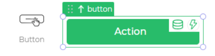
Code :-
Coffee_ File
Formbuilder.registerField 'Button1',
group: 'Button'
order: 18
type: 'non_input'
view: """
<div class="fb-field-wrapper control-body-style <%= rf.get('cid') %>" >
<div class="wrapper">
<div class='control-button <%= rf.get('card_theme') %>'>
</div>
</div>
</div>
<style>
.<%= rf.get('cid') %> .wrapper {
height: 100%;
<% if(rf.get('isDhqGridCtrl')) { %>
display: flex;
<%}%>
}
.<%= rf.get('cid') %> .control-button
{
box-shadow: none;
font-weight: <%= rf.get('title_font_weight') %>;
border-radius: <%= rf.get('card_border_radius') %><%= rf.get('card_border_radius_unit') %> !important;
padding: 10px 5px;
width: 100%;
height:auto;
color: <%= rf.get('title_text_color') %>;
background: <%= rf.get('title_background_color') %>;
font-size: <%= rf.get('title_font_size') %><%= rf.get('title_font_size_unit') %>;
line-height: <%= rf.get('title_font_size') %><%= rf.get('title_font_size_unit') %>;
min-height:40px;
width: -webkit-fill-available;
margin: 0px;
display: flex;
align-items: center;
justify-content : <% if(rf.get('title_text_alignment') == "right") {%> flex-end <%}else{%> <%= rf.get('title_text_alignment') %> <%}%>;
}
.<%= rf.get('cid') %> .hide {
display:none;
}
.<%= rf.get('cid') %> .filled-theme{
border: none;
border: 1px solid <%= rf.get('card_background_color') %>;
background: <%= rf.get('card_background_color') %>;
}
.<%= rf.get('cid') %> .outlined-theme{
background-color: transparent;
border: 1px solid <%= Formbuilder.helpers.single_color(rf.get('card_background_color')) %>;
}
</style>
<script>
</script>
"""
edit: """
<%
var newProperty = rf.get('show_new_property') ? rf.get('show_new_property') : false
%>
<% if(newProperty == true && Formbuilder.templates && Formbuilder.templates['edit/prop_heading_section']) { %>
<div class="revamp-category-section">
<%= Formbuilder.templates['edit/prop_heading_section']({
"type": "main",
"name": "Content",
"show_advanced_sec": true
}) %>
<div class="adv-setting-section">
<%= Formbuilder.templates['edit/prop_heading_section']({
"type": "advance"
}) %>
<div class="adv-grp-body">
<%= Formbuilder.templates['edit/revamp_text_input']({
"label": {name:"Type"},
"name": "field_type",
"col_width": "three_col",
"isDisabled": true,
}) %>
</div>
</div>
<div class="child-prop-sec">
<div class="data-bind-section"></div>
<% if(rf.get('button_label') != '') { %>
<%= Formbuilder.templates['edit/revamp_text_input']({
"label": {name:"Text"},
"name": "button_label"
}) %>
<%}%>
<div class="add-on-grp">
<%= Formbuilder.templates['edit/prop_heading_section']({
"type": "add-on",
"values": [{"label":"Label","name":"label_hidden","showOn":"model.label_hidden"},{"label":"Tooltip","name":"show_tooltip","hideOn":"model.show_tooltip"},{"label":"Description","name":"show_description","hideOn":"model.show_description"}]
}) %>
<div class="grp-body">
<%= Formbuilder.templates['edit/revamp_text_input']({
"label": {name:"Tooltip"},
"name": "tooltip",
"showOn":"model.show_tooltip",
"col_width":"three_col",
"add_on_feature": true,
}) %>
<%= Formbuilder.templates['edit/revamp_text_input']({
"label": {name:"Description"},
"name": "tip_description",
"showOn":"model.show_description",
"col_width":"three_col",
"add_on_feature": true,
}) %>
<div class="nested-prop-section">
<%= Formbuilder.templates['edit/revamp_text_input']({
"label": {name:"Label"},
"name": "label",
"hideOn": "model.label_hidden",
"col_width":"three_col",
"add_on_feature": true,
"nested_prop": true,
}) %>
<div class="nested-prop-sidebar">
<%= Formbuilder.templates['edit/nested_heading_section']({
"label": "label",
"name": "model.field_display_key_name"
}) %>
<%= Formbuilder.templates['edit/revamp_info_label_group']({rf:rf}) %>
</div>
</div>
</div>
</div>
</div>
</div>
<div class="revamp-category-section">
<%= Formbuilder.templates['edit/prop_heading_section']({
"type": "main",
"name": "Interaction",
"show_advanced_sec": false
}) %>
<div class="child-prop-sec">
<%= Formbuilder.templates['edit/revamp_toggle_prop']({
"label": {name:"Button State"},
"name": "state_dropdown",
"values" :[{"Enabled":"enable"},{"Disabled":"disable"}],
"col_width":"three_col",
"isMultiselect":false
}) %>
<div class="add-on-grp">
<%= Formbuilder.templates['edit/prop_heading_section']({
"type": "add-on",
"values": [{"label":"Show Icon","name":"icon_visible","hideOn":"model.icon_visible"}]
}) %>
<div class="grp-body">
<div class="nested-prop-section">
<%= Formbuilder.templates['edit/revamp_text_input']({
"label": {name:"Show Icon"},
"name": "Configurations",
"col_width":"three_col",
"nested_prop": true,
"add_on_feature": true,
"show_close": true,
"showOn" : "model.icon_visible"
}) %>
<div class="nested-prop-sidebar">
<%= Formbuilder.templates['edit/nested_heading_section']({
"label": "Show Icon",
"name": "model.field_display_key_name"
}) %>
<%= Formbuilder.templates['edit/revamp_toggle_prop']({
"label": {name:"Icon Position", position:"top"},
"name": "side_to_display",
"values" :[{"Right":"right"},{"Left":"left"}],
"isMultiselect":false,
"showOn":"model.icon_visible",
}) %>
<%= Formbuilder.templates['edit/revamp_icon_picker']({
"label": {name:"Select Icon", position:"left"},
"name": "workflow_icon",
"showOn":"model.icon_visible",
}) %>
</div>
</div>
</div>
</div>
<div class="actionflow-section"></div>
</div>
</div>
<div class="revamp-category-section">
<%= Formbuilder.templates['edit/prop_heading_section']({
"type": "main",
"name": "Appearance",
"show_advanced_sec": true
}) %>
<div class="adv-setting-section">
<%= Formbuilder.templates['edit/prop_heading_section']({
"type": "advance"
}) %>
<div class="adv-grp-body">
<%= Formbuilder.templates['edit/revamp_checkbox']({
"label": {name:"Hide on desktop", width:"three_col"},
"name": "isDhqHideOnDesktop",
"col_width": "one_col",
"position": "right"
}) %>
<%= Formbuilder.templates['edit/revamp_checkbox']({
"label": {name:"Hide on Mobile", width:"three_col"},
"name": "isDhqHideOnMobile",
"col_width": "one_col",
"position": "right"
}) %>
<%= Formbuilder.templates['edit/revamp_checkbox']({
"label": {name:"Dynamic Height", width:"three_col"},
"name": "grid_dynamic_height",
"col_width": "one_col",
"position": "right"
}) %>
<%= Formbuilder.templates['edit/revamp_checkbox']({
"label": {name:"Maintain Space when hidden", width:"three_col"},
"name": "grid_maintain_space",
"col_width": "one_col",
"position": "right"
}) %>
<%= Formbuilder.templates['edit/revamp_numberPickerWithUnit']({
"label": {name:"Max Height","width":"two_col"},
"name": "grid_max_height",
"col_width":"two_col",
"steps": "1",
"max": "9999",
"min": "0",
"showOn": "model.grid_dynamic_height"
}) %>
</div>
</div>
<div class="child-prop-sec">
<%= Formbuilder.templates['edit/revamp_checkbox']({
"label": {name:"Visibility",width:"three_col"},
"name": "visibility",
"col_width": "one_col",
"position": "right"
}) %>
</div>
<div class="popup-prop-section">
<%= Formbuilder.templates['edit/revamp_text_input']({
"label": {name:"Button Properties"},
"name": "color, radius, theme",
"col_width":"three_col",
"popup_prop": true,
}) %>
<div class="popup-prop-sidebar">
<%= Formbuilder.templates['edit/prop_heading_section']({
"type": "popup",
"name": "Button Properties",
}) %>
<%= Formbuilder.templates['edit/revamp_color_picker']({
"label": {name:"Color", position:"top", width:""},
"name": "card_background_color",
}) %>
<%= Formbuilder.templates['edit/revamp_font_size']({
"label": {name:"Radius"},
"name": "card_border_radius",
"disableUnit": false,
"steps": "1",
"max": "1000",
"min": "0",
}) %>
<%= Formbuilder.templates['edit/revamp_toggle_prop']({
"label": {name:"Theme ", position:"top", width:""},
"name": "card_theme",
"values" :[{"Filled":"filled-theme"},{"Outlined":"outlined-theme"}],
"col_width":"",
"isMultiselect":false,
}) %>
</div>
</div>
<div class="popup-prop-section">
<%= Formbuilder.templates['edit/revamp_text_input']({
"label": {name:"Text Properties"},
"name": "size, weight, color, alignment",
"col_width":"three_col",
"popup_prop": true,
}) %>
<div class="popup-prop-sidebar">
<%= Formbuilder.templates['edit/prop_heading_section']({
"type": "popup",
"name": "Text Properties",
}) %>
<%= Formbuilder.templates['edit/revamp_font_size']({
"label": {name:"Size"},
"name": "title_font_size",
"disableUnit": true,
"steps": "1",
"max": "1000",
"min": "0",
}) %>
<%= Formbuilder.templates['edit/revamp_font_weight']({
"label": {name:"Weight"},
"name": "title_font_weight",
}) %>
<%= Formbuilder.templates['edit/revamp_color_picker']({
"label": {name:"Color", position:"top", width:""},
"name": "title_text_color",
"solid_color_only" : true
}) %>
<%= Formbuilder.templates['edit/revamp_selectbar']({
"label": {name:"Alignment", position:"top"},
"name": "title_text_alignment",
"Icon_type":"icon",
"col_width":"three_col",
}) %>
</div>
</div>
</div>
<div class="revamp-category-section">
<%= Formbuilder.templates['edit/prop_heading_section']({
"type": "main",
"name": "advanced",
"show_advanced_sec": false
}) %>
<div class="child-prop-sec">
<%= Formbuilder.templates['edit/revamp_codemirror_editor']({
"label": {name:"External Css"},
"name": Formbuilder.options.mappings.DHQ_EXTERNAL_CSS_DATA,
"cmConfig": {mode: "text/css"},
"info": "Info External css-Code",
})%>
<%= Formbuilder.templates['edit/revamp_checkbox']({
"label": {name:"Trigger Dependents",width:"three_col"},
"name": Formbuilder.options.mappings.DHQ_TRIGGGER_FORWARD_DEPENDENCIES,
"col_width": "one_col",
"position": "right"
}) %>
<%= Formbuilder.templates['edit/revamp_checkbox']({
"label": {name:"Caching",width:"three_col"},
"name": "caching",
"col_width": "one_col",
"position": "right"
}) %>
</div>
</div>
<%}else{%>
<div class="category-section">
<div class="ui accordion edit-accordion">
<div class="title active header-accordion">
Properties<span class="caret"></span>
</div>
<div class="content active">
<div class="accordion-content-inner">
<div class="form-group ui grid" style="height: auto; min-height: 44px; display: flex !important;">
<label for="" style="color: #969696;font-size: 10px;font-weight: 500;" class="five wide column p-l-0 theme">Control ID</label>
<div class="form-control eleven wide column">
<label style="display: flex;align-items: center;height: 32px;border-radius: 5px;position: relative;border: 1px solid #e0e0e0;box-shadow: inset 0 -1px 1px rgb(0 0 0 / 3%), inset 0 1px 1px rgb(0 0 0 / 6%);" class="disabled-label-input" disabled=""><%= rf.get('cid')%></label>
<a href="#" title="copy to clipboard" class="copy-to-clipboard" data-value="<%= rf.get('cid')%>">
<i class="icon-docs icons"></i>
</a>
</div>
</div>
<div class="edit_view_ctrl_prop ">
<%= Formbuilder.templates['edit/text_input']({
"label": {name:"Text", position:"left", width:""},
"name": "button_label",
"col_width":"two_col"
}) %>
<%= Formbuilder.templates['edit/toggle']({
"label": {name:"Show Icon", position:"top", width:""},
"name": "icon_visible",
}) %>
<%= Formbuilder.templates['edit/dropdown_new']({
"label": {name:"Icon Position", position:"top"},
"name": "side_to_display",
"values" :[{"Right":"right"},{"Left":"left"}],
"col_width":"two_col",
"isMultiselect":false,
"showOn":"model.icon_visible"
}) %>
<%= Formbuilder.templates['edit/icon_picker']({
"label": {name:"Select Icon", position:"left"},
"name": "workflow_icon",
"col_width":"two_col",
"showOn":"model.icon_visible"
}) %>
</div>
<div class="form-group ui grid flex-center hide" style="height:auto;min-height:44px;">
<label for="" class="six wide column p-l-0">Action</label>
<div class="form-control ten wide column">
<div class="form-control selection ui dropdown ten wide column" tabindex="0">
<select data-rv-value="model.button_type">
<option value="no_action">
No Action
</option>
<option value="phone">
Phone Number
</option>
<option value="mail">
Mail
</option>
<option value="dhq_app_exit">
Exit App
</option>
</select><i class="dropdown icon"></i>
<div class="text">Mail</div>
<div class="menu transition hidden" tabindex="-1">
<div class="item" data-value="no_action">
No Action
</div>
<div class="item" data-value="phone">
Phone Number
</div>
<div class="item active selected" data-value="mail">
Mail
</div>
<div class="item" data-value="dhq_app_exit">
Exit App
</div>
</div>
</div>
</div>
</div>
<div class="form-group ui grid flex-center" data-rv-show="model.button_type | eq phone">
<label class="six wide column p-l-0">
<abbr title='required'>Phone Number</abbr>
</label>
<div class="form-control ten wide column">
<input type="text" data-rv-input="model.button_value" />
</div>
</div>
<div class="form-group ui grid flex-center" data-rv-show="model.button_type | eq mail">
<label class="six wide column p-l-0">
<abbr title='required'>Email Address</abbr>
</label>
<div class="form-control ten wide column">
<input type="text" data-rv-input="model.mailto_to" />
</div>
</div>
</div>
</div>
</div>
</div>
<div class="category-section">
<div class="ui accordion edit-accordion">
<div class="title active header-accordion">
Style<span class="caret"></span>
</div>
<div class="content active" style="overflow: visible;">
<div class="accordion-content-inner">
<div class="edit_view_ctrl_prop prop_group">
<label class="prop_group_label">TEXT </label>
<%= Formbuilder.templates['edit/numberPickerWithUnit']({
"label": {name:"Size"},
"name": "title_font_size",
"disableUnit": true,
"steps": "1",
"max": "1000",
"min": "0",
}) %>
<%= Formbuilder.templates['edit/font_weight']({
"label": {name:"Weight"},
"name": "title_font_weight",
}) %>
<%= Formbuilder.templates['edit/color_picker']({
"label": {name:"Color", position:"top", width:""},
"name": "title_text_color",
"solid_color_only" : true
}) %>
<%= Formbuilder.templates['edit/selectbar']({
"label": {name:"Alingment", position:"top"},
"name": "title_text_alignment",
"Icon_type":"icon",
"col_width":"three_col",
}) %>
</div>
<div class="edit_view_ctrl_prop prop_group">
<label class="prop_group_label">BACKGROUND PROPERTY</label>
<%= Formbuilder.templates['edit/color_picker']({
"label": {name:"Color", position:"top", width:""},
"name": "card_background_color",
}) %>
<%= Formbuilder.templates['edit/numberPickerWithUnit']({
"label": {name:"Radius"},
"name": "card_border_radius",
"disableUnit": false,
"steps": "1",
"max": "1000",
"min": "0",
}) %>
<%= Formbuilder.templates['edit/dropdown_new']({
"label": {name:"Theme ", position:"top", width:""},
"name": "card_theme",
"values" :[{"Filled":"filled-theme"},{"Outlined":"outlined-theme"}],
"col_width":"",
"isMultiselect":false,
}) %>
</div>
</div>
</div>
</div>
</div>
"""
viewJs : ($el,model,optn) ->
obj = model.get('LiveData')|| "";
iconContainer = if model.get('icon_visible') && model.get('workflow_icon') then model.get('workflow_icon') else "";
iconTemplate = "";
button_label = if obj then obj else model.get('button_label')
if model.get('side_to_display')== "right"
iconTemplate = ""+button_label+"<span class='right_side' style='margin-left:8px;'><i class='"+iconContainer+"'</i></span>";
else
iconTemplate = "<span class='left_side' style='margin-right:8px;'><i class='"+iconContainer+"'></i></span>"+button_label+"";
$el.find(".control-button").html(iconTemplate);
addButton: """
<span class="symbol">
<span class="symbol-icon-box">
<img src="app/src/images/controls/action_button.svg" />
</span>
<span class="clabel">Action1</span>
</span>
"""
gridConfiguration:
minWidth: 1,
maxWidth: 24,
minHeight: 5,
maxHeight: 0,
defaultHeight: 5,
defaultWidth: 12,
isWidthResizable: true,
isHeightResizable: true
defaultAttributes: (attrs) ->
attrs.title_font_size = 16
attrs.title_font_size_unit = 'px'
attrs.title_text_color = '#ffffff'
attrs.title_text_alignment = 'center'
attrs.title_font_weight = 500
attrs.card_background_color = '#28bc6a'
attrs.card_theme = 'filled-theme'
attrs.workflow_icon = "fas fa-arrow-right"
attrs.side_to_display = "right"
attrs.card_border_radius = 5
attrs.card_border_radius_unit = 'px'
attrs.button_label = 'ACTION'
attrs.button_type = 'no_action'
attrs.button_value = ''
attrs.is_button = true
attrs.icon_visible = false
attrs.label_hidden = true
attrs.navigation_enabled = false
attrs.navigate_to = ''
attrs.navigation_transition = ''
attrs.mailto_to = 'name@domain.com'
attrs.mailto_subject = 'subject'
attrs.mailto_body = 'Hi'
attrs.is_navigation_control = true
attrs.submit_from_pages = ''
attrs.show_new_property = true
attrs.formbuilder_theme = 'var(--theme-color-light)'
#CTRL METADATA CONFIGURATION
attrs.field_composition_type = "single"
attrs.data_type = "string"
attrs.LiveData = ''
attrs.field_database_editor_data_format = "single_line_text"
attrs.field_available_in_database_editor = false
attrs.field_editable_in_database_editor = true
attrs.event_items = {
button_click: {
'click': [{
"formula_with_id": "",
"formula_with_name": ""
}]
}
}
attrs.action_items = {
"button_click": {
"events": ["click"],
"selector": ".control-button"
}
}
attrs.field_datatypes = []
attrs
CSS_ File
.{{cid}} .component-head-container {
 font-size: {{label_font_size}}{{label_font_size_unit}};
 font-weight: {{label_font_weight}};
 color: {{label_text_color}};
 text-align: {{label_text_alignment}};
}
.{{cid}} .control-button
{
    box-shadow: none;
   font-weight: {{title_font_weight}};
   border-radius: {{card_border_radius}}{{card_border_radius_unit}} !important;
   padding: 10px 5px;
   width: 100%;
   height: auto;
    color: {{title_text_color}}  !important;
   background: {{title_background_color}};
    font-size: {{title_font_size}}{{title_font_size_unit}};
   min-height:40px;
   width: -webkit-fill-available;
   margin: 0px;
   cursor:pointer;
   display: flex;
   align-items: center;
    justify-content : {{#ifCond  title_text_alignment "==" "right"}}flex-end{{else}}{{title_text_alignment}}{{/ifCond}};
}
.{{cid}} .wrapper{
   {{#if isDhqGridCtrl}}
   display: flex;
   {{/if}}
}
.{{cid}} .hide {
    display:none;
}
.{{cid}} .filled-theme{
        border: none;
        border: 1px solid {{single_color card_background_color}};
        background: {{card_background_color}} !important;
}
.{{cid}} .outlined-theme{
   background-color: transparent;
 border: 1px solid {{single_color card_background_color}} !important;
}
Javascript_ File
BSCOMPONENTS["Button1"] = function() {
   this.$el = "";
   this.initComponent = function() {
       var self = this
       var model = this.model;
       // var flow = this.model.actionflows.button_click;
       this.$el.find('.control-button').on('click',function(e){
           e.stopPropagation();
           triggerAction(self.model.field_key_name,'button_click','click',e);
           //newActionExecute(flow, e, model);
       });
       this.showIcon();
       this.EventManager.publish("setimeout", "some custom data");
   };
   this.setValue = function(value) {
       this.showIcon(value);
   }
   this.showIcon = function(textValue){
       iconContainer = this.model.icon_visible && this.model.workflow_icon ? this.model.workflow_icon : "";
       itemLabel = ""
       if(!textValue){
           itemLabel = this.model.button_label
       }
       else
           itemLabel = textValue;
       iconTemplate = "";
       if (this.model.side_to_display == "right"){
           iconTemplate = ""+itemLabel+"<span class='right_side' style='margin-left:8px;'><i class='"+iconContainer+"'</i></span>";
       }else{
           iconTemplate = "<span class='left_side' style='margin-right:8px;'><i class='"+iconContainer+"'></i></span>"+itemLabel+"";
       }
       this.$el.find(".control-button").html(iconTemplate);
   }
};
BSCOMPONENTS["Button1"].prototype = BaseComponent;