Overview
In this tutorial, we will explore what can be done with data in DronaHQ dashboards. We will cover every aspect, from loading data to building visualizations on the dataset. We will introduce key concepts in DronaHQ Dashboard by exploring a comprehensive dataset containing different Energy usage data from various buildings and their respective departments. This tutorial aims to familiarize you with the process of creating and analyzing data, building informative dashboards, and utilizing various visualization tools offered by DronaHQ.
The dataset we will use offers valuable insights into energy usage patterns and building characteristics across various sites. Specifically, the dataset provides insights into the following areas:
- Analysis of electricity and natural gas usage across different sites, helping identify energy consumption trends.
- Insights into the maximum energy demand periods, crucial for planning and managing energy resources.
- A measure of energy efficiency that can be used to benchmark performance and identify high-energy-use sites for improvement.
- Understanding of the distribution of electric utility providers across sites, which can influence energy sourcing strategies.
- Data on the total use of solar energy across various sites, revealing the extent of renewable energy integration.
- Analysis of how building types and sizes relate to energy usage, supporting more targeted energy efficiency measures.
Creating and Managing Datasets
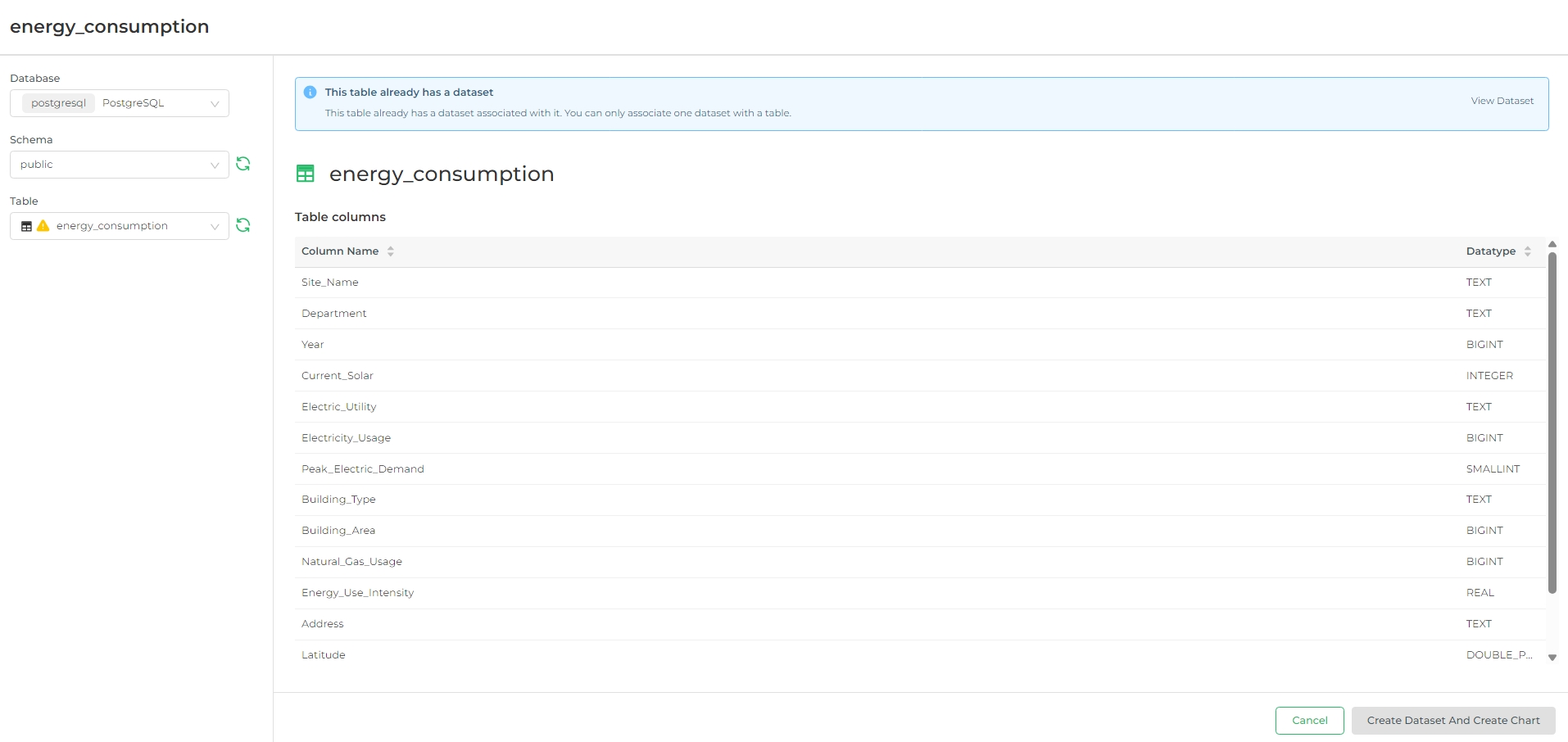
The first step in building our dashboard is to create and manage datasets. To do this, navigate to the dashboards
section, click the + Dataset button.
This will allow you to import and organize the Energy consumption data. Once the data is available as a dataset, you can easily apply various analyses and create
feature-rich charts. After saving the dataset, all relevant metrics will be fetched and ready for use in different categorized tables and charts.
Availing Data
To create a dataset, you must first connect a database using a connector. Follow the steps to configure a connector for your database. Additionally, there are other methods to avail data:
- Uploading CSV: You can upload a CSV file directly. Simply provide a table name and select the appropriate schema to structure the data.
- Columnar to Database Configuration: This method involves configuring a columnar data format to fit into your database schema, optimizing for storage and query performance.
- Excel to Database Configuration: Similar to CSV upload, this method allows you to upload Excel files. You will need to specify the table name and schema to ensure the data is correctly integrated into your database.
Building the Dashboard
Once your dataset is ready, you can proceed to build the dashboard. Start by creating a new dashboard through
+ > Dashboard. Initially, your dashboard will be blank, but don't worry—we'll guide you through the process of
populating it with meaningful visualizations.
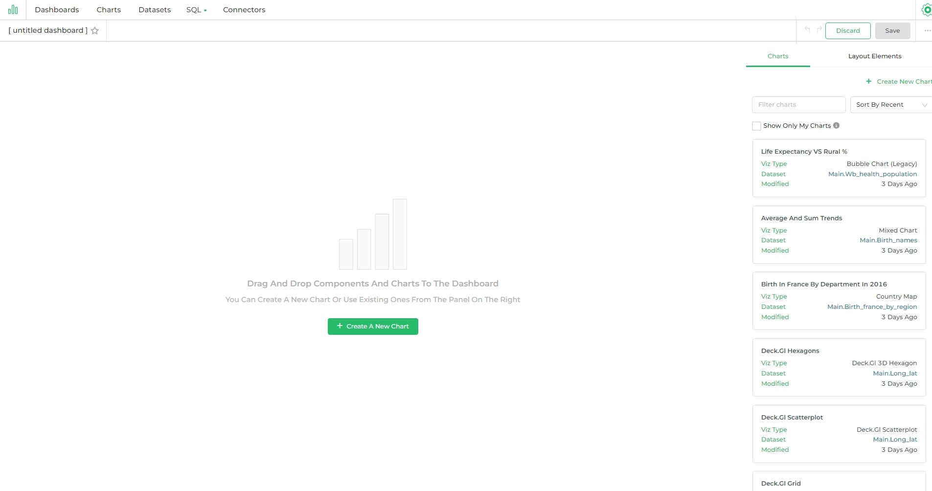
On the dashboard screen, you will find a button labeled Create a New Chart. This feature enables you to generate new
charts and tables using the dataset.
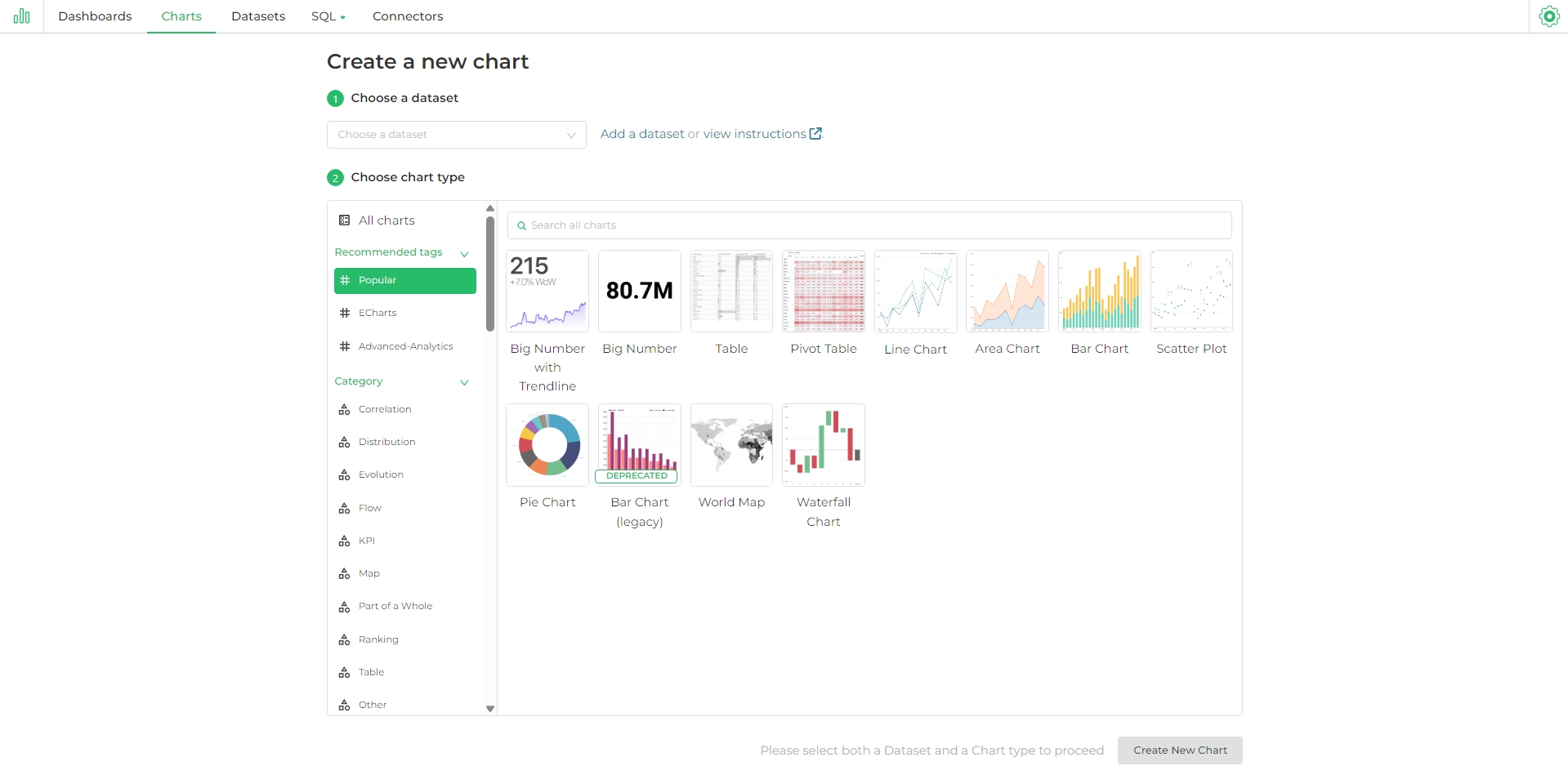
By leveraging DronaHQ's powerful visualization tools, you can create a variety of charts, such as bar graphs, line charts, pie charts, and more, to effectively present your data.
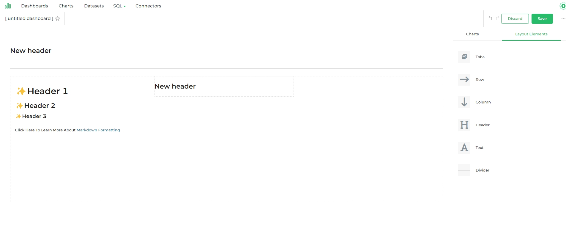
Using Layout Elements : Text
To make your dashboard more attractive and improve the user experience, consider incorporating layout elements such as Tabs, Rows, Columns, Headers, and more.
These elements help organize your dashboard content, making it easier to navigate and understand.
Follow these steps to use elements:
- Navigate to
Layout Elements. - Within elements, drag and drop
HeaderandTextelements onto the dashboard. Look for the blue lines indicating where the box will go. - Select the element to edit the text. Use Markdown format (see this Markdown Cheatsheet for more information).
- Toggle between Edit and Preview using the menu on top of the box.
- To exit editing mode, select any other part of the dashboard. Remember to save your changes using Save changes.
Creating Charts for Dashboard
Pie Chart
To visualize peak Electricity Demand by Building Type, start by creating a pie chart using the energy_consumption dataset. Begin by selecting the Pie Chart option in the chart creation section. In the Query section, you can define dimensions by choosing from saved dimensions, simple dimensions, or by writing custom SQL queries. For metrics, summation of the peak electric demand is required to represent the data accurately.
Now put these into as fields
Here's the table based on the new query:
| Column | Value |
|---|---|
| DIMENSIONS | Building_Type |
| METRIC | SUM(Peak_Electric_Demand) |
| SORT BY METRIC | Toggle On |
In the Customize section, you can configure various options to enhance your chart. Adjust the color scheme, set the percentage threshold, and decide whether to show the legend.
Finally, you can modify the pie shape by adjusting the outer radius or converting it into a donut chart by setting the inner radius. These customizations will help you create a visually appealing and informative pie chart that clearly illustrates the distribution of electric demand across different buildings.
Click Create Chart. Then click Add to dashboard. This chart will be added top dashboard. We are going to repeat this for every chart or table we create.
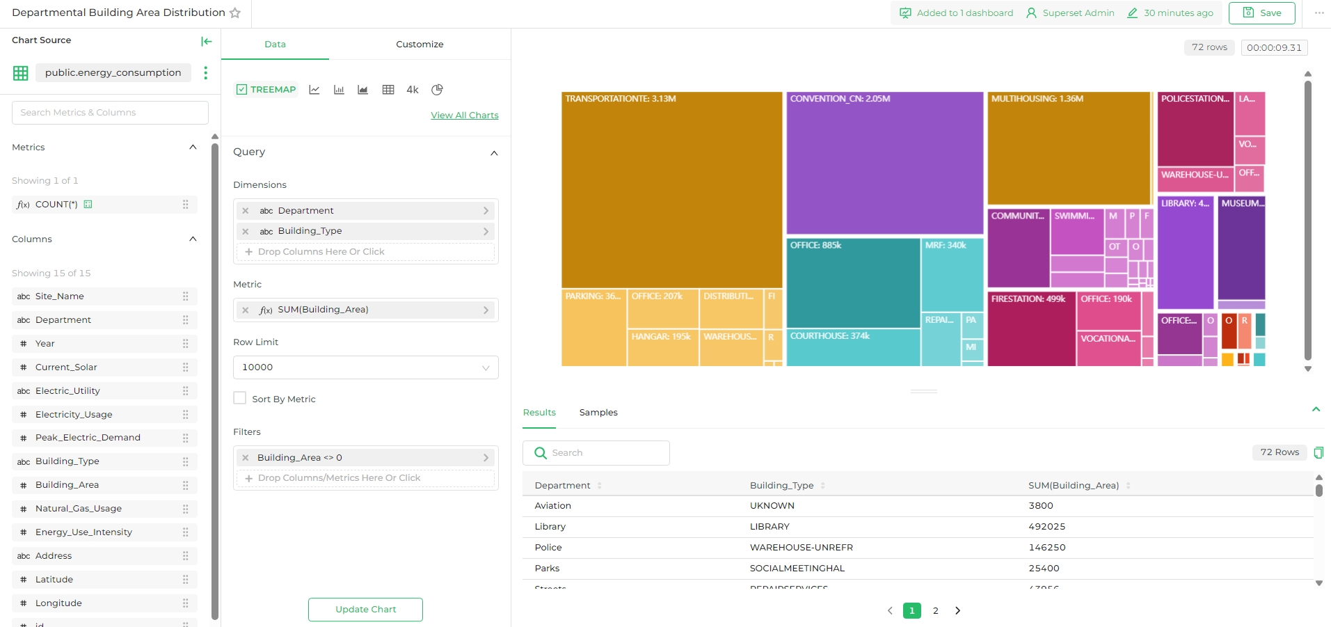
Tree Map
Let's create a Treemap chart to visualize the distribution of building areas across different departments using the public.energy_consumption dataset. Start by selecting the Treemap chart option in the chart creation section.
- Dimensions: Set the
Departmentcolumn as the primary dimension andBuilding_Typeas the secondary dimension to categorize the data. - Metric: Use
SUM(Building_Area)to aggregate the total area for each building type under the respective department. - Filters: Apply a filter where
Building_Areais not equal to 0 to ensure only valid building areas are included in the chart.
In the Customize section, you can adjust the color scheme and other visual settings to enhance the chart's appearance.
Click on Create Chart, and you'll generate a Treemap chart that clearly depicts the distribution of building areas across various departments and building types. This visual representation allows you to easily compare the sizes and distribution of different building types within each department.
Publishing Stage Essentials
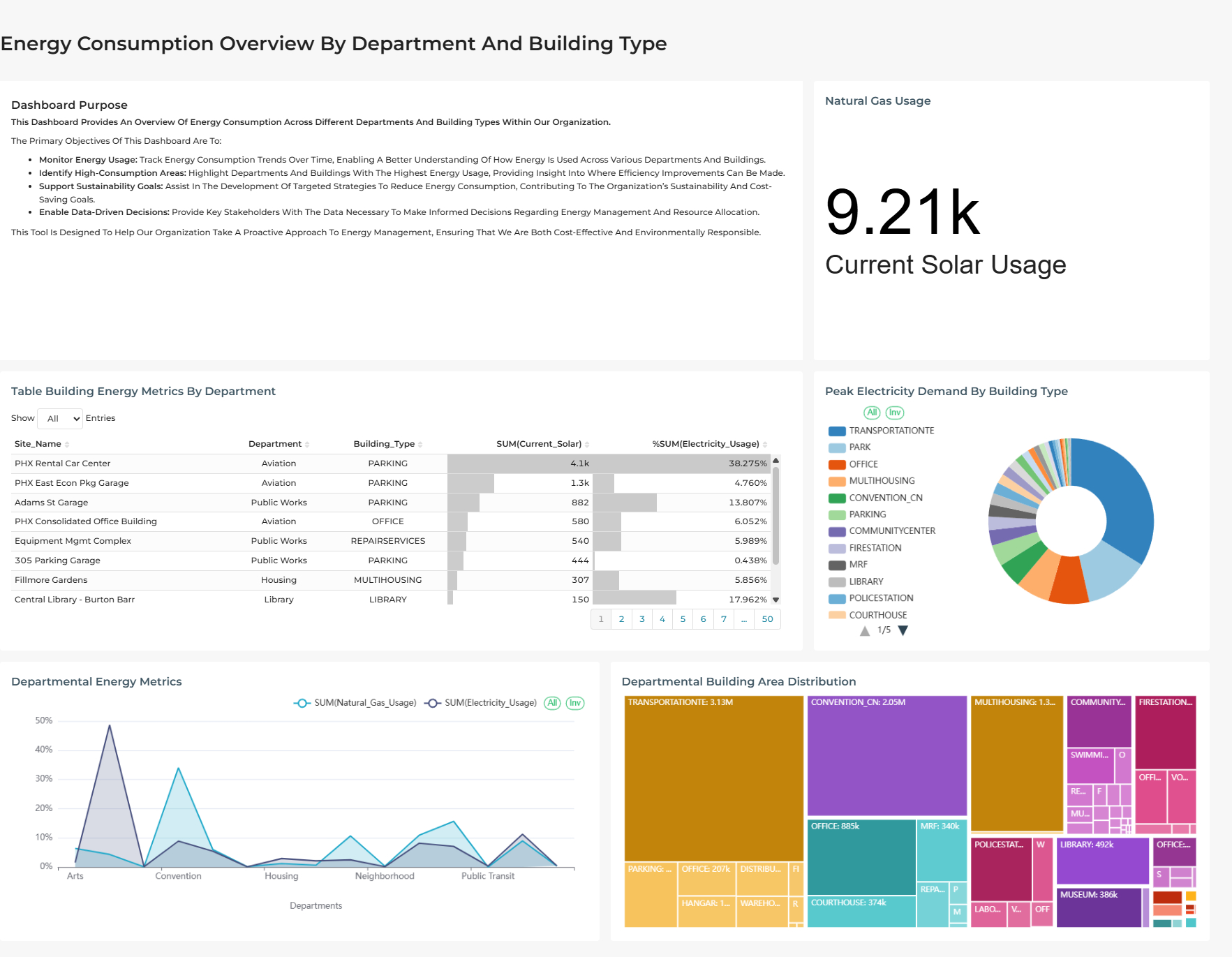
Once you've finished building your dashboard, click "Save" at the top. Your dashboard will resemble something like this:
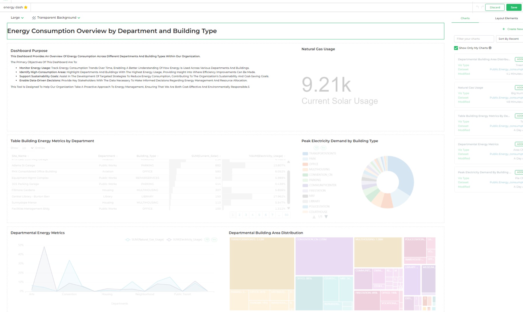
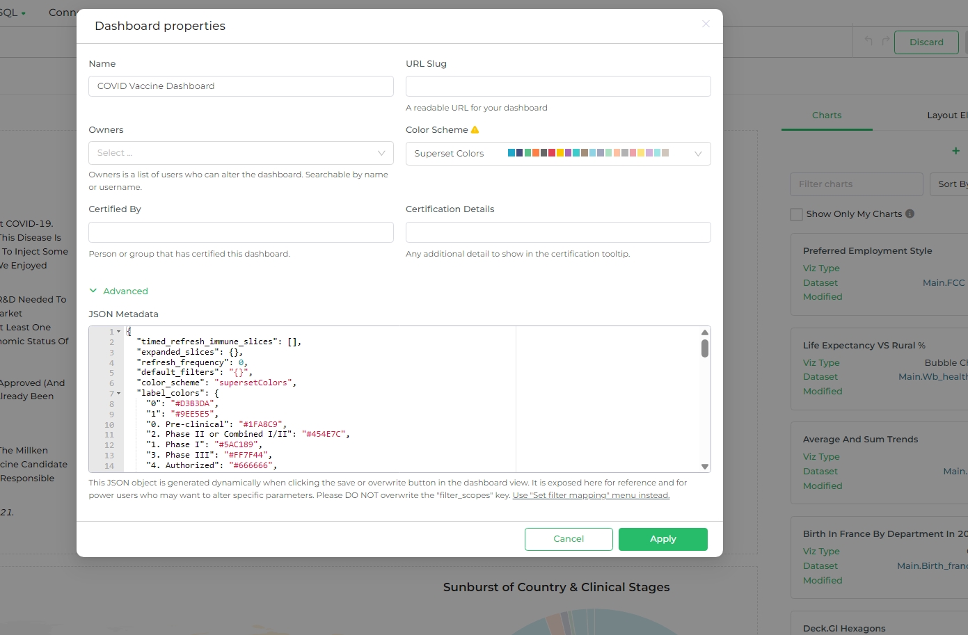
Great job on creating your dashboard! Before publishing, let's review some essential steps. Click on Edit and then ---, and select Edit Properties.
| Section | Details |
|---|---|
| Basic Information | |
| Name | Provide Name for your dashboard. |
| URL Slug | A readable URL for your dashboard |
| Access | |
| Owners | Owners are users who can modify the dashboard. Searchable by name or username. |
| Colors | |
| Color Scheme | Select a scheme |
| Certification | |
| Certified By | Person or group that has certified this dashboard |
| Certification Details | Any additional details to display in the certification tooltip |
ADVANCED
JSON Metadata
This JSON object is generated dynamically when you click "Save" or "Overwrite" in the dashboard view. It's provided here for reference and for power users who may wish to modify specific parameters. Please DO NOT overwrite the "filter_scopes" key; use the "Set Filter Mapping" menu instead.
Hit Appy, now your Dashboard is ready to be published. Click Save and then Publish with provided release note and versioning.