Table Visualization for Dataset
This document provides a detailed guide on creating a Table Visualization on a dataset using DronaHQ Dashboard. Let's see a dashboard setup for visualizing the highest degree held by respondents from the FCC 2018 survey dataset. This guide will walk you through setting up a similar table visualization.
Ensure you have access to uploaded dataset. Navigate to the DronaHQ dashboard, select your dataset, and click + Add Chart and select Table1 to create a new table visualization.
Data
Setting Up the Query:
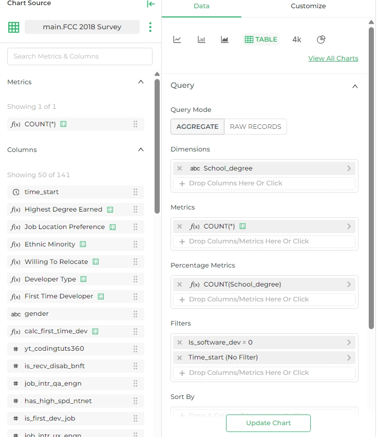
- Query Mode: Set the query mode to
AGGREGATE. - Dimensions: Drag and drop the column
School_degreeto the Dimensions section. This column contains the different degrees held by respondents. - Metrics: Drag and drop
COUNT(*)to the Metrics section. This will count the number of records for each degree. - Percentage Metrics: Add a percentage metric to show the proportion of each degree. Use the formula
COUNT(School_degree) / TOTAL COUNT(School_degree)to calculate the percentage.
- Query Mode: Set the query mode to
Applying Filters:
- Filter by Software Developers: To filter out records where the respondent is not a software developer, set the filter
is_software_dev = 0. - Time Filter: You can apply a time filter if needed. In this example, there is no specific time filter applied (
time_start (No Filter)).
- Filter by Software Developers: To filter out records where the respondent is not a software developer, set the filter
Sorting the Data:
- Sort the data by the count of degrees in descending order to display the degrees with the highest counts at the top.
Server Pagination:
- Enable server pagination if your dataset is large to enhance performance.
Customize
To customize the appearance and behavior of your table, follow these steps:
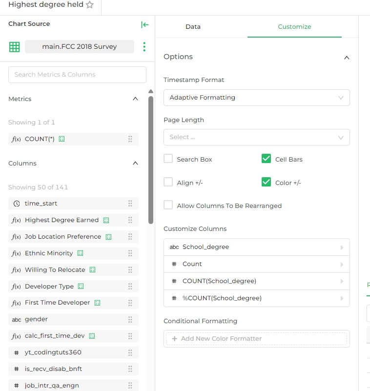
Timestamp Format:
- Choose the desired timestamp format. In this example we will select,
Adaptive Formatting.
- Choose the desired timestamp format. In this example we will select,
Page Length:
- Define the number of rows to display per page. If left empty, it will display all rows.
Options:
- Search Box: Enable the search box to allow users to search within the table.
- Cell Bars: Enable cell bars to visually represent the magnitude of the values.
- Align +/-: Enable to align positive and negative values appropriately.
- Color +/-: Enable to color positive and negative values differently.
- Allow Columns To Be Rearranged: Enable if you want users to rearrange columns.
Customize Columns:
- Modify the columns to be displayed and their order.
- For this example:
School_degreeCountCOUNT(School_degree)%COUNT(School_degree)
Conditional Formatting:
- Add new color formatter rules if you need to apply conditional formatting to the cells.
Chart Preview
The chart preview section allows you to see a visual representation of your data. In this example, we can see representation of the number of respondents holding each degree type. Each bar's length corresponds to the count of respondents for each degree.
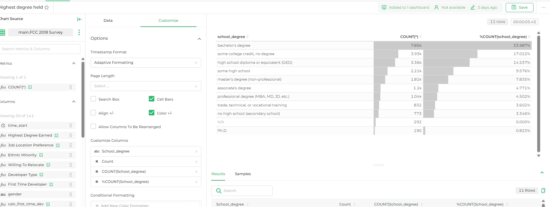
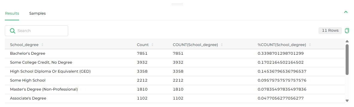
Results/Samples
The results/samples section displays the actual data in a tabular format. It shows the degree types in one column and the count of respondents for each degree in another column. The table also includes a percentage column to represent the proportion of each degree type.