Responsive UI
DronaHQ offers a robust and intuitive platform for building mobile responsive user interfaces (UI) that seamlessly adapt to different screen sizes and devices. A mobile responsive UI is crucial in today's digital landscape, where users access applications from various mobile devices such as smartphones and tablets. With DronaHQ, creating mobile-friendly and visually appealing interfaces is a seamless process that enhances user experience and engagement.
Responsive Layout Options
DronaHQ offers two types for Screen layouts options to built Apps - Basic Freeflow Editor and Advance Editor. Different responsive options are available based on Layout types -
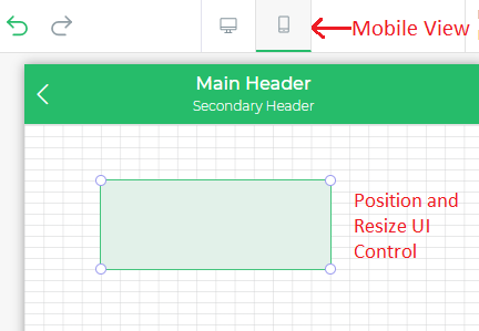
- Basic Freeflow Editor: Using this editor, you get an option to design Mobile UI differently from desktop UI. You can position any UI component anywhere you want by dragging UI Components and resize it accordingly. DronaHQ will auto-adjust the UI Components position and size based on Mobile device screen sizes. For eg - If you have aligned the UI component horizontally center with 20px top margin than same setting will get applied on any Mobile device screen size when open after publishing this app.
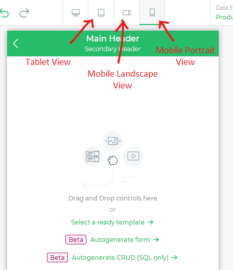
- Advanced Editor: Using this editor, you get an option to design pixel perfect Mobile UI with ability to configure UI Components width based on different device types - Tablet, Mobile Landscape and Mobile Portrait. Panel and Layouts - One Column, Two Column and others can be used effectively to organise UI based on different screen sizes.
Key Features and Benefits
Responsive Design: DronaHQ's drag-and-drop interface empowers developers to effortlessly design responsive layouts that automatically adjust to the screen size of the device. This ensures that the app's content and elements are displayed optimally, regardless of whether the user is on a small mobile screen or a larger tablet.
Flexible Grid System: DronaHQ offers a flexible grid system that allows developers to create dynamic and fluid layouts. Grid-based designs enable precise alignment of elements and content, guaranteeing a consistent and visually pleasing experience across devices.
Device Preview: To fine-tune the UI, DronaHQ provides a device preview feature, allowing developers to visualize the application on mobile devices screen size before deployment. This ensures that the app looks and functions flawlessly on mobile devices screen size.
Adaptive Widgets: DronaHQ's extensive library of adaptive widgets automatically adjusts their appearance and behavior based on the screen size. Whether it's buttons, tables, forms, or charts, these widgets offer a consistent user experience across devices.
Touch-Friendly Interactions: Mobile-responsive UIs in DronaHQ prioritize touch-friendly interactions, making it easy for users to navigate and interact with the app using gestures, taps, and swipes, ensuring a smooth and intuitive user experience.
Multi-Platform Support: DronaHQ enables developers to create mobile responsive UIs that work seamlessly across various platforms, including iOS, Android, and web browsers. This multi-platform support ensures a consistent experience for all users, regardless of the device they are using.
Performance Optimization: Mobile responsiveness in DronaHQ is complemented by performance optimization, ensuring that the UI loads quickly and functions efficiently, even on low-bandwidth connections and less powerful mobile devices.
Conclusion
Mobile responsiveness is a critical aspect of modern app development, as users increasingly rely on mobile devices for accessing applications on the go. DronaHQ's mobile responsive UI capabilities empower developers to create visually stunning and user-friendly interfaces that adapt effortlessly to different screen sizes and devices. By leveraging DronaHQ's extensive features and benefits, developers can deliver exceptional user experiences and drive engagement across various mobile platforms.