Controls
Controls are the fundamental building blocks of DronaHQ apps. They serve as prebuilt interface elements that allow you to display data and enable user interactions and manipulations. You can explore the DronaHQ Controls - Reference to discover a wide range of available controls and access reference documentation for each control. These controls empower you to create dynamic and interactive experiences within your DronaHQ apps.
How to use Control
The process of using controls in a DronaHQ environment involves five essential aspects that contribute to creating a functional and interactive user interface. These aspects are:
- Dragging and Dropping Controls on the Screen: In this step, the developer selects and places various controls from the available control list onto the screen. These controls can include buttons, input fields, dropdown lists, checkboxes, and other interactive elements.
- Configure properties: Once the controls are placed on the screen, the next step is to configure their properties. This involves customizing each control's appearance, behaviour, and functionality. Commonly configured properties include size, position, colors, fonts, labels, default values, and placeholders. Additionally, developers can set specific properties related to how the control interacts with the user, such as enabling or disabling certain features or validation mechanisms. All Controls have their own set of properties which defines how the user will interact with the control.
- Bind data: Binding data is a crucial aspect of control usage as it establishes a connection between the user interface elements and the underlying data sources or business logic. This step involves linking the controls to relevant control or Data Queries, enabling real-time data display, and synchronization.
- Control events: Most of the controls in the DronaHQ have their own set of events on which users can configure action flows which will be executed if that event is triggered by user action. such as the focus out event of input control, and button click event of button control. This allows users to build interactive applications.
- Add Rules and Validation: If necessary user can configure some rules and validations to ensure data integrity and enforce specific conditions or constraints, guiding the user through correct input and interactions.
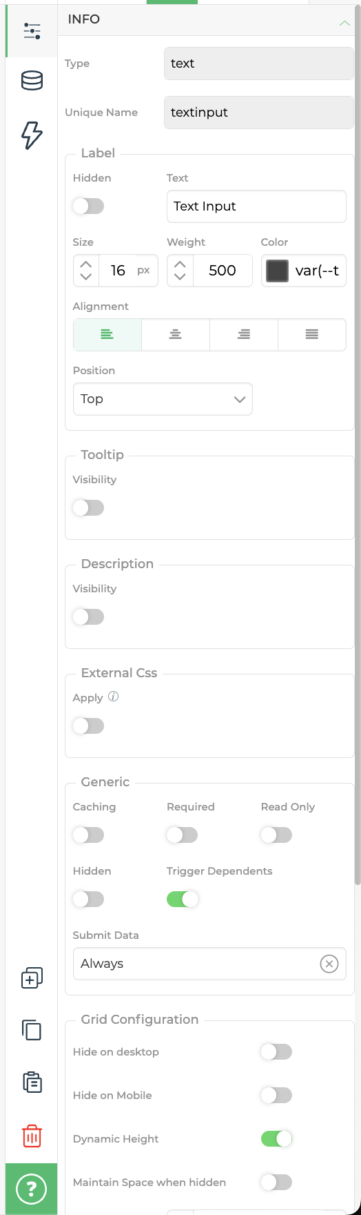
Control properties
| Attributes | Description |
|---|---|
| Type | The Type field is automatically generated based on the type of control utilized. |
| Unique Name | A Unique Name is assigned to each control in your DronaHQ App, allowing for unique identification. The system generates a Unique Name based on the Label assigned to the control. |
| Label | The label is the text displayed above the control, providing users with an understanding of the purpose of the Control. |
| Hide Label | This option enables the hiding of the control's label from view. |
| Tooltip | You can add a Tooltip text that provides users with hints or additional information for input. The Tooltip icon becomes visible when the "Show tooltip icon" toggle property is enabled. |
| Description | The description allows you to provide additional information or instructions for the control. The Description is visible when the "Show Description" toggle property is enabled. |
| External CSS | This property enables the application of custom CSS to the controls. You can customize the appearance of the control by selecting the appropriate class or ID. Further information can be found here. |
Generic
| Property | Description |
|---|---|
| Caching | When the caching option is selected and a LOOKUP formula is applied to this control, the state returned by the LOOKUP is cached. This allows offline accessibility. |
| Hidden | The hidden option allows you to hide the field from the user. This can be useful for performing computations that should not be visible or displaying fields based on conditions. |
| Trigger Dependents | Disabling Trigger Dependents optimizes the evaluation of dependent control formulas, resulting in quicker response times. Refer to this article for more details. |
Grid Configuration
| Property | Description |
|---|---|
| Hide on desktop | This option hides the selected control in the desktop view. |
| Hide on Mobile | This option hides the selected control in the mobile view. |
| Dynamic Height | This option dynamically adjusts the height of the text control based on the content provided. |
| Maintain space when hidden | This option preserves the specified space between controls when a particular control is hidden. When a control is hidden, the space it occupied is maintained for the subsequent control. |
The properties of Dynamic height, Hide on Mobile, Hide on Desktop, and Maintain space when hidden are applicable in the Freeflow Editor only.
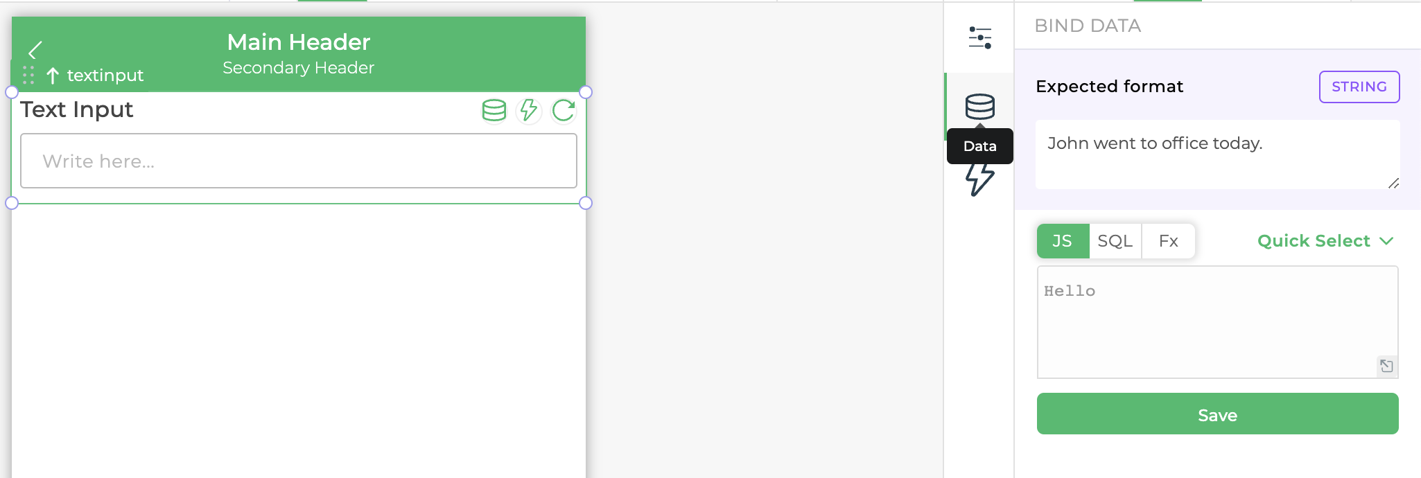
Bind data to Control
Each Control has its own data binding section where you can define the source of data for that control, it either can be a static js formula or referring data from other controls or data queries, there are various ways of binding data to a control as explain in Binding Data Articles .
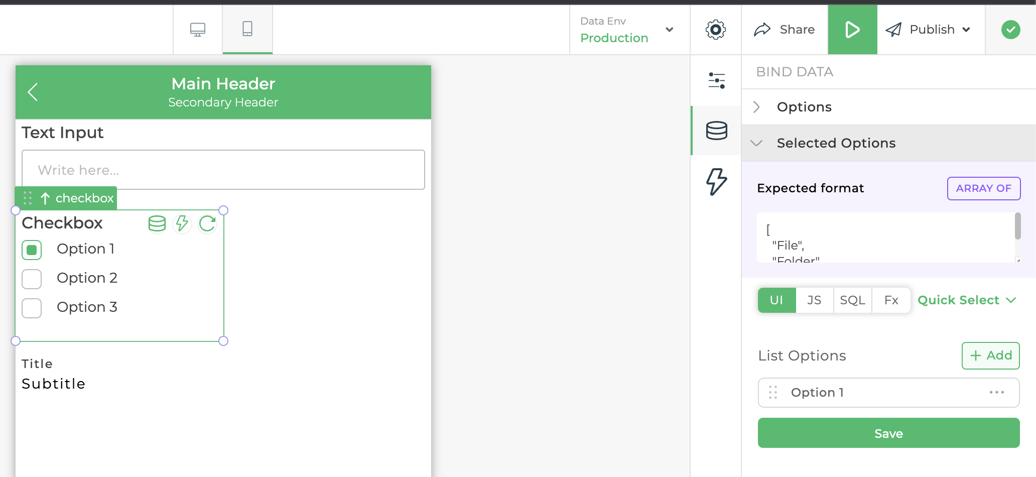
The data binding section of the control can be different based on what type of control it is if it's a list type control example checkbox and radio and dropdown. they will have two sub-sections: options and select options each having a similar data binding option as visible in the above image.
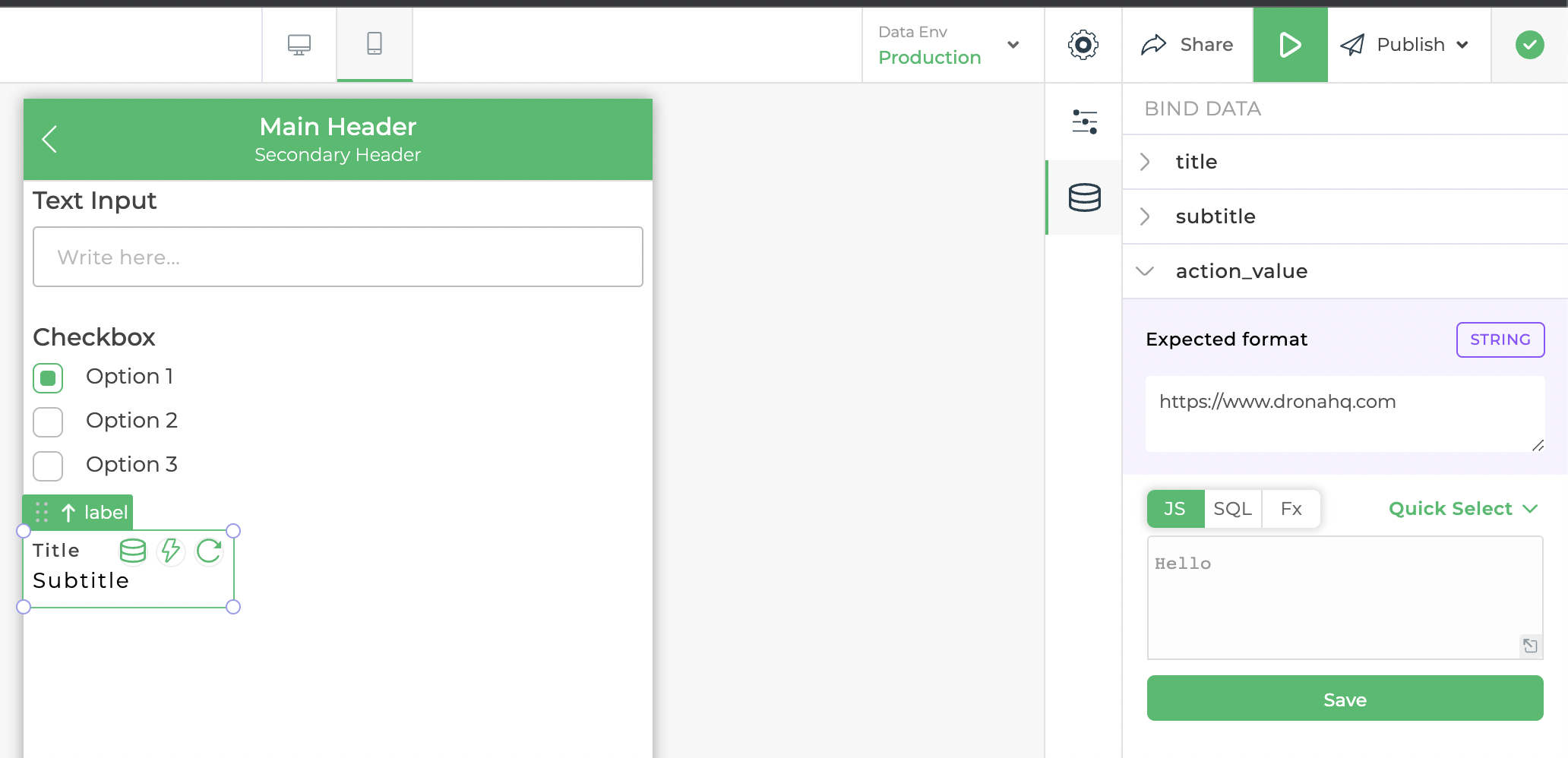
If the control is of composite type then it can have multiple subsections based on what composite control you are binding for example if you are binding a label control you will have title, subtitle and action_value as a subsection in data biding each with similar data biding options visible in the above image
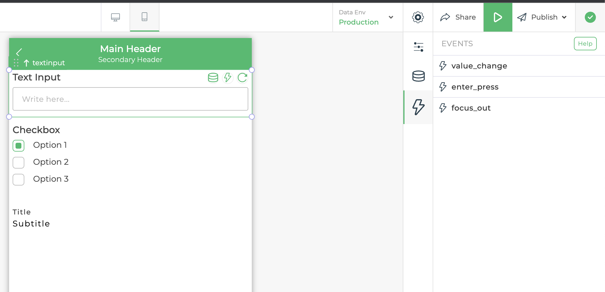
Control Events
Every Control has its own set of events which users can use to set up a workflow also known as action flow to set up their business logic as explained in the Action Flow Articles . Let's take an example of text input control, it has three events: value_change, enter_press, and focus_out as visible in the image below. value-change event is triggered when control data is changed, the enter_press event is triggered when the user press enter while typing inside text input, and the focus_out event is triggered when the user focuses out of control. similar to this different control can have more events or fewer events or in some cases it can have no events.
Control Options
- Duplicate control : This icon duplicates the current control, creating an exact copy of it on the builder. This is useful when you want to replicate a control within the same screen.
- Copy control : This copies the control's configuration or settings, allowing you to reuse them elsewhere.
- Paste control : This pastes a previously copied control or its settings onto the builder.
- Delete control : This icon deletes the current control from the builder.