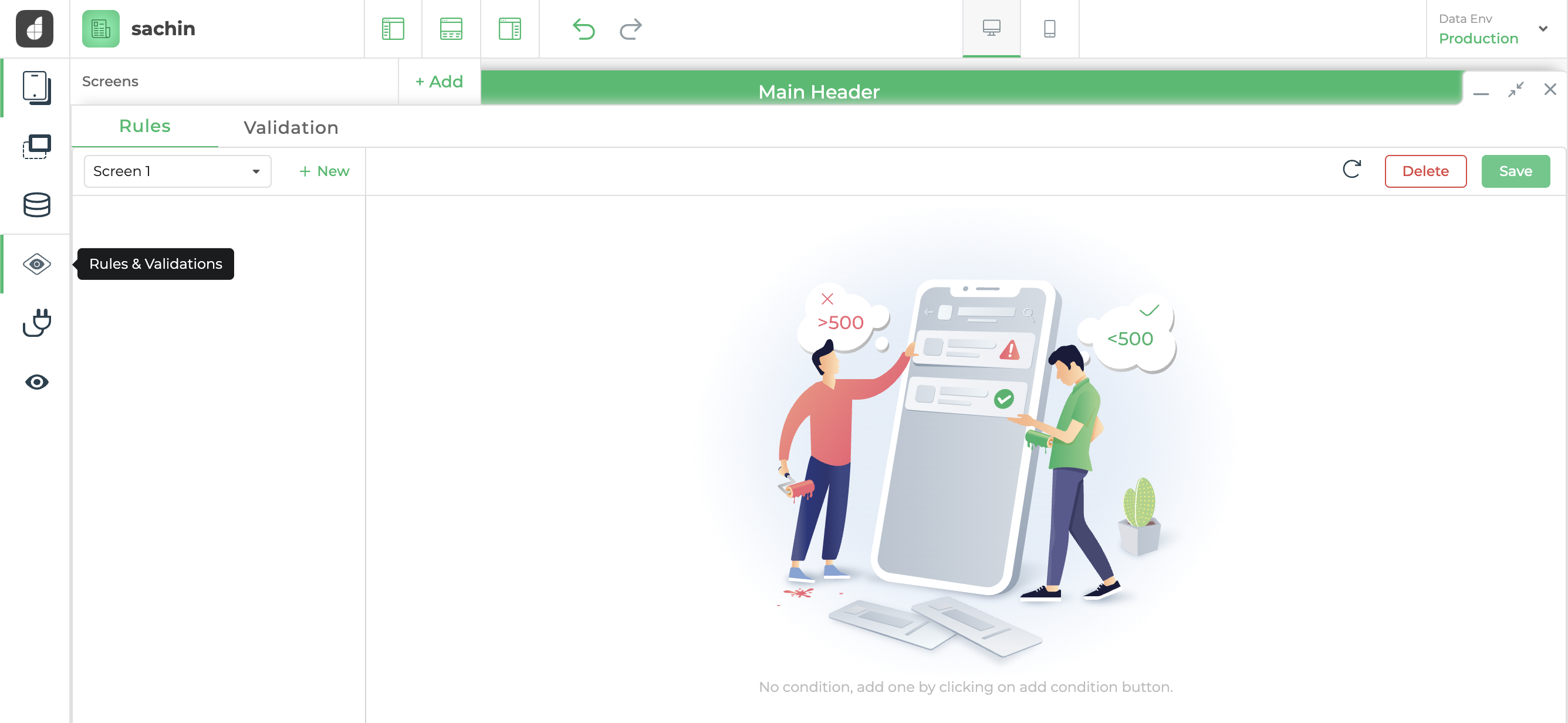
Rules and Validations
Rules in DronaHQ is a powerful feature that empowers users to dynamically manipulate the state of controls within their applications. This capability is achieved by defining rules that respond to specific conditions based on values provided by other controls, keywords, or data queries. Using DronaHQ Rules, users can create intuitive and interactive user interfaces by setting up conditional logic. When certain conditions are met, the state of controls, such as enabling or disabling, showing or hiding, required or not required, set ui state or remove ui state.
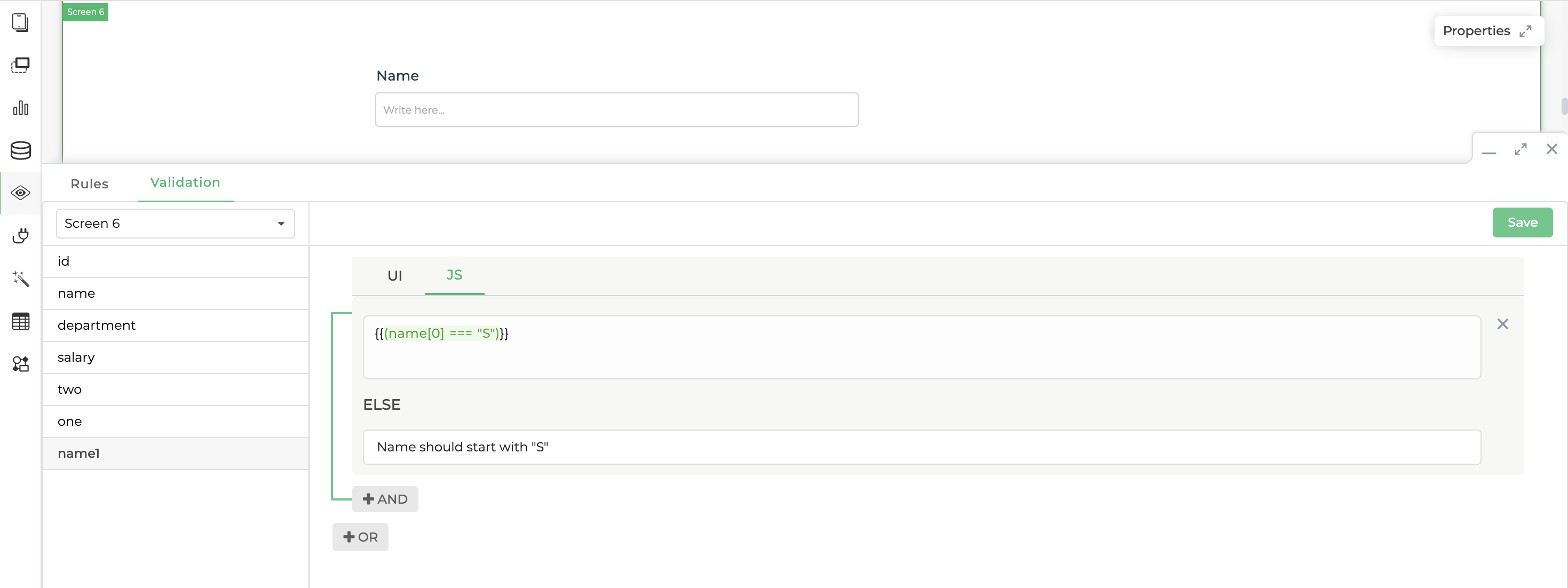
Validation in DronaHQ empowers developers to ensure the accuracy of data provided by users within input fields. This powerful feature enables the creation of custom validation rules and allows the display of personalized error messages when users submit incorrect or incomplete information.
Working with rules
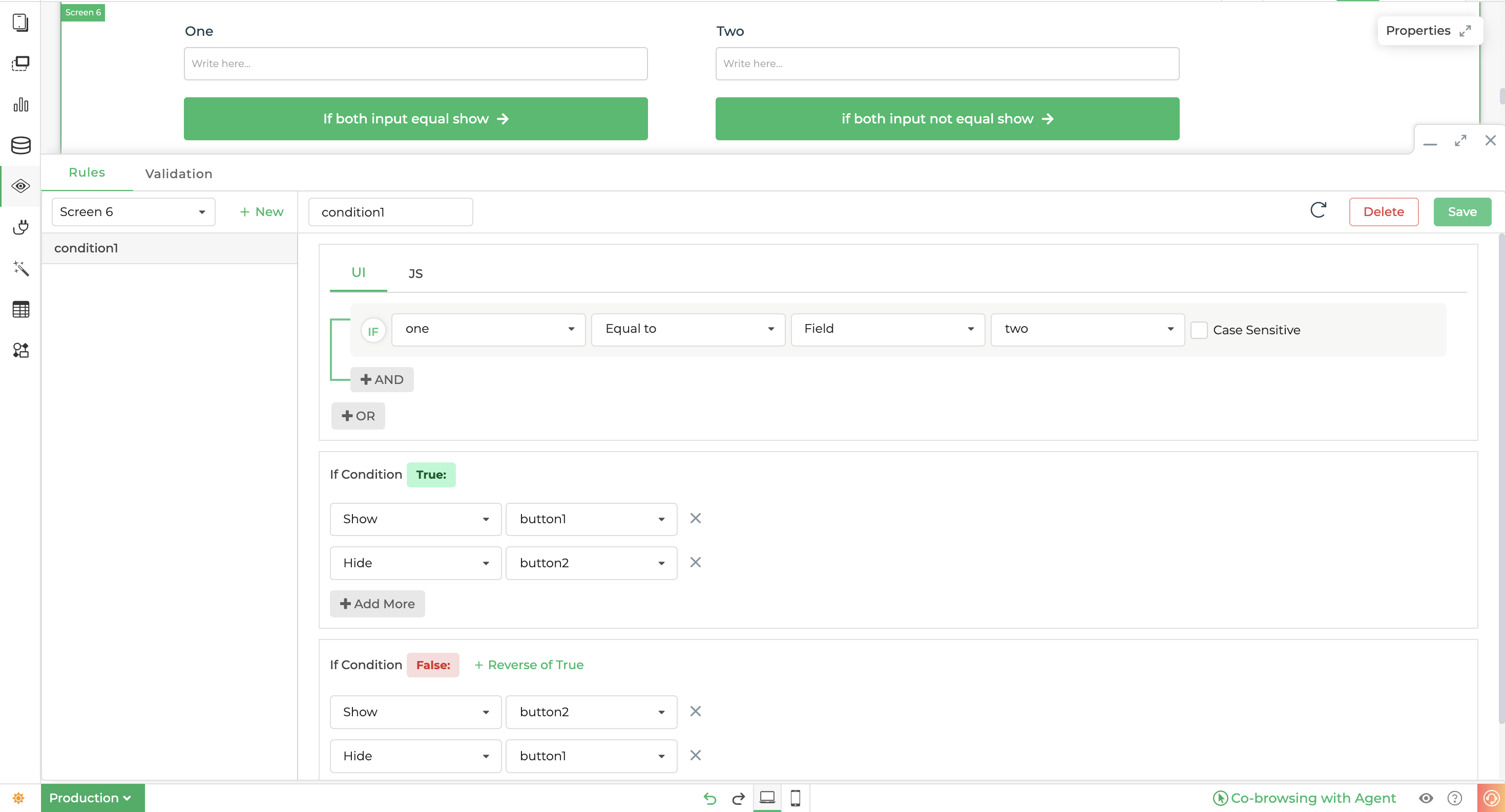
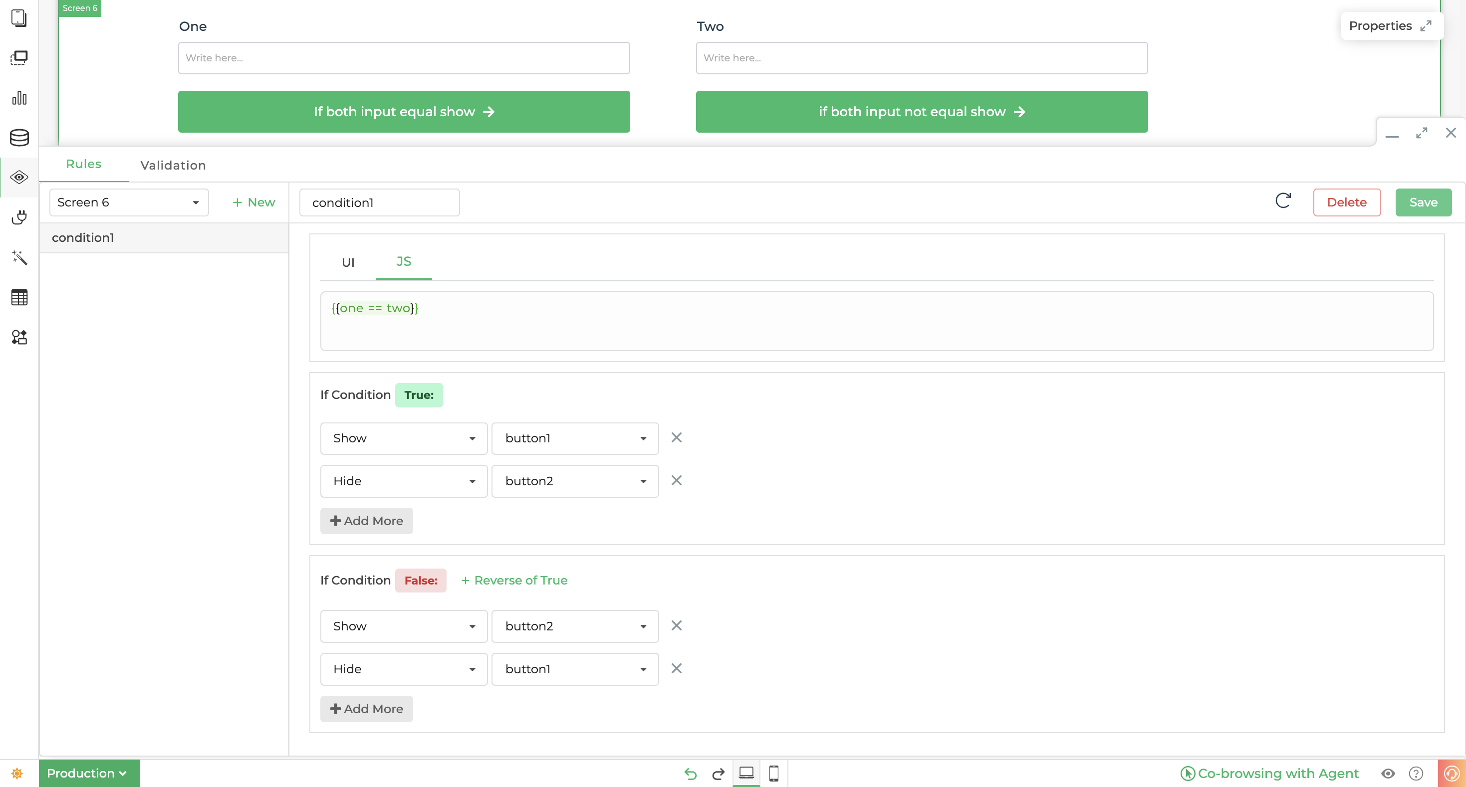
Adding rules in DronaHQ is a user-friendly and intuitive process that allows developers to define conditions and corresponding actions, enabling dynamic behaviour and interactivity within the application. Rules serve as a powerful mechanism to respond to user input and system events, making it possible to control the visibility, state, and properties of controls based on specific conditions.
Key Features of Adding Rules in DronaHQ:
Simple Configuration: Defining rules in DronaHQ is straightforward. Developers can specify conditions using UI or JS that evaluate to either true or false based on user input, system variables, or other data sources configured in condition UI and JS, as visible in the example images below.
Conditional Actions: Once the condition is set, developers can configure actions to be performed when the condition is met
trueor not metfalse. These actions dictate how the application behaves in response to user actions, creating a dynamic user experience.Types of Actions: DronaHQ supports various action types that can be triggered on conditions:
- Hide Control: Allows developers to hide specific controls (e.g., fields, buttons) on the user interface when certain conditions are satisfied, streamlining the user experience by presenting only relevant information.
- Show Control: The opposite of hiding controls, this action displays specific controls when the associated condition becomes true, enabling progressive disclosure of information.
- Set State and Remove State: Developers can define custom states for controls and dynamically change their state based on conditions. these states are configured in controls while they are built, these states are usually present in controls built by the designer. for example, an info control can have three states info, warning and error.
- Set Property and Remove Property: Refers to modifying the properties of controls, such as making a field "required" or "read-only" when certain conditions are met, which ensures data integrity and enforces business rules.
Real-Time Rule Evaluation: Rules are evaluated in real-time as users interact with the application. This ensures immediate responsiveness to user actions, creating a smooth and interactive user experience.
Cross-Control Interactions: Rules in DronaHQ are not limited to controlling individual controls. Developers can create complex interactions between multiple controls to implement intricate business logic and achieve dynamic behaviour across the application.
Error Handling: DronaHQ provides error handling and validation mechanisms to detect and resolve rule-related issues during the design phase, ensuring that the application functions as intended and minimizing potential errors.
To ensure predictable and intended behaviour, it is essential to consistently include the reverse actions for true conditions and vice versa. This practice helps prevent unintended consequences and improves overall reliability.
Rules in UI
Rules in JS
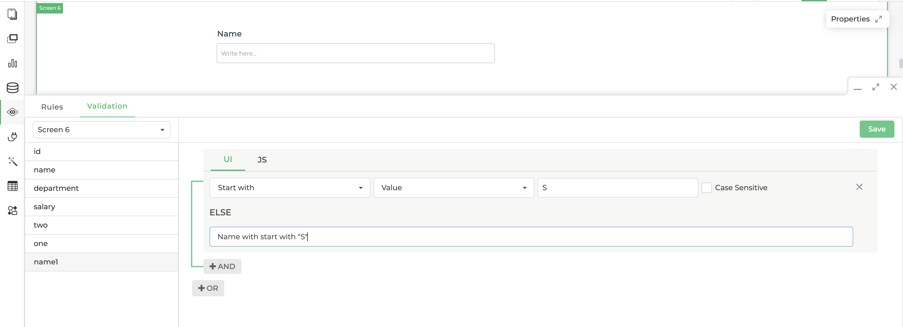
Working with validations
Validation is a crucial aspect of ensuring data accuracy and a smooth user experience of the end user. It helps prevent erroneous or incomplete data from being submitted, reducing the likelihood of errors and improving the overall quality of user interaction.
Configuring validation:
Select the Target Screen: Begin by selecting the appropriate screen where you want to apply validation from the dropdown available on the left side below the validation tab as visible in the example image above. This could be any screen you created in the DronaHQ, by default current screen is selected when you open the validation tab.
Choose Input Control: Once you've identified the target screen, proceed to select the specific input control from the list where you wish to add validation. Common input controls include text fields, dropdown lists, radio buttons, checkboxes, and more.
Define the Validation Condition: Set the validation condition that the user input must meet. This could be as simple as checking if a field is not empty, or it could involve more complex rules like validating email addresses, and phone numbers, or enforcing data formats. Choose the appropriate validation rule that aligns with the specific requirements of the input field.
Error Message: Provide a clear and concise error message to be displayed to the user if the validation condition is not satisfied. The error message should inform users of the validation criteria and guide them towards entering the correct data.
Validation in UI
Validation in JS
Custom validations and rules
There are times when extremely custom rules and validations are to be applied which might not be possible in the our of the box configurations provided in in the above sections. You can use events like value change value selected or even on a button click before your queries. You can give alerts, toasts, modify control values, hide/show controls etc from the actionflows.