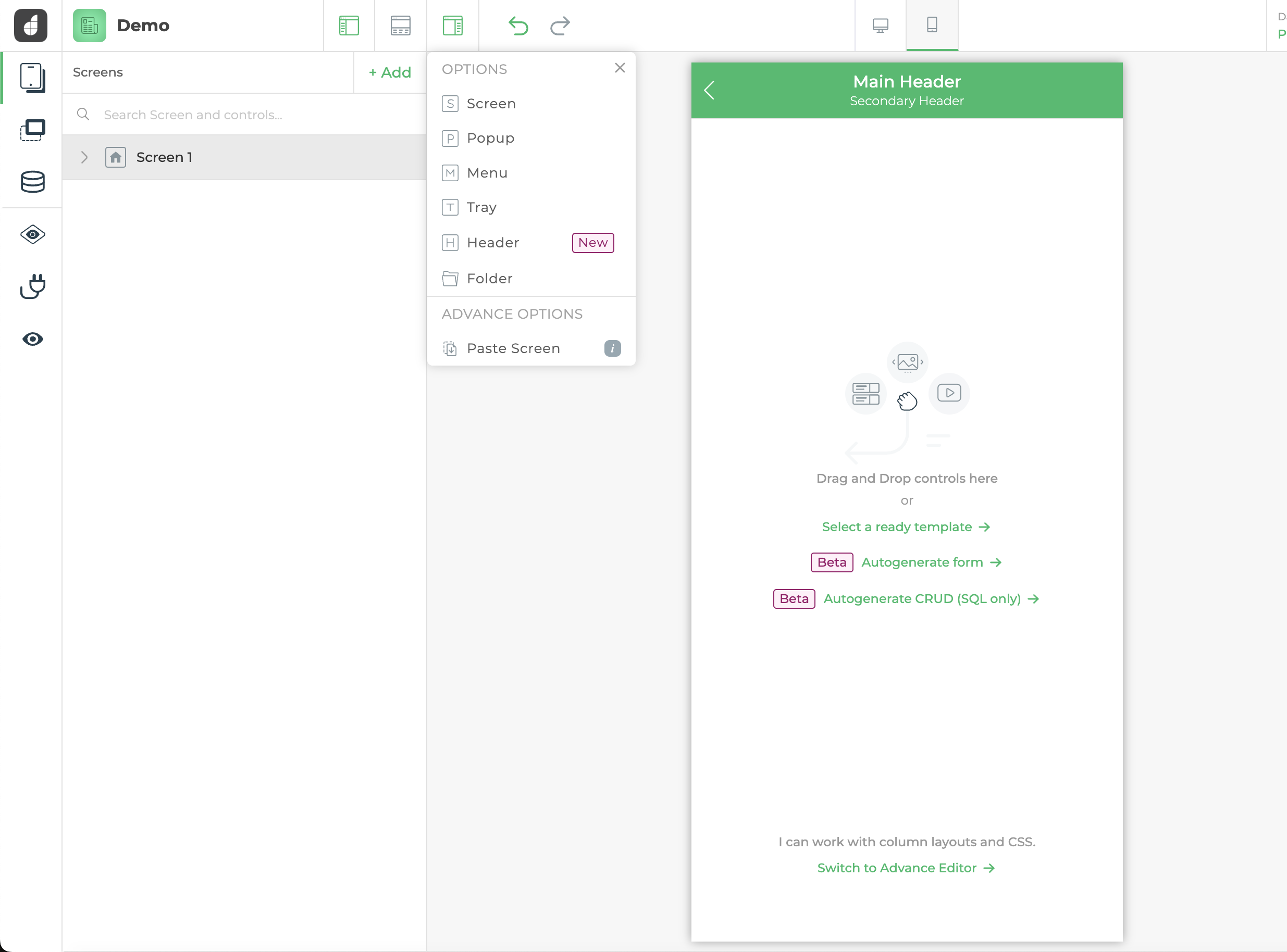
Multiscreen apps
DronaHQ offers an intuitive platform that empowers you to effortlessly create multiscreen applications. With its extensive range of screen options, including sidebars, trays, menus, popups, and Headers screen, you have the flexibility to design applications that are not only visually appealing but also highly dynamic and interactive. This article will explain to you in detail, about all the screens and their properties and how to use them.
Sections in screens
Each screen type is categorized into three sub-sections, excluding the header type screen. These three sections further specify and delineate the screen's functionality and purpose.
Depending upon the screen type these properties are preconfigured, for example in a popup screen, the header is hidden by default and for all types of screen, the footer is hidden by default. Each section of the screen has its own configuration properties.
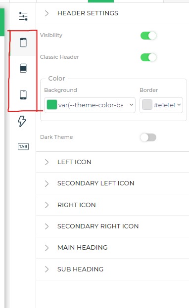
Header configuration
| Attributes | Description |
|---|---|
| Visibility | Toggles screen header visibility |
| Classic header | Toggles between, classic DronaHQ header and custom header created by user using controls. |
| Background color | Configures Background color for header. |
| Border color | Configures bottom bottom color of header |
| Dark theme | Makes the classic header icons white |
Classic Header Icon Configuration
| Attributes | Description |
|---|---|
| Icon enabled | Toggles classic header icon visibility |
| Icon color | Configures the icon color. |
| Choose icon | Configures icon for the header. |
| Hide for | Configures for which screen resolution icon should be hidden. |
| Action | Configures which action to perform on the action icon click. |
Classic Header Main and Sub-Heading Configuration
| Attributes | Description |
|---|---|
| Text | Configures the text to display in the heading. |
| Font size | Configures font size of the heading. |
| Font weight | Configures font-weight of heading. |
| Font color | Configures font color of heading. |
| Alignment | Configures alignment of heading. |
Body configuration
| Attributes | Description |
|---|---|
| Control spacing | Configures space between two different controls only applicable for advance editor screen. |
| Padding | configures screen body padding, only applicable for advanced editor screens. |
| Background color | Configures Background color for the body section of the screen. |
Footer configuration
| Attributes | Description |
|---|---|
| Visibility | Toggles Footer visibility of screen |
| Border visibility | Toggle border-top visibility of footer |
| Border color | Configures Border-top color for footer |
| Control spacing | Configures space between two different controls only applicable for advance editor screen. |
| Padding | Configures screen body padding, only applicable for advanced editor screens. |
| Background color | Configures Background color for the body section of the screen. |
Types of screen
DronaHQ offers multiple types of screen each with its own properties and use case, following are the list of all the different types of screens:
Screen / Page
Screen/Page is The Primary Screen type in DronaHQ. All Other screens are either overlaid over Screen/Page or either stick to it. Following are the configuration provided by the Screens/Page.
| Attribute | Description |
|---|---|
| Name | Configures display name of the screen |
| id | Displays the navigation Id of the screen, it is non-editable and autogenerated by the DronaHQ |
| Routing Url | Displays the Public link URL for the current screen of the app. only visible if routing is configured and the public link is enabled in the app |
| Screen type | Allows you to change screen type, only available in the Advance Editor mode |
| Sticky menu screen | Configures the Sticky header for the screen, you can choose any header type screen in the value to be displayed as a sticky header. |
| Sticky menu screen | Configures the Sticky menu for the screen, you can choose any menu type screen in the value to be displayed as a sticky Menu. |
Only Screen/Page can be made as the home screen any other screen as the home screen will result in an error in the application.
Popup
This Screen type allows user to configure their own popup screen with their custom layout and UI. following are the different configurations available in the popup type screen.
| Attribute | Description |
|---|---|
| Name | Configures display name of the screen |
| id | Displays the navigation Id of the screen, it is non-editable and autogenerated by the DronaHQ |
| Routing Url | Displays the Public link URL for the current screen of the app. only visible if routing is configured and the public link is enabled in the app |
| Screen type | Allows you to change screen type, only available in the Advance Editor mode |
| Click outside to close | Configures if the popup screen should close after the user clicks / taps outside the popup. |
| Max width | Configures the maximum width of the popup screen. |
The height for the popup screen is derived from the controls placed inside the popup screen, its maximum height is 80% of the screen
Under the Body Property, you will find the toggle for Enable Overflow, which allows content that exceeds the designated area to be displayed beyond the normal boundaries.
Menu
Menu Screen type allows users to configure menu screens for their application, only menu screen can be used as a sticky menu for screen/page type screens. Following are the configurations provided by the menu type screen.
| Attribute | Description |
|---|---|
| Name | Configures display name of the screen |
| id | Displays the navigation Id of the screen, it is non-editable and autogenerated by the DronaHQ |
| Screen type | Allows you to change screen type, only available in the Advance Editor mode |
| Open from | Configures weather menu will open from left or from right, even if made sticky menu direction will remain same. |
| Width on desktop | Configures the width of the menu sidebar if the app is displayed on the desktop. the default width is 90% for the other devices |
Tray
Try-type screens allow you to create sidebars in your application, tray-type screens are displayed as an overlay on all the other screens. Following are the configurations available in the tray-type screen.
| Attribute | Description |
|---|---|
| Name | Configures display name of the screen |
| id | Displays the navigation Id of the screen, it is non-editable and autogenerated by the DronaHQ |
| Routing Url | Displays the Public link URL for the current screen of the app. only visible if routing is configured and the public link is enabled in the app |
| Screen type | Allows you to change screen type, only available in the Advance Editor mode |
| Open from | Configures weather tray will open from left/right / top/bottom |
| Click outside to close | Configures if the tray should close after the user clicks / taps outside the tray. |
| Width | Configures width for the tray if opening from the left or right direction. |
| Max width | Configures max width for the tray if opening from the left or right direction. |
| Height | Configures height for the tray if opening from the top or bottom direction. |
| Max height | Configures max height for the tray if opening from the top or bottom direction. |
Under the Body Property, you will find the toggle for Enable Overflow, which allows content that exceeds the designated area to be displayed beyond the normal boundaries.
Header
Header type screen is used in a very special use case in which if you want to use a single header screen throughout the application then create a header screen and use it as a sticky header in all the screen/page type screens.
| Attribute | Description |
|---|---|
| Name | Configures display name of the screen |
| id | Displays the navigation Id of the screen, it is non-editable and autogenerated by the DronaHQ |
You can inherit header configuration to all the newly created screens if you configure a screen header as the default header in settings -> style -> default screen header.
Screen - Options
We have covered different screen options above, now let's see options available on each screen.
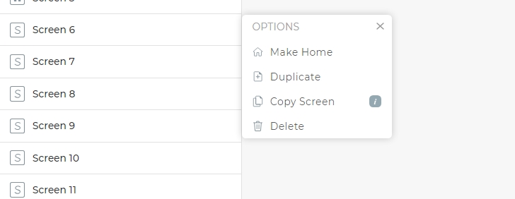
Make Home
(Only available for type: Screen)
Select this option to make the current screen as home screen, this will ensure that whenever the application is loaded, it will open the selected screen first as the home screen.
Duplicate
Select this option to create a replica of the current screen (tray, menu, popup and all others). This will ensure to duplicate the UI as well as integrated data and action flow.
Copy Screen
Well this is quite similar to duplicating a screen, provided that only the UI elements will get copied, and to paste it, we have to click on +ADD and select Paste Screen from the advance options.
Delete Screen
Select this option to delete the respective screen.