Building Interactive tables
Tables are a common way to view and interact with your data. You can sort, filter, paginate, and download rows of information. Tables also support row selection and insertion, server-side pagination, and custom columns.
Load data in a table
When you drag a Table component to the Builder screen, it automatically displays data from one of your queries. If you don't have any queries, DronaHQ initially populates the table with test data in JSON format. You can change the data displayed in a table by editing the Data property. Select control -> Data section From Quick Select you can select a query, use JavaScript (e.g., data_1), or input an array.
Working with columns
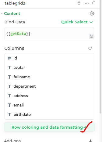
sorting columns :- using the first 3 dots you can sort the columns as per your requirements.
Type Icon :- this shows a icon according to data type for different columns, it is also a short-cut button to open format data section.
Rename columns :- using this section we can directly rename the headers of the table grid control.
Hide/show columns :- by clicking on the
eye iconwe can hide those columns to be visible on table grid, but this columns will be available as data for any other references.
Change column types
using format data in data section you can change column type of the data that is binded. by using different data types you can also set different look and feel for your data.
Editable table columns
To edit table data directly inside table grid control.
Config in property section
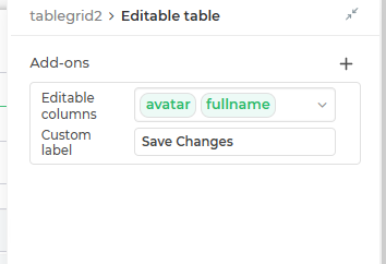
After binding data to table grid control, you can make columns editable and edit data on run time directly inside that cell.
To do this in Property section we have a dropdown Choose columns that will be editable you need to choose columns that you want to make editable.
Config in Events section
After choosing columns that will be editable we have to configure the save_changes event of table grid control.
once you edit any cell you will be able to see 2 Buttons Cancel and Save changes.
Cancel:- on click of cancel button all the changes will be reverted back and buttons will be invisible.Save Changes:- on click of save changes the flow that is configured insave_changesevent will be called, so logic to save data to your data source will go here. you can also change the text for this button from Custom label property from property section.
To use this feature you need to do a single click on the cell that you wish to edit.
To view the new data you need to call the Run Data Queries action and refresh the variable that is providing data to table grid.
so this will reload the table and again hide the cancel and Save changes again.
Access only edited data
Once data in any of the cell is edited it will be available in the controls EDITEDROWS properties as eg :- {{tablegrid.PROPERTIES.EDITEDROWS}}.
This will always return an array of objects.
Add new data to tables
To add new data directly to table grid control.
Config in property section
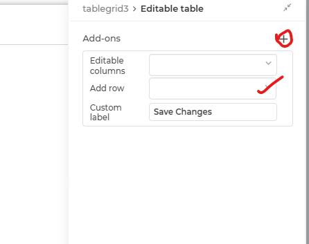
Inside property section you have to toggle on Add new Row property, this will add a + Add Row button to the bottom of the table.
On click of this button it will add a blank row to table grid with columns that are editable in new row.
To specify which columns will be editable in this new row we have to Choose columns in columns that will be editable in new rows dropdown in property section.
Config in Events section
The event of save_changes will be used for both Editing as well as adding New data to table grid.
After choosing columns that will be editable in new rows we have to configure the save_changes event of table grid control.
same as Editable Table columns.
Access only edited data
Once data in any of the cell is edited it will be available in the controls EDITEDROWS properties as eg :- {{tablegrid.PROPERTIES.NEWROWS}}.
This will always return an array of objects.
For smooth integration of both the features in single save_changes event you should use branches with respective conditions. AutoGenerate CRUD
Format data options effect on Editable Columns
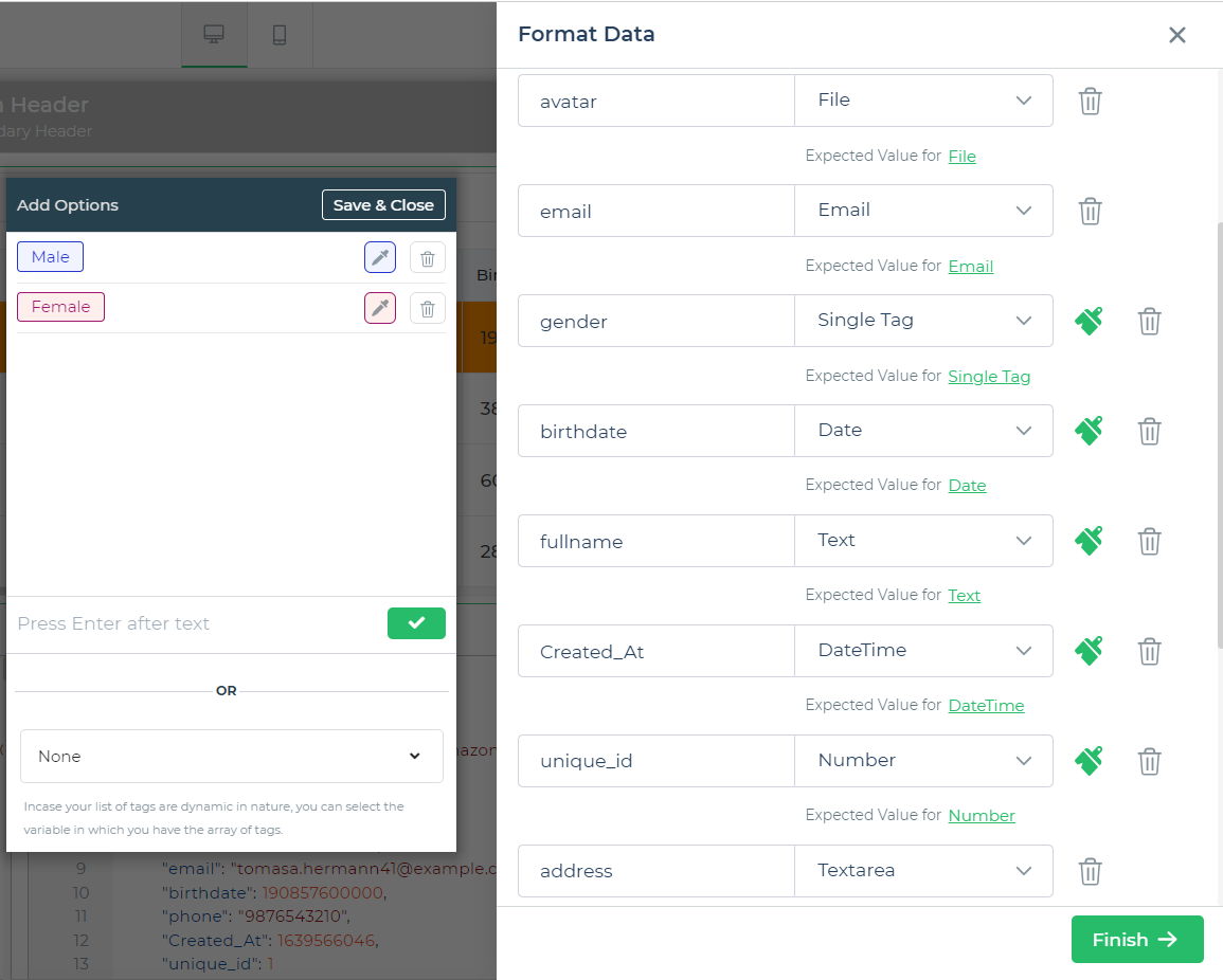
Several types of formats such as email, rating, file, decimal, Textarea, and more are available for different types of input providing their respective validations.
| column type | editor option while editing |
|---|---|
| Text | Text editor – used for editing normal text type, will return data as string. |
| Textarea | Textarea box for editing where data can be entered in multiple lines, will return data as string. |
| Single Tag | Dropdown - it is used for providing dropdown like editing options as tags in single select mode with a clear option to make it empty, will return data as string. |
| Multi Tag | Dropdown - it is used for providing dropdown like editing options as tags in multi select mode with a clear option to make it empty, will return data as array of strings. |
| Toggle | Checkbox – it will show a checkbox like ui when editing is done, will return data as boolean. |
| JSON | JSON editor - it will show a JSON Editor with capabilities to detect and show errors, it will have a expand button as well to show a bigger JSON editor for Large Data. |
| Date | Date Picker - it will show a date picker with a text input where user can input date and it will be validated as per the format set for display. will return data as Timestamp. |
| Time | Time Picker - it will show a time picker with a text input where user can input date and it will be validated as per the format set for display. will return data as Timestamp. |
| DateTime | Date and Time Picker - it will show a combination of both date and time picker, will return data as Timestamp. |
Text editor – used for editing normal text type, Email will be validated as per Email standards, will return data as string. | |
| Number | Number Input - a number input with small arrows to move numbers up and down , will return data as Number with all the validations. |
Toolbar
Top section of table grid can have multiple different utilities with there respective functionality.
- Search Bar :- Search bar can be used to
search for filter recordsfrom theloaded dataas well as fromserver side. To enable server side search there is a toggle in property section to enable Server Side Search. - Actions :- this actions are
Add,Update,Deletethis will be visible in the top bar of table grid along with search bar (if enabled) and on click of this actions what flow will be executed has to be defined in their respective actionsadd_click,update_click,delete_click. - Download :- Download action will help user to download the data is loaded in table in
.csvformat, you can also specify name for the file that will be downloaded using Downloaded File Name property. - Refresh :- Refresh action will help user to reload the table data by clicking it, you also configure the refresh action flow to be performed using the
refresh_clickevent. - Row Size :- Row Size property allows you to switch between the row sizes while displaying the data, for this feature there are 3 different values
Small (S),Medium (M),Large (L). You can also set default size using Default Row Size property.
Sort, Filter and customize data presentation
To enable sorting in table grid you have to toggle on Sorting property this will enable the end user to define the sorting conditions and this will persistent for user so every time user lands on this screen this sorting will also be applied by default.
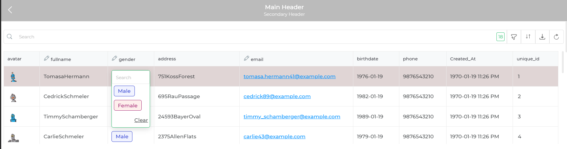
To enable filters in table grid you have to toggle on Filters property this will enable user to provide filter conditions according to data types defined for different columns, it will show different ui for different data types. Also if the data type of a column is set to Single tag then you can enable Quick Filter property and select the column that is set to single tag you wish to use for quick filter in Quick Filter dropdown and it will show values as tags below the search bar.
this Filters by default persist when you use pagination so you wish to avoid this behavior you can toggle off Persist Filter property.
Customize UI for Table
Table Headers:you can setBackground,Font size,Font weight,Font colorandText alignment.Table Data:you can setFont size,Font weightandText alignment.Hide Vertical Lines:Enable the option to hide vertical lines between table cells for a cleaner appearance.Row Background colors:you can set different colors for odd and even rows of display them separately.Theme:you can set a color inThemeproperty and it will be applied to many places where color is applicable.Column Width:By default, you can specifyColumn min widthandColumn max widthin pixels. However, ifEnable custom column widthtoggled on, you can provide numeric arrays of widths in sequence to customize column widths dynamically.Checkboxesyou can set checkboxes toSingle selectorMulti selectorNoas per your requirements.Detail viewyou can show some data in table and enable detail view to show more data, when user clicks on it a sidebar will be shown with all the data. You can also customize this as well usingShow Key Value Mapproperty and by toggling oncustomizeyou can choose which columns will be shown on detail view as well.
Group Data
To use this feature you need to toggle on Group Data property, with the help of this property you can group data according to value of one of the columns in the data. To set which columns will be used for grouping needs to be set to Group By property and you can set Accordion Style property as All Open, All Close, First Open as per your requirements.
Column Reorder and Visibility
To use this feature you need to toggle on Column Reorder and Visibility property, with the help of this property end users can change the look and feel of the table for them, they can rearrange columns and also hide or show columns as per there requirements, this will also persist for them so every time they close and open the app that will get same look and feel for table.
Row selection
To use this feature it is not necessary to have checkbox on in the table grid, on row selection what action flow needs to be executed can be configured in row_select event. you can also decide background color for selected row by setting Selected Row Color property. You can also configure which row will be by default selected when table is loaded or after refresh by setting Default Selected Row property.
Fit to Screen
To use this feature you need to toggle on Fit Height To Screen property, this property enables you to set Height of the Table grid to fit the screen. During pagination, the table fits the screen and you can scroll within the table within the area. also when working with small screen and table grid is not the only control screen the height calculation should not be affected so you can provide a minimum height to Minimum Height property this will prevent table grid from unnecessary shrinking in height.
Aggregation footer
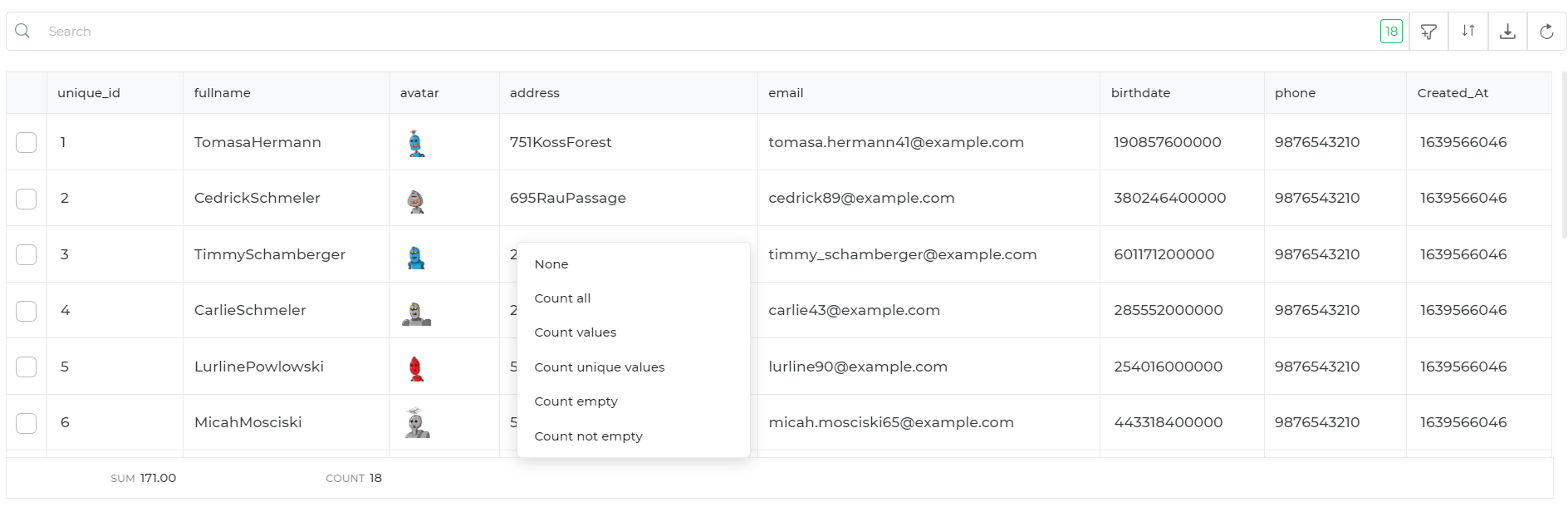
To use this feature you need to toggle on Show Aggregation Footer property, this property enables the end users to have some basic calculation operations like Count all, Count values, Count unique values, Count empty, Count not empty for basic text type columns and Sum, Average, Min, Max, Median, Range for number type columns.
Pagination
To use this feature, toggle on Allow in the pagination group. Your API must support pagination. DronaHQ supports two pagination types: limit offset-based and cursor-based. Additionally, you can customize the position of the pagination bar by setting the Pagination Bar Location property. For connectors that support cursor-based pagination, like Airtable, select Cursor Based Pagination as the type and use the OFFSET key from the respective connector.
To know about implementing pagination in Tablegrid control within DronaHQ, explore the various types: server-side, client-side, and cursor-based. Configure properties such as pagination bar location and default cursor values for optimal performance. Learn how to apply pagination for MySQL, GraphQL, and REST API data sources. For more details, you can read the Pagination in Tablegrid Control article.
Freeze columns
To use this feature you need to toggle on Freeze columns property, this feature enables you to freeze columns when you are scrolling horizontally the number of columns froze will not move from there position.
Sort and Filter Query
The Filter Query and Sort Query features enable dynamic filtering and sorting of data for both client-side and server-side operations. These functionalities generate outputs in SQL and JSON formats, which can be consumed directly for backend processing or local data manipulation.
Filter Query
The Filter Query feature provides users with the ability to define conditions for filtering data. The conditions can be applied server-side or client-side to retrieve only the relevant data rows.
How It Works:
User Interaction:
- Users select or input filter criteria through the table grid interface (e.g., "Name equals Vaibhav" and "Age greater than 25").
Generated Outputs:
- SQL Output: A filter query string that can be sent to a backend for data retrieval.
Example:SELECT * FROM table_name WHERE name = 'Vaibhav' AND age > 25; - JSON Output: A structured JSON object representing the filter conditions for client-side use.
Example:{
"name": "Vaibhav",
"age": { "$gt": 25 }
}
- SQL Output: A filter query string that can be sent to a backend for data retrieval.
Use Case:
- Dynamic data filtering in SQL-based databases or NoSQL environments like MongoDB (with JSON filters).
- Adaptable to both server-side and client-side search behavior.
Sort Query
The Sort Query feature allows users to sort table data based on one or more columns, either in ascending or descending order. This can be used for backend processing or client-side table arrangements.
How It Works:
User Interaction:
- Users select columns to sort by (e.g., "Sort by Status in Ascending Order" and "Sort by Age in Descending Order").
Generated Outputs:
SQL Output: A sort query string that defines the column order for a backend query.
Example:SELECT * FROM table_name ORDER BY status ASC, age DESC;JSON Output: A structured JSON object for sorting criteria.
Example:```json
{
"status": "asc",
"age": "desc"
}
```Filter Query and Sort Query in Action
#### **Filter Query Example**Imagine a user wants to filter rows where
nameequals "John" andageis greater than 25.
- SQL Output:
SELECT * FROM users WHERE name = 'John' AND age > 25; - JSON Output:
{
  "name": "John",
  "age": { "$gt": 25 }
}
Sort Query Example
The user wants to sort data by status in ascending order and by age in descending order.
- SQL Output:
ORDER BY status ASC, age DESC; - JSON Output:
{
  "status": "asc",
  "age": "desc"
}
Properties Summary
| Property | Type | Description |
|---|---|---|
tablegrid.properties.filterquery | String | Returns filter conditions as a SQL query string. Example: name = 'Vaibhav' AND age > 25. |
tablegrid.properties.filterjson | JSON Object | Outputs filter conditions in JSON format for use in client-side or NoSQL environments. Example: {"name": "Vaibhav", "age": {"$gt": 25}}. |
tablegrid.properties.sortquery | String | Returns sorting criteria as a SQL query string. Example: status ASC, age DESC. |
tablegrid.properties.sortjson | JSON Object | Outputs sorting criteria in JSON format for client-side or NoSQL-based sorting. Example: {"status": "asc", "age": "desc"}. |
Actions
In Table grid control you can configure different set of actions like row_select, add_click, update_click, refresh_click, etc. The First action here is on Row click, so what action will be performed on row click like Select Row will perform the action flow configured in row_select event,Show Details will open detail view, Navigate with Selection will navigate to screen that is configured.
In same fashion you can define custom actions for rows that can be made visible at different places like in search bar or as a new column or onHover based on properties that are configured and define action flow in their respective events. for eg:- Action1 action flow should be configured in action1_click.