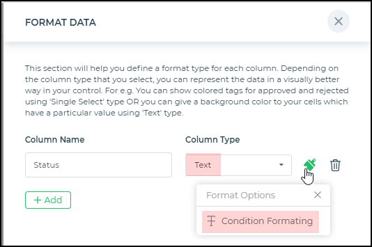
Format Data
For Connectors and when using the output of the Lookup formula, you would get different types of data from the respective sources. Typically, when presenting data in a Table grid control or any card control, you would prefer to make it visually appealing.
You have the option of applying conditional formatting or data type-specific formatting in DronaHQ using the Format Data feature or property available for the table grid control, the detail view control, and the different card controls like compact card, single-user card, long card, and so on. The formatting options would differ based on the type of data. At times you may also apply formatting based on a condition. Now let's see the different types of formatting available.
Conditional Formatting - Conditions
Typically conditional formatting involves providing the condition to check with the column data and then apply the selected formatting options.
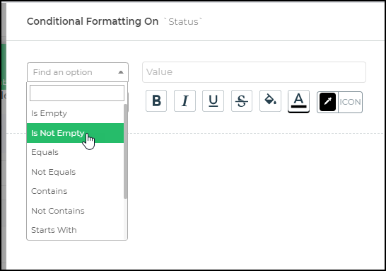
The conditions available are as follows:
| Condition | Data Type | Description |
|---|---|---|
| IsEmpty | Text, Date, Time, Datetime, Numeric, Decimal | If the cell is empty or does not contain data, then apply a certain format. |
| IsNotEmpty | Text, Date, Time, Datetime, Numeric, Decimal | If the cell is not empty or contains data. |
| Equal | Text, Date, Time, Datetime, Numeric, Decimal | If the cell value is exactly equal to a certain value. |
| Not Equals | Text, Date, Time, Datetime, Numeric, Decimal | If the cell value is not equal to a certain value. |
| Contains | Text | If the cell value contains a specified sequence of characters. |
| Not Contains | Text | If the cell value does not include a specified sequence of characters. |
| Starts with | Text | If the cell value begins with the specified sequence of characters. |
| Does not start with | Text | If the cell value does not begin with the specified sequence of characters. |
| Ends with | Text | If the cell value ends with the specified sequence of characters. |
| Does not end with | Text | If the cell value does not end with the specified sequence of characters. |
| Greater than | Text, Date, Time, Datetime, Numeric, Decimal | If the cell value is more than a specified value. |
| Less than | Text, Date, Time, Datetime, Numeric, Decimal | If the cell value is smaller than a specified value. |
| Greater than equal to | Text, Date, Time, Datetime, Numeric, Decimal | If the cell value is more than or equal to a specified value. |
| Less than equal to | Text, Date, Time, Datetime, Numeric, Decimal | If the cell value is smaller than or equal to a specified value. |
You can use these conditions in the specific column. If the condition is true, the formatting is applied to that cell/column data, which could include options like bold, italics, underline, strikethrough, cell background color, text color, and icon color.
Text
Text data types include conditional formatting based on filters/conditions applied to the respective data. The data of the column being formatted should be text or string type data.
Number and Decimal
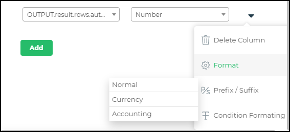
For Numeric and Decimal data, you can add either of the following format types: Format, Prefix/Suffix, Conditional formatting.
Format
Includes options to use the cell values as normal integers or use the Currency or Accounting format.
Prefix/Suffix
You can add a Prefix or a Suffix to your numeric values, such as a currency symbol or a percentage symbol.
Conditional formatting
If you need to check each value based on a condition, like if the value is more than or equal to a certain amount, you can make use of conditional formatting.
Single Tag and Multi-Tag
The Single Tag and Multi-Tag components are versatile UI elements that allow users to select one or multiple tags from a predefined list. These components support formatting options for defining how tags are populated, categorized, and displayed, making them adaptable to various use cases like filtering, categorization, or tagging.
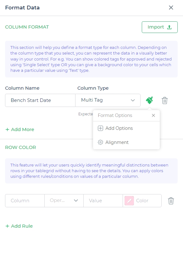
Format Options for Adding Tags
Both Single Tag and Multi-Tag components offer two primary ways to configure their options:
- Manual
In this mode, you define the tags explicitly. This is useful when the tags are static and predefined.
Example:High Priority(Red)Medium Priority(Yellow)Low Priority(Green)
- Dynamic
In this mode, the tags are populated dynamically using a query or data source. This is useful when the list of tags is large, constantly updated, or derived from a database.
Select the Data query in which you can dynamically send the tag values and other meta data. If you map a Data query with "Array of strings" as a format it will auto assign the colors of the tags. In case your Data query is of type JSON - "Array of objects", you can map the values and other meta data below.
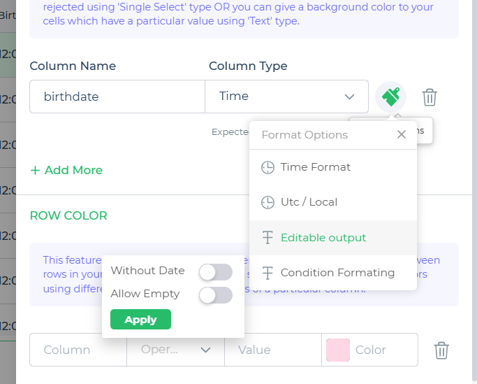
Date, Time, and Datetime
The Date, Time, and Datetime column types in the table grid offer robust formatting options to handle date and time data efficiently and consistently.
Format Options
- Date Format: Customize how the date is displayed in the column, allowing formats like
dd-mm-yyyyormm/dd/yyyy. - Time Format: Adjust how the time appears, such as
HH:MM(24-hour) orhh:mm AM/PM. - UTC / Local: Switch between Coordinated Universal Time (UTC) and Local Time for displaying time-based values accurately.
- Condition Formatting: Apply custom styles or conditions to the column's data for improved visual representation and analysis.
Toggles
- Without Date: Available for Time column types, this toggle ensures only the time is displayed, removing any associated date values.
- Allow Empty: Present across Date, Time, and Datetime column types, this toggle allows the field to remain empty, providing flexibility for optional inputs.
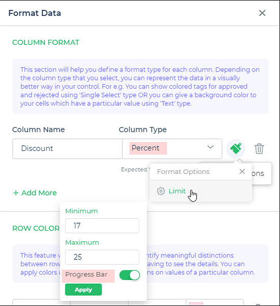
Percent
To format Percent type data, you can specify the limit between which the percentage amount would be formatted.
Limit
Specify the minimum and maximum limit values. You can enable a progress bar to display in the column if the value is within the specified range.
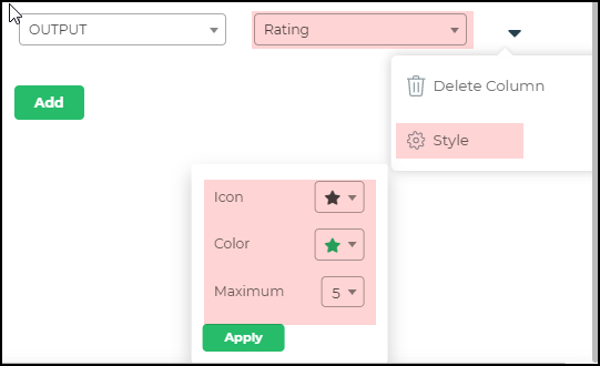
Rating
For Rating, you can add different styles to express the kind of rating you are indicating.
Style
You can set icons like a star, heart shape, and set the color for each of the types, and also provide the maximum number of icons to provide the rating degree.
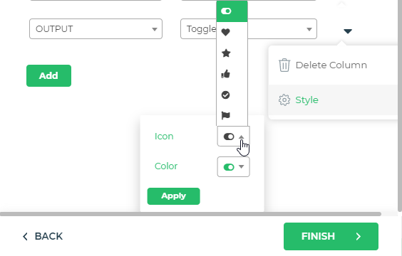
Toggle
When you have toggle switches to indicate data, like/dislike, star rating, toggle switch on or off, and so on, you can select styles such as a toggle switch, star, heart, like/dislike, checkmark, or flag.
Styles
You can provide different styles of toggle symbols and use different colors for them.