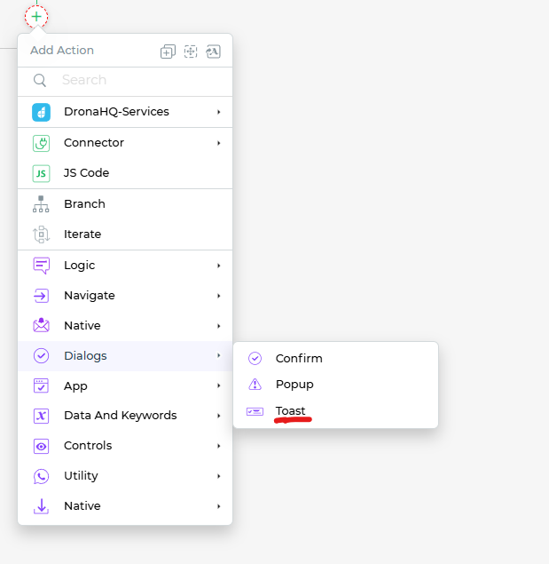
Toast
Setting up the Toast Action
The Toast action is a non-intrusive way to display notification messages to users within your application. Unlike other popups, a toast message does not block the user's interaction with the app and automatically disappears after a few seconds. It's an excellent choice for delivering brief, time-sensitive information.
Key features of the Toast action include:
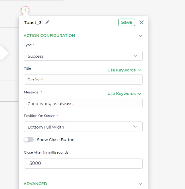
Type: Toast messages can have different types, such as
success,warning,error,orinfo.The type defines the color scheme of the toast, making it easy for users to identify the nature of the message.Title: This is a short title that appears on the toast. It provides a brief context for the message.
Message: The actual message you want to convey to the user. Toast messages are typically concise and to the point, as they are meant to deliver information quickly and unobtrusively.
Position on Screen: You can specify where the toast message should appear on the screen. Options include
top left,top right,top full width,bottom full width,top center,orbottom center.Show Close Button: This toggle option allows you to decide whether or not to include a close button on the toast. The close button enables users to dismiss the toast manually if needed.
Close After (in milliseconds): This setting determines the time, in milliseconds, that the toast message will remain visible before automatically disappearing. You can customize this duration based on your application's requirements.
Toasts are a valuable tool for delivering timely information without disrupting the user's workflow. Whether it's a success message, a warning, an error notification, or general information, toasts provide a subtle and user-friendly way to keep your users informed.