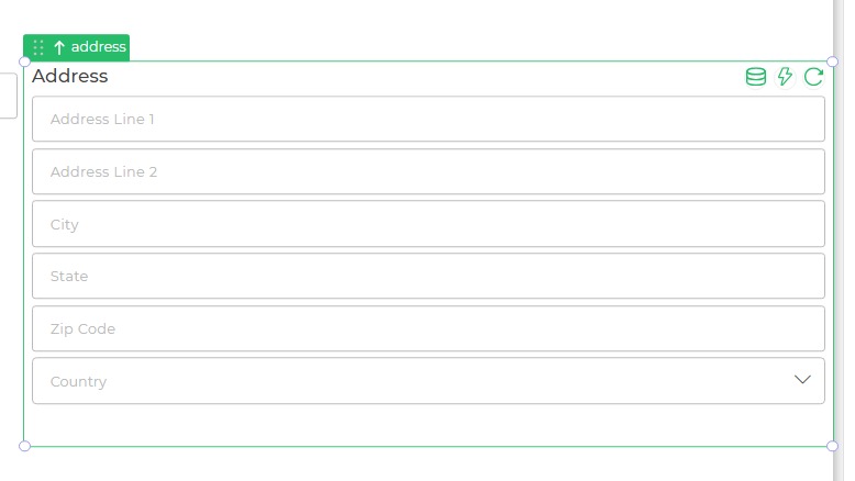
Address
The Address control is designed to accept addresses in a composite manner, allowing the user to input address details using multiple fields. It segments the address into 6 different components.
Content
The Address control consists of the following fields:
- Address Line 1
- Address Line 2
- City
- State
- Zip Code
- Country
Each field provides placeholders and options to guide user input, ensuring accurate address collection.
Binding Data Options
The Address control accepts data in string format for address-related fields. This enables users to input and store detailed address information.
Static Data Option
You can bind static data to the Address control using strings. For example:
{
  "address_Line_1": ["123 Main Street"],
  "address_Line_2": ["Apt 5B"],
  "city": ["New York"],
  "state": ["New York"],
  "zip": ["10001"],
  "country": ["United States"]
}
Add-ons
| Add-on | Description |
|---|---|
| Tooltip | Allows you to display additional information or helpful hints when users hover over table cells or column headers. |
| Description | Adds descriptive text beneath table headers or rows to provide better context for users. |
| Label | Enables the addition of labels for specific columns or rows, making the data easier to interpret. |
| Placeholder | Provides guidance for each field, such as "Enter Address Line 1." |
Interaction
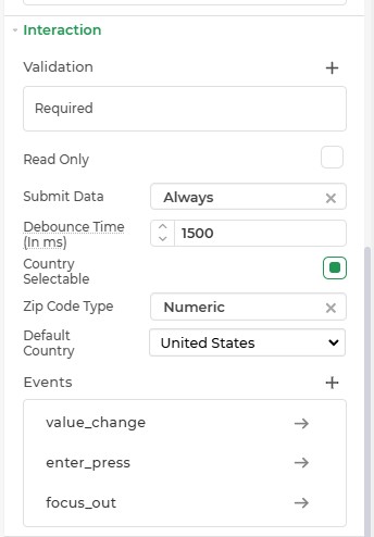
| Option | Details |
|---|---|
| Validation | Add validation rules to the control. |
| Read Only | Makes the control non-editable. |
| Submit Data | Determines when data is submitted (Options: Always, Never, Not When Hidden). |
| Debounce Time | Time in milliseconds to delay the data submission (Default: 1500 ms). |
| Country Selectable | Enables users to select a country from the list. |
| Zip Code Type | Specifies the type of zip code (Options: Numeric, Alphanumeric). |
| Default Country | Sets the default country (Default: United States). |
| Events | Triggers for specific actions: value_change, enter_press, and focus_out. |
Events
The Address control may trigger events when there is a modification in the value of the respective control.
| Trigger | Description |
|---|---|
| value_change | Occurs upon modification in the value of the respective control. |
| focus_out | Triggers when the control loses focus, typically when the user clicks outside the control. |
| enter_press | Activates upon pressing the Enter key while interacting with the Address control. |
The focus_out event for the address control only triggers when all input fields within the control are filled. If any field remains incomplete, the event will not fire, even if the user clicks outside the control. This behavior is intentional and ensures data completeness before triggering dependent actions.
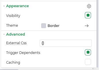
Appearance
- Visibility: Toggle visibility of the control.
- Theme: Customize the control's color using hex codes or predefined themes.
- Border: Modify the border's appearance.
Advanced Settings
- External CSS: Add custom styles to the Address control.
- Trigger Dependents: Automatically invoke linked controls or workflows.
- Caching: Enable caching to store frequently used inputs.
Control Outputs
The Address control generates outputs for each field:
| Output | Description |
|---|---|
| {{address_Line_1}} | Represents the first line of the address. |
| {{address_Line_2}} | Represents the second line of the address. |
| {{city}} | Represents the city name in the address. |
| {{state}} | Represents the state in the address. |
| {{zip}} | Represents the zip code or postal code. |
| {{country}} | Represents the country in the address. |