Progress Bar
The Progress Bar Control serves as a visual indicator, showcasing the percentage progress of various actions or activities within a microapp. It's particularly useful for tracking completion progress, such as filling out forms or monitoring course registrations online.

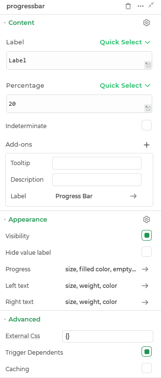
Content
label
Represents the label or text displayed on the left side of the progress bar.
Percentage
Indicates the percentage value for the progress.
Add-ons
| Add-on | Description |
|---|---|
| Tooltip | Provides helpful hints or extra information on hover. |
| Description | Adds descriptive text beneath options or sections. |
| Label | Displays labels for specific options or sections. Configurable with size, weight, and color. |
Appearance
- Visibility – Controls whether the element is shown or hidden in the interface.
- Hide value label - Toggle this yo hide and show label and values of the control.
- Progress : Specifies the size, filled and empty color of the progress bar.
- Left Text : Customizes the text on the left side of the progress bar.
- Right Text : Customizes the text on the right side of the progress bar.
Advanced Settings
- External CSS: Add custom styles to the Link control.
- Trigger Dependents: Automatically invoke linked controls or workflows.
- Caching: Enable caching to store frequently used inputs.