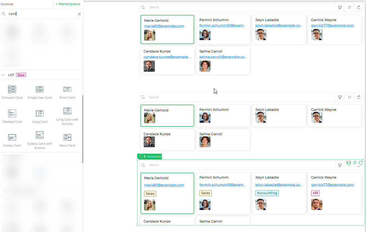
List - Cards
Various card types are designed to present tabulated data in layouts according to their specific purposes. For instance, the News Card is optimized for news feeds, displaying headlines in a reader-friendly format. On the other hand, the Single User Card provides lists such as contacts, employees, and task lists, offering a detailed view tailored to individual users. While each card may have unique attributes, they generally share common features, ensuring a consistent user experience.
Binding Data Options
The List- Card controls accepts an array of objects in JSON format to display data. You can bind data to the List- Card controls in various ways, allowing for flexible customization and presentation of menu items.
Static Data Option
To display static options in the List- Card controls, you can use the Bind Data option. The Bind Data option must be specified as an array of objects. For example:
[
    {
        "fullname": "Maria Gerhold",
        "email": "maria81@example.com",
        "avatar": "https://dronamobilepublic.s3.amazonaws.com/DRONA5_Team2050/content/app/images/public/Maria_T4j7j.jpg",
        "_isSelected": false
    },
    {
        "fullname": "Fermin Schumm",
        "email": "fermin.schumm51@example.com",
        "avatar": "https://dronamobilepublic.s3.amazonaws.com/DRONA5_Team2050/content/app/images/public/Fermin_6ZIef.jpg",
        "_isSelected": false
    },
    {
        "fullname": "Jalyn Labadie",
        "email": "jalyn.labadie@example.com",
        "avatar": "https://dronamobilepublic.s3.amazonaws.com/DRONA5_Team2050/content/app/images/public/Mask%20Group%204_SsFFA.jpg",
        "_isSelected": false
    }
]
Properties
| Property | Description |
|---|---|
| Theme | The option to select the border colour to be used for the selected card. After selection, you can view the border colour change of the first card. |
| Layout | There are two options: either card or list. If the card layout is selected, you would be able to view in a tabular format, and if the list is selected, you will be able to view the list format. |
Card Properties
| Property | Description |
|---|---|
| Max Width | Is the max-width to be set for the individual Cards. |
| Spacing | Is the spacing between the two cards. |
Cards in Row
| Screen Size | Number of Cards Per Row |
|---|---|
| On Desktop | Specifies the number of cards to be displayed in a row on Desktop screen. |
| On iPad/ Tablet | Specifies the number of cards to be displayed in a row on iPad/ tablet screen. |
Display
This includes the different components that would be displayed on the card. You can enable or disable displaying the Header, Cover Image, Title, and Detailed View. If you toggle switch ON the Detailed view, then a detailed view icon appears in the right-hand corner of the card. Simply click the icon against any of the records, the data for the selected row would be displayed in the detail view.
| Property | Description |
|---|---|
| Headers | The Headers are the field names from the source. You can set the Font size, Font weight, and the Font color. |
| Detailed view | Allows you to switch ON or OFF to show data in the Detailed view of your card data. |
| When enabled, the columns you have selected will be displayed. | |
| Show Key Value Map | Displays the selected row as a key-value map instead of the default grid in the Detailed view. |
| Customize | When ON, allows you to customize the columns shown in the Detailed view. By default, all columns are shown, but you can select a limited number for a quick data overview. |
| Select column | When Customize is enabled, you can select the columns to be displayed in the Detailed view. |
| Cover Image | If a file upload field in the sheet contains images uploaded as Image type, it is automatically taken as the Cover image for the card. |
| Column name | Select the image/file upload column to be used as the cover image. |
| Position | Specifies the position of the image in the card (left, right, top, or bottom). |
| Full size | Determines whether the image would be displayed in full size. |
| Object Fit | Specifies how the image would fit the container, as cover or contain. |
| Width | Sets the default width to be used for the Cover image. |
| Max Height | Specifies the maximum height for any image. Smaller images will appear as-is, while larger images will fit into the specified maximum size. |
| On Error | Specifies the action in case of an error with the image, either hide the image or show the default placeholder icon. |
| Border Radius | When the image is not full-size, you can specify the border-radius to create a curved border to the specified radius. |
Title
| Property | Description |
|---|---|
| Column Name | Select the column name that would be used as the title. |
| Font Size | Specifies the font size for the Title text. |
| Font Weight | Being the title, you can specify a separate font weight to make it appear with impact. |
| Font Color | Determines the color of the title text. |
Data
| Property | Description |
|---|---|
| Spacing between properties | Specifies the space you need to specify between two data columns. |
| Height | Specifies whether you can set the height manually or it would be set automatically as per the data. |
| Pagination | Allows you to enable pagination for your data. Additional properties will be added based on your pagination type (Limit |
Actions
The list controls offer a valuable set of actions, including search, download, refresh, filter, and quick filter functionalities. To activate these actions, you can easily toggle the respective buttons. When you enable the search bar, you have the option to customize the placeholder text. Similarly, turning on the download feature allows you to specify a default file name for the downloaded files.
Types of List - Cards
There are a few subtle differences in the appearance of each type of these cards. However the properties would remain the same. In case you compare the Gallery card and Gallery Card with Actions, they would virtually be the same.
Only addition in the Gallery Card with Actions is a few default actions are provided right at the time of adding it to your screen. But you can even add the actions to the Gallery Card, there is no restriction to adding the actions as required.
Card Types and Their Applications
| Card Type | Description | Preview |
|---|---|---|
| Compact Card | Ideal for showcasing basic details like employee email addresses, customer data, and more. | 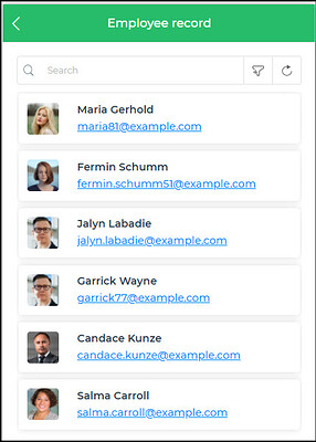 |
| Single User Card | Perfect for displaying contact lists and user-specific information. | 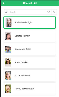 |
| Short Card | Commonly used for business cards and concise information display. | 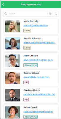 |
| Detailed Card | Well-suited for presenting data in a detailed view with comprehensive information. | 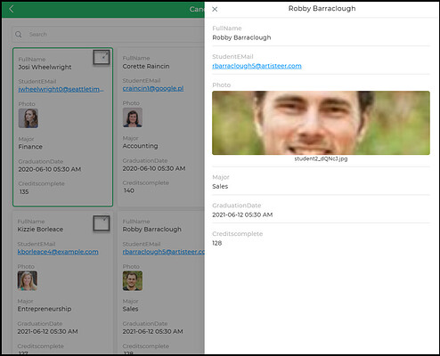 |
| Long Card | Effective when numerous details need to be displayed, such as candidate records. | 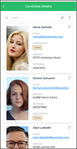 |
| Long Card with Actions | Similar to the Long Card but with added action buttons for increased functionality. | 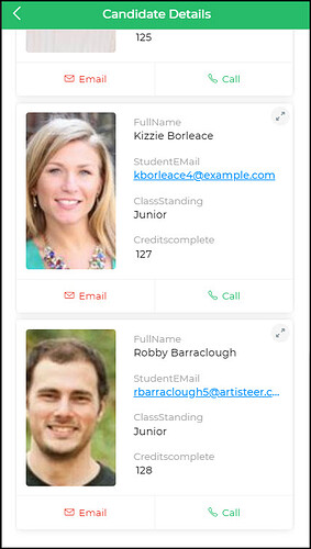 |
| Gallery Card | Provides a quick overview of candidate data or received job applications with a detailed view option. | 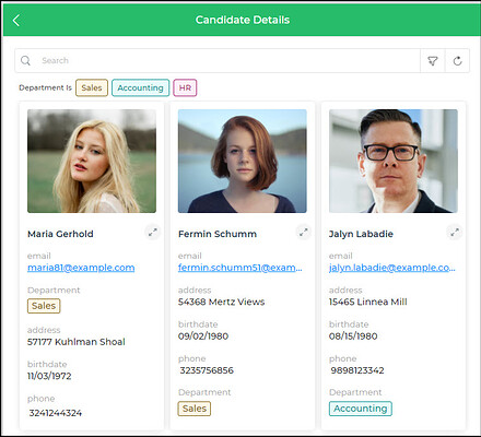 |
| Gallery Card with Actions | Similar to the Gallery Card, featuring additional action buttons for enhanced user interaction. | 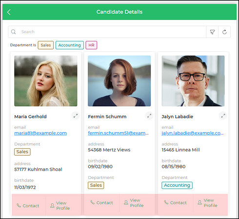 |
| News Card | Useful for integrating news feeds into your applications with a quick preview of the news content. | 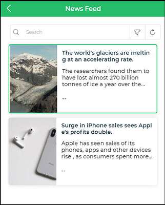 |
Embrace the versatility of these card types, catering to diverse information display needs in your applications. Choose the one that best suits your requirements and delivers an enhanced user experience. Whether you need a compact view or detailed insights, these cards empower you to showcase data effectively. Unlock their potential and take your app's interface to new heights!