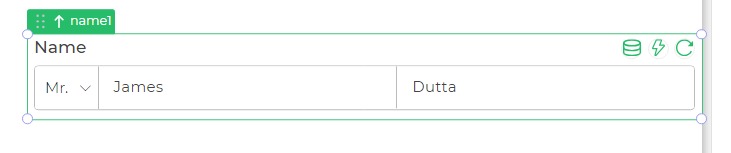
Name
The Name control is designed to accept names in a composite manner, enabling the user to input the complete name in a single field. It facilitates the entry of both first and last names simultaneously.
Binding Data Options
The Name control accepts data in the string format for both the first name and last name, allowing the user to input and store the complete name in a single field
Static Data Option
Utilizing the Bind Data option to display static options in the Name control involves specifying of strings.
Suppose you are designing an application where users want to input first and last name.:
first_name:
[
    "Shibam"
]

last_name:
[
    "Dhar"
]
Properties
| Property | Description |
|---|---|
| Theme | Allows selection of the text box's color, either using a hex code or choosing from available themes. |
| Placeholder | Provides a prompt for users, guiding what needs to be entered in the Name field. |
| Max Text Length | Limits the maximum character count for the Name Control. |
| Hide Last Name | Hides the last name component, allowing only the first name to be entered. |
Control Outputs
The output from the Name control, represented by the placeholder {{name}}, captures the complete name as entered by the user.
| Output | Description |
|---|---|
| name | Represents the complete name input. |
Events
| Trigger | Description |
|---|---|
| value_change | Occurs when there is a modification in the value of the respective control. |
| enter_press | Activates upon pressing the Enter key while interacting with the Name control. |
| focus_out | Triggers when the control loses focus, typically when the user clicks outside the control. |