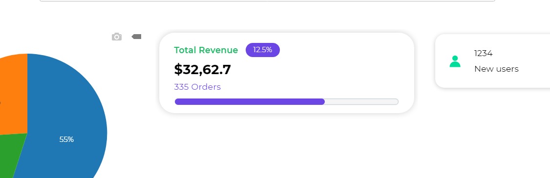
Dashboard
The Dashboard Control is a composite control used to visually present data with tags and a progress bar. It's commonly employed for various scenarios, such as showing daily sales of a store, overall earnings, and ratings for a restaurant, or displaying aggregated data from different sources like Trivago. It allows users to see ratings represented as tags and track progress with a progress bar for specific parameters.
Binding Data Options
The Dashboard control is versatile and can handle diverse data formats, enabling it to showcase a wide range of information. There are different ways in which you can bind data to the Dashboard control.
Static Data Option
To display static options in the Dashboard control, you can use the Bind Data option.
The Dashboard control has different bind data options for head_text, tag_text, title_text, and footer_text, all of which use the data type string. However, for the Progress Bar Percentage, the bind data option requires the data type number to accurately represent the progress percentage.
Properties
Card
| Property | Description |
|---|---|
| Border Radius | Specifies the radius for curved borders of the card. |
| Color | Sets the border color of the card. |
| Shadow | Controls the appearance of the shadow around the card. |
| Border | Toggles the visibility of the border on the card. |
| Tag | Toggles the display of tags on the card. |
| Progress | Toggles the visibility of the Progress Bar on the card. |
Progress Bar
These properties can be seen if you have toggle switched ON the Progress Bar with the Progress property.
| Property | Description |
|---|---|
| Height | Specifies the height of the Progress Bar. |
| Filled color | Sets the color of the bar indicating progress. |
| Empty Color | Defines the color of the empty area indicating pending progress. |
Default Text These are the default text labels for the Header, Title, Footer, and Tag.
Text Style
| Property | Description |
|---|---|
| Header | Represents the properties specified for the header text of the card. |
| Title | Represents the properties specified for the title text of the card. |
| Footer | Represents the properties specified for the footer text of the card. |
| Text Alignment | Specifies the alignment of the text within the card, including header, title, and footer sections. |
Tag Style
These properties can be seen if you have toggle switched ON the Tag with the Tag property above.
| Property | Description |
|---|---|
| Border Radius | Specifies the radius for curved borders of the card. |
| Font Size | Sets the font size for the Tag text. |
| Font Weight | Specifies the font weight for the Tag text. |
| State | Defines the state of the Tag: Normal, Negative, or Positive. |
| Normal State | Represents the properties for the font color, background color, and icon in the normal state. |
| Negative State | Represents the properties for the font color, background color, and icon in the negative state. |
| Positive State | Represents the properties for the font color, background color, and icon in the positive state. |
Events
| Trigger | Description |
|---|---|
| value_change | Occurs when there is a modification in the dashboard control's value. To control the frequency or speed of the change event, you can utilize the debounce property associated with the control. |
| focus_out | Occurs when the control loses focus, typically when the user clicks outside the control. It allows you to perform actions or handle specific behavior when the focus is no longer on the element. |