Detail Select
The Detail Select Control is a versatile Selection control designed to showcase details such as Title, Subtitle, and additional text alongside the Select button. This feature enriches the user experience by presenting comprehensive information related to the selection choices.
Binding Data Options
The Detail Select Control offers the functionality to populate data such as Title, Subtitle, and additional information on the right side of the select button. This is achieved using the Bind Data option, which accepts an array of objects in JSON format.
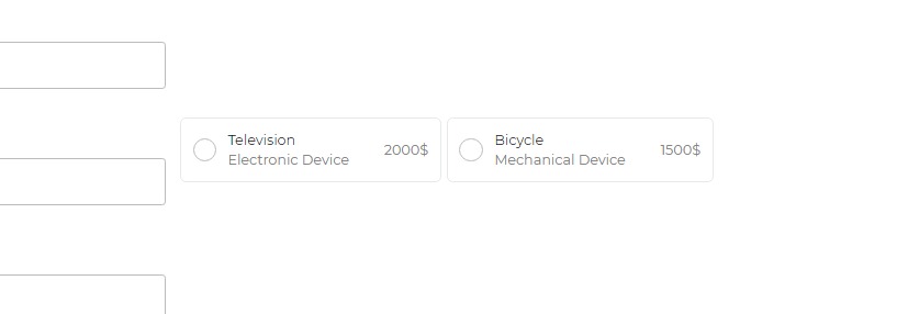
Binding Options Example
For instance, if you want to create a Detail Select Control with items such as "Television" and "Bicycle" along with their descriptions and prices, you can use the Bind Data option with an array of objects, like this:
[
    {
        "name": "Television",
        "description": "Electronic Device",
        "price": 2000
    },
    {
        "name": "Bicycle",
        "description": "Mechanical Device",
        "price": 1500
    }
]
Selected Options - Data Binding
To set the default selected option in the Detail Select Control, you can use the Bind Data - Selected Option section with a single string value. For example:
"Television"
Ensure the selected option matches a specific value within the provided data to appear correctly in the Detail Select Control.
Properties
The Detail Select Control comes with various properties to customize its appearance and functionality:
| Property | Description |
|---|---|
| Flex control | Enables or disables control as a flexible layout. |
| Hide icon | Hides the icon for user selection. |
| Selection Type | Allows single or multiple item selection. |
| Title text | Adjusts the size, weight, and color of the title text. |
| Subtitle text | Modifies the size, weight, and color of the subtitle text. |
| Right text | Customizes the size, weight, and color of the right text. |
Selected
| Property | Description |
|---|---|
| Text Style | Customize the text style by changing the text size, weight (Light, Normal, Bold, Extra Bold, X Extra Bold), alignment (Left, Center, Right, Justified), and color of the label. |
| Background Color | The background color of the selected option. |
| Border Color | The color of the border for the selected option. |
| Radio Color | The color of the radio or selection button. |
Control Outputs
The outputs from the Detail Select control, represented by the placeholder {{detail_select}}, can be referenced in other controls, data queries, or JavaScript functions using the control's unique name.
| Output | Description |
|---|---|
| detail_select | Represents the user-selected value from the Detail Select control. |
Events
| Trigger | Description |
|---|---|
| value_select | Occurs when there is a change in the value of the control, typically triggered by selecting another option or inputting a new value. |