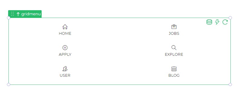
Grid Menu
The Grid Menu control is a navigation tool with a grid-based layout, allowing users to navigate between different screens within the microapp through an icon-based grid system.
Properties
Grid Menu Properties
| Property | Description |
|---|---|
| Columns | Sets the number of columns to display in the Grid Menu. |
| Height | Defines the height of each item within the Grid Menu. |
| Label Property | Customizes label properties, including text size, weight, and color. |
| Icon Property | Customizes icon properties, such as size, weight, and color. |
| Border Property | Configures the width and color of the border around menu items. |
| Image Alignment | Specifies the alignment for the image used in the Menu item. |
| Grid View | Reduces margins between menu items when activated. |
| Reset Target Screen | Resets the screen to default upon navigation. |
Grid Data
| Property | Description |
|---|---|
| Label | Sets the name of the Menu Item. |
| Image URL | Utilizes an image as the Menu item by entering the image's URL. |
| Action | Specifies navigation, either with or without validation. |
| Navigate To | Selects the destination screen upon selecting the Menu Item. |
| Menu Icon | Chooses the icon to display for the menu item. |
| Transition | Defines the direction of the new screen's transition into the user view. |
| Reset Target Screen | Resets the screen to its default state upon navigation. |