Date Range Picker
The Date Range Picker control in DronaHQ is a composite control that provides two outputs: the start date and end date. It allows users to select a range of dates from a calendar widget in the app. This control offers several properties that enable you to include time selection as well.
The Date Range Picker control saves the selected date and time in timestamp format, measured in milliseconds. It can be used for various purposes, such as accepting appointments or scheduling events that require a specific time range.
Content
Binding Data Options
There are different ways to bind data to the Date Range Picker control. From the Quick Select, you can provide both the start date and the end date.
Static Data Options
The expected and best practice format for binding data to the Date Range Picker control is UNIX timestamp format or
the "MM/DD/YYYY" date format.
UNIX timestamps in milliseconds.

Start Date: 1625198400000
End Date: 1627876799000
"MM/DD/YYYY" date format.

Start Date: "07/01/2023"
End Date: "07/31/2023"
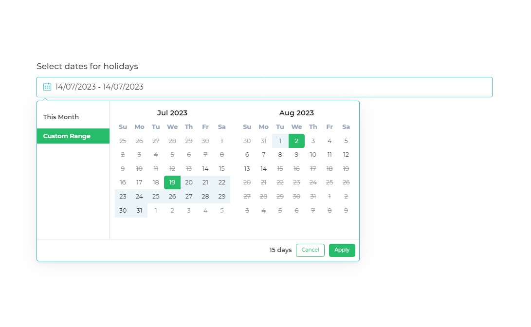
Consider a scenario where you are developing a leave application system for your employees. As a requirement, employees are required to apply for leave at least 15 days in advance.
To meet the requirement, the Date Range picker in the leave application system should dynamically disable the next 15 days.
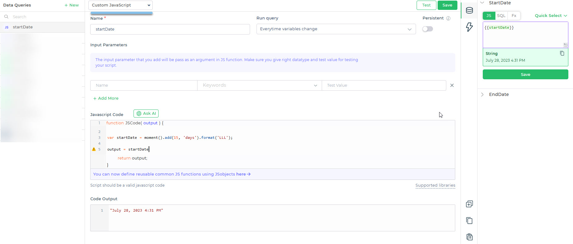
Go to Bind Data Option, StartDate -> Quick Select -> Custom JS and write a JavaScript function to retrieve a date that
is 15 days ahead of the current date. Below is an example code that utilizes the Moment.js library:
function JSCode(output) {
  var startDate = moment().add(15, 'days').format('LLL');
  output = startDate;
  return output;
}
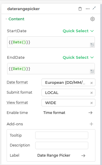
When binding data to the Date Range Picker control, consider the format of the data: DD/MM/YYYY or UNIX timestamp.
Choose the appropriate Submit format in the Input Properties of the control: LOCAL for DD/MM/YYYY format and
UTC for UNIX timestamp. This ensures accurate handling of dates and times based on the data format.
Properties
| Property | Description |
|---|---|
| Submit format | Allows you to choose between the Local time zone and UTC for displaying the Date & Time. |
| Date format | Allows you to choose the format in which the date should be displayed. Three formats are available: Friendly format, European format, and US format. |
| View Format | This allows users to choose a default display style for the date range picker dropdown based on their viewing preference. Options include Wide (default) and Compact (ideal for small spaces like trays) – This will always open the dropdown in a vertical layout, also known as mobile view. |
| Enable Time | Toggle that enables the selection of time in addition to the date. Also can select the Time format. |
Add-ons
| Add-on | Description |
|---|---|
| Tooltip | Allows you to display additional information or helpful hints for the control |
| Description | Adds descriptive text beneath to provide better context for users. |
| Label | Enables the addition of labels for specific details, making the data easier to interpret. |
Interaction
| Option | Details |
|---|---|
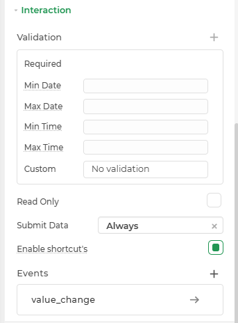
| Validation | Add validation rule such as Required to the control. |
| Min Date | Specifies the minimum selectable date. Dates before this value will not be available for selection. |
| Max Date | Specifies the maximum selectable date. Dates after this value will not be available for selection. |
| Min Time | Specifies the minimum selectable time. Time before this value will not be available for selection. |
| Max Time | Specifies the maximum selectable time. Time after this value will not be available for selection. |
| Read Only | Makes the control non-editable. |
| Submit Data | Determines when data is submitted (Options: Always, Never, Not When Hidden) |
| Enable Shortcut | Toggle that enables the selection of predefined date ranges. |
| Events | Triggers for specific actions: value_change |
| Date Range Properties | Configuration options for color themes of the control and calendar widget. |
Events
| Trigger | Description |
|---|---|
| value_change | Occurs when there is a modification in the Date range picker control's value. To control the frequency or speed of the change event, you can utilize the debounce property associated with the control. |
Appearance
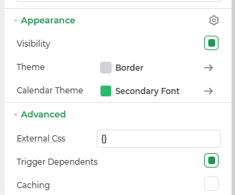
- Visibility: Toggle visibility of the control.
- Theme: Customize the control's border color using hex codes or predefined themes.
- calendar Theme: Modify the calendars's appearance.
Advanced Settings
- External CSS: Add custom styles to the Date Range Picker control.
- Trigger Dependents: Automatically invoke linked controls or workflows.
- Caching: Enable caching to store frequently used inputs.
Control Output
| Keyword | Explanation |
|---|---|
| {{dhq_date_range_picker.StartDate}} | This keyword allows you to retrieve the start date selected by the user in the Date Range Picker control. |
| {{dhq_date_range_picker.EndDate}} | With the help of this keyword, you can obtain the end date as the output of the Date Range Picker control. It can be used in your application to pass the end date and perform further operations. |