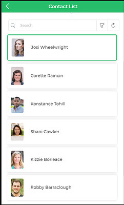
Single User Card
The Single User Card control is designed to display detailed information about a single user, including their name, contact details, and avatar. It offers a comprehensive view of individual user data.

Binding Data Options
The Single User Card control accepts data in the form of a single object representing a user's information. Here's an example of the data bind format:
{
  "fullname": "Maria Gerhold",
  "email": "maria81@example.com",
  "avatar": "https://dronamobilepublic.s3.amazonaws.com/DRONA5_Team2050/content/app/images/public/Maria_T4j7j.jpg",
  "_isSelected": false
}
Properties
Display
| Property | Description |
|---|---|
| Cover Image | Displays the user's image as the cover image. |
| Title | Displays the user's name as the title for the card. |
| Detailed View | Offers a detailed view of the selected user's information. |
Data
| Property | Description |
|---|---|
| Font Size | Font size of the displayed data. |
| Font Weight | Font weight of the displayed data. |
| Font Color | Font color of the displayed data. |
| Spacing Between Properties | Spacing between different properties. |
| Visible Columns | Number of visible columns. |
| Fit to Screen | Option to fit data to the screen. |
Actions
| Property | Description |
|---|---|
| Searchbar | Option to show or hide the search bar. |
| Buttons | Available action buttons (e.g., Download, Refresh). |
| Filters | Option to persist filters. |
| Quick Filter | Option to enable quick filter. |
| Sorting | Option to enable sorting. |
| On Card Click | Action to perform when the card is clicked. |
Control Outputs
| Output | Description |
|---|---|
| singleusercard | Data associated with the selected user. |
Events
| Trigger | Description |
|---|---|
| selection_change | Triggers when there is a change in the selected user card. |
| action1_click | Triggers when the first custom action button is clicked. |