Statistics
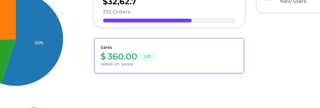
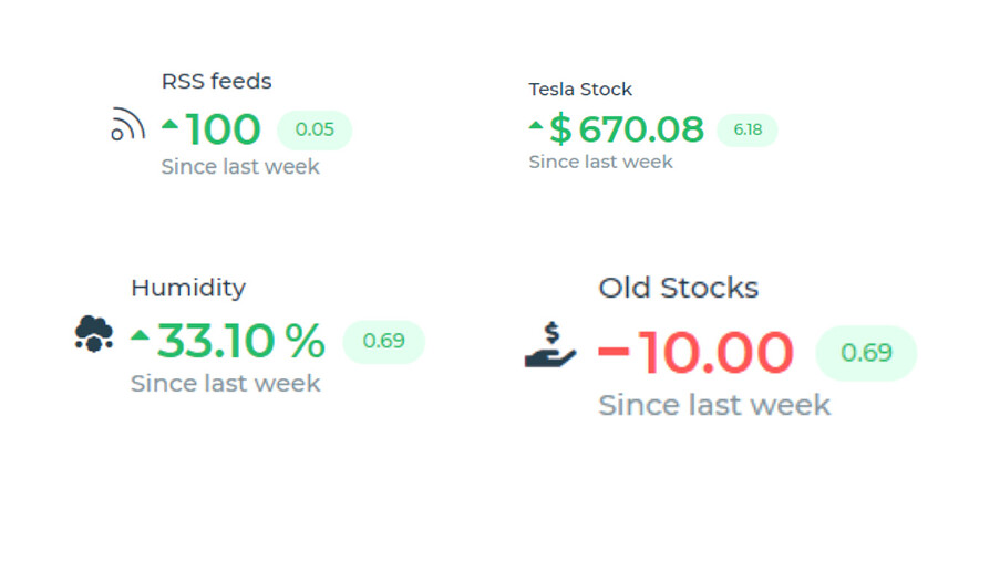
The Statistics control is a specialized display component designed for versatile applications. It enables the representation of different quantities along with their corresponding growth or decline trends, making it valuable for data visualization in various contexts.
Binding Data Options
Statistics control accepts various combination of string and numeric values to display data. There are different ways in which you can bind data to the Statistics control.
It allows users to present varying quantities with indicative trends of growth or decline rates. The control offers extensive customization with properties like title, primary value, secondary value, and footer text.
Users can set font styles, colors, formats, and even introduce trend arrows or separators. Additionally, the control supports dynamic data binding for the title, primary value, secondary value, and footer components, enabling real-time updates and dynamic content display based on various data sources.
Properties
Default Values
| Property | Description |
|---|---|
| Title | Set the title of the statistics control. |
| Primary Value | Set the primary value of the statistics control. |
| Secondary Value | Set the secondary value of the statistics control. |
| Footer | Set the footer text of the statistics control. |
Icon UI Option
| Property | Description |
|---|---|
| Font Size | Set the font size of the icon. |
| Font Weight | Set the font weight (boldness) of the icon. |
| Font color | Set the color of the icon. |
| Font Icon | Select the icon to be featured. |
Title
| Property | Description |
|---|---|
| Font Size | Set the font size of the title text. |
| Font Weight | Set the font weight (boldness) of the title text. |
| Font color | Set the color of the title text. |
Primary Value
| Property | Description |
|---|---|
| Font Size | Set the font size of the primary value. |
| Font Weight | Set the font weight (boldness) of the primary value. |
| Font color | Set the color of the primary value. |
| Format | Specify the format of the primary value. |
| Primary Sign | Set the sign of the primary value (Trend Arrows, Negative, etc.). |
| Thousand Separator | Toggle to introduce a separator after the thousand’s position. |
| Prefix | Set the prefix for the primary value. |
| Suffix | Set the suffix for the primary value. |
| Primary State | Set the primary state of the value (positive or negative). |
Secondary Value
| Property | Description |
|---|---|
| Font Size | Set the font size of the secondary value. |
| Font Weight | Set the font weight (boldness) of the secondary value. |
| Font color | Set the color of the secondary value. |
| Format | Specify the format of the secondary value. |
| Primary Sign | Set the sign of the secondary value (Trend Arrows, Negative, etc.). |
| Thousand Separator | Toggle to introduce a separator after the thousand’s position. |
| Prefix | Set the prefix for the secondary value. |
| Suffix | Set the suffix for the secondary value. |
Footer
| Property | Description |
|---|---|
| Font Size | Set the font size of the footer text. |
| Font Weight | Set the font weight (boldness) of the footer text. |
| Font color | Set the color of the footer text. |