Cascader
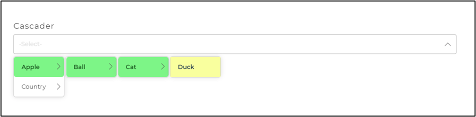
The Cascader Control serves the purpose of defining the exact location or path of an element. By utilizing parent-child relationships, it enables users to navigate through the multi-level tree and determine the endpoint of the path.
This control combines the functionality of a select and input field, allowing users to select values from the tree structure. It also supports direct input for searching values and includes validation for ensuring required fields are filled.
Binding Data Options
Cascader control accepts array of objects in JSON format to display data. There are different ways in which you can bind data to the Cascader control.
Static Data Option
To display static options in the Cascader control, you can use the Bind Data option. The Bind Data option must be specified as an array of objects. For example:
[
    "Toyota, Corolla, Corolla LE",
    "Camry, Camry SE, Camry XLE"
]
Properties
| Property | Description |
|---|---|
| Delimiter | This delimiter determines the symbol on which the path connected to our Cascader Control would be separated. |
| Return Type | The return type option enables us to select the return type of the path data from the Cascader Control, which can be further used in the app by other controls. We can opt from string, array, and return only value in the Return Type section. The above images show that the ‘-’ is chosen as delimiter and the return type is a string. |
| Selected | To provide color to the selected element from the dropdown. |
| Hover Element | To provide a color effect to hovered elements from the dropdown. |
Control Outputs
The outputs from the Cascader control, represented by the placeholder {{cascader}}, can be referenced in other controls, data queries, or JavaScript functions using the control's unique name.
| Output | Description |
|---|---|
| cascader | Represents the user-selected value from the given path/trail of the Cascader control. |