Tabs
The Tabs control offers a structured way to organize and present content in separate sections or tabs, enabling users to access information selectively.
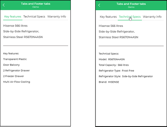
Tabs are a versatile tool to compartmentalize information, allowing users to view distinct sections without overwhelming them.
Binding Data Options
The Tabs control allows the user to select a tab from a specified list of tabs. To populate the Tab control with data, you can use the Bind Data option, which accepts an array of string in JSON format.
Options - Data Binding
The Tabs control allows you to create tabs from different data sources. Here's an example of using the "Bind Data" option to create tabs with an array of strings:
[
    "Tab 1",
    "Tab 2",
    "Tab 3"
]
Selected Option - Data Binding
If you want to have a default selected tab in the Tabs control, you can use the "Bind Data - Selected Option" section with the following data:
[
    "Tab 2"
]
Properties
| Property | Description |
|---|---|
| Selected Color | Is the color of the selected tab item. |
| Border Color | Is the color of the bottom borders of the tabs. |
| Font Properties | Is the text size, weight ( Light, Normal, Bold, Extra Bold, X Extra Bold), alignment (Left, Center, Right, Justified), and color of the label. |
| Minimum tab width | Specifies the minimum width to be maintained for the tab as the number of pixels, as a percentage, or root elements. |
Data
| Property | Description |
|---|---|
| Text | The text that appears referring to the tab. |
| Selected | Allows you to toggle ON or OFF to indicate whether a tab would be selected by default. |
Control Outputs
The outputs from the Tabs control, represented by {{tabs}}, can be referenced in other controls, data queries, or JavaScript functions using the control's unique name.
| Output | Description |
|---|---|
| tabs | Represents the user-selected value from the tabs available in the Tabs control. |
Events
| Trigger | Description |
|---|---|
| tab_change | Emitted when the selected tab changes, enabling tracking of the chosen tab and respective actions can be configured for tab change. |