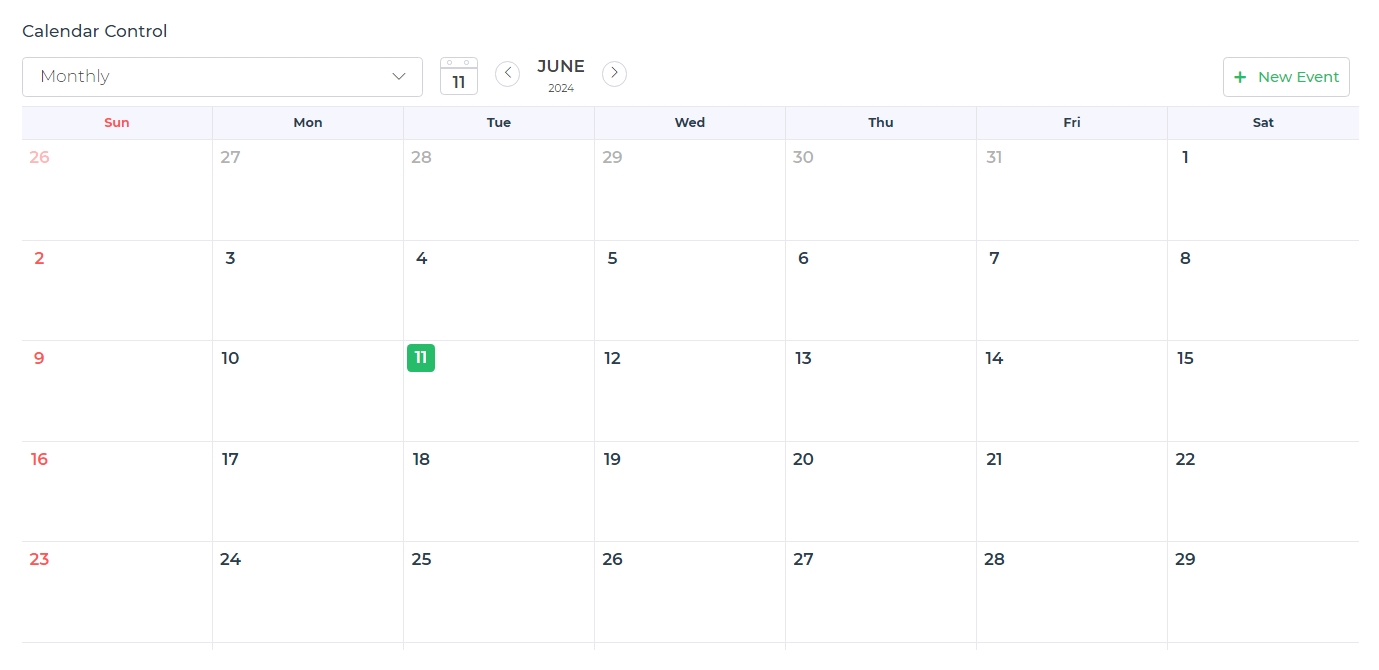
Calendar
The Calendar is a user interface control that allows the display of a set of events in a calendar format. It provides functionality for creating, updating, and deleting events, and offers various customization options to tailor the view according to user preferences.
Binding Data Options
The Calendar control in DronaHQ accepts an array of objects to display events and data. There are different ways in which you can bind data to the Calendar control.
Static Data Option
To display static events in the Calendar control, you can use the Bind Data option.
The Bind Data option must be specified as an array of objects. For example:
[
  {
    "id": 1,
    "title": "Meeting with Carlyn",
    "start": "2024-06-15T10:00:00",
    "end": "2024-06-15T11:00:00",
    "category": "allday"
  },
  {
    "id": 2,
    "title": "Lunch with Murry",
    "start": "2024-06-16T12:00:00",
    "end": "2024-06-16T13:00:00",
    "category": "time"
  }
]
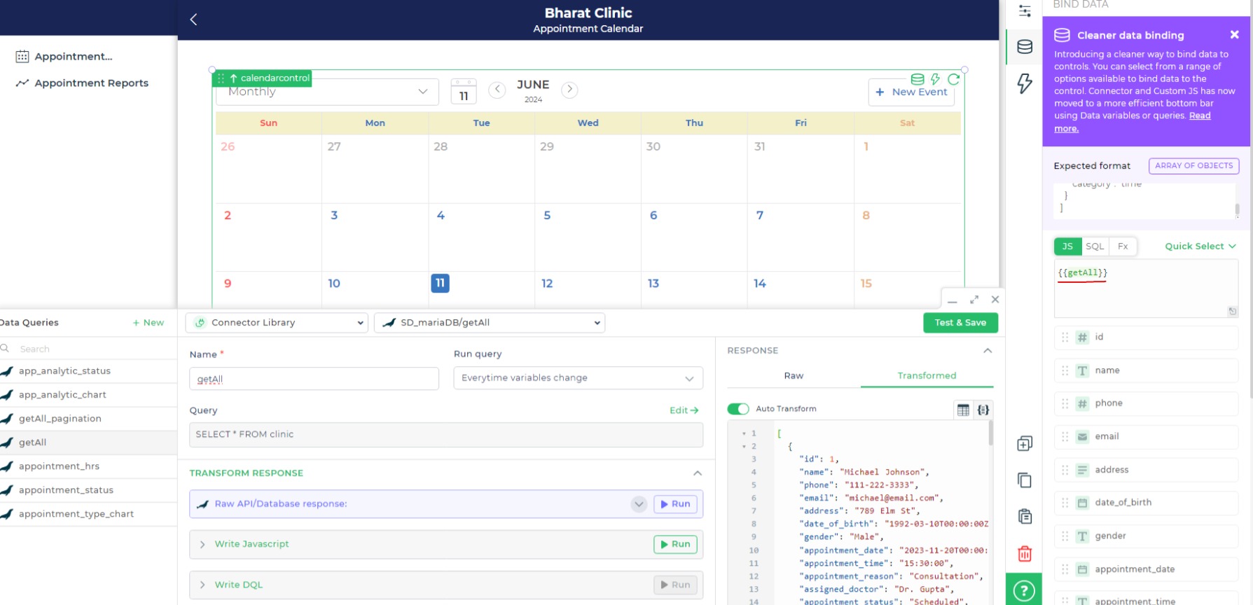
Dynamic Data Option
You can dynamically bind events by fetching data from Data queries, Sheets, or Custom functions by binding the response to the Data Bind option. For example:
Let's fetch data from a configured MariaDB connector. We have a predefined query, getEvents, that fetches data from the MariaDB database using the connector. The SQL syntax for this query:
SELECT * FROM events
In the Calendar control, Bind Data Options, select the Quick Select -> Connector Library -> MariaDB_Connector -> getEvents
Properties
| Property | Description |
|---|---|
| Title | Specify the title of the calendar event by selecting the respective identifier from the data. |
| Body | Provide the body or description of the calendar event by selecting the respective identifier from the data. |
| Start Date | Set the start date and time for the event by selecting the respective identifier from the data. |
| End Date | Set the end date and time for the event by selecting the respective identifier from the data. |
| Category | Assign a category to the event for better organization by selecting the respective identifier from the data. |
| Default Calendar View | Choose the default view of the calendar (e.g., Monthly). |
| Event Background | Set the background color for the event display by selecting the respective identifier from the data. |
| Event Font Color | Choose the font color for the event text by selecting the respective identifier from the data. |
| Event Border Color | Specify the border color for the event display by selecting the respective identifier from the data. |
| Open Detailed View onClick | Toggle this ON to open a detailed view of the event when clicked. |
| Specific Date Format | Define the date format for displaying event dates. |
| Calendar UI | Configure the overall UI settings of the calendar. |
UI CONFIG
| Property | Description |
|---|---|
| Theme | Choose a theme for the calendar UI. |
| New Event Button | Add a button for creating new events. |
| Fit Height To Screen | Toggle this ON to adjust the calendar height to fit the screen. |
| Header Background Color | Set the background color for the calendar header. |
| Font Size | Set the font size for calendar text (e.g., Medium). |
| Sunday - Font Color | Define the font color settings for Sunday. |
| Weekdays - Font Color | Define the font color settings for weekdays. |
| Saturday - Font Color | Define the font color settings for Saturday. |
| Background - Schedule | Set the background color for the calendar. |
| Text Color - Schedule | Choose the text color for the selected items or dates. |
Control Outputs
These outputs can be referenced in other controls, data queries, or JS functions using the control's unique name.
| Property | Description |
|---|---|
| {{calendarcontrol}} | Provides the entire data set of the calendar control, including all events and their details. |
| {{calendarcontrol.KEY}} | Fetches specific data from the calendar control by replacing KEY with the desired property (e.g., {{calendarcontrol.title}} for the title of the calendar). |
Events
| Trigger | Description |
|---|---|
| schedule_click | Occurs when a schedule item is clicked. |
| new_schedule | Occurs when the button to create a new schedule is clicked. |