Textarea
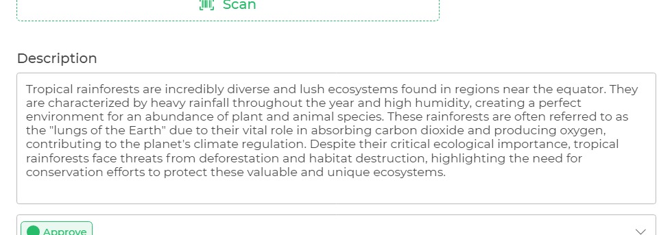
The Text Area control lets the maker accept multiple lines of text in a single field. It can hold an unlimited number of characters, and the text renders in a fixed-width font.

Binding Data Options
Textarea control accepts string value to display data. There are different ways in which you can bind data to the Textarea control.
Static Data Option
To display static options in the Textarea control, you can use the Bind Data option. The Bind Data option must be specified as string.
Properties
| Property | Description |
|---|---|
| Theme | Sets the color of the text box border from the available themes. |
| Placeholder | Provides a hint to the user on what needs to be done. It appears in the field and gets overridden when the user types something. |
| Max Character | Defines the maximum number of characters the text block will accept. The character count is displayed at the bottom right of the control. |
| Character Count Error Message | Shows an error message if the character count limit is exceeded. |
| Debounce Time (In ms) | Sets the delay in milliseconds between events to control the action frequency triggered on value change. |
Control Outputs
The outputs from the Textarea control, represented by the placeholder {{textarea}}, can be referenced in other controls, data queries, or JavaScript functions using the control's unique name.
| Output | Description |
|---|---|
| textarea | Represents the multiple lines of texts being provided of the Textarea control. |
Events
| Trigger | Description |
|---|---|
| value_change | Occurs when there is a modification in the respective control's value. To control the frequency or speed of the change event, you can utilize the debounce property associated with the control. |
| focus_out | Occurs when the control loses focus, typically when the user clicks outside the control. It allows you to perform actions or handle specific behavior when the focus is no longer on the element. |