Dropdown
We have merged the dropdown and advanced dropdown control, kindly refer to the Advance Dropdown control document for further information.
The Dropdown control enables users to make a selection from a predefined list of options, allowing them to choose one or more items. For instance, it can be utilized to facilitate the selection of all necessary cities from a given list of choices.

Binding Data Options
The Dropdown control allows the user to select one or more options from a specified list of choices. To populate the Dropdown control with data, you can use the Bind Data option, which accepts an array of objects in JSON format.
Static Data Option
Suppose you want to create a Dropdown control with a list of colors as options. Here's how you can use the Bind Data option with an array of color names:
[
    "Red",
    "Green",
    "Blue",
    "Yellow",
    "Purple"
]
Options - Data Binding
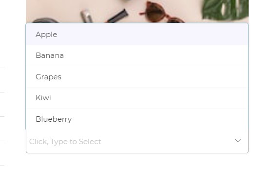
If you have an array of objects representing different fruits and their corresponding colors, you can use the Bind Data option to display the fruits' names in the Dropdown control:
[
    {
        "name": "Apple",
        "color": "Red"
    },
    {
        "name": "Banana",
        "color": "Yellow"
    },
    {
        "name": "Grapes",
        "color": "Purple"
    },
    {
        "name": "Kiwi",
        "color": "Green"
    },
    {
        "name": "Blueberry",
        "color": "Blue"
    }
]
Selected Options - Data Binding
If you want to have a default selected option in the Dropdown control, such as "Grapes," you can use the Bind Data - Selected Option section with the following data:
[
    {
        "name": "Grapes",
        "color": "Purple"
    }
]
Remember to include the necessary keys and values based on the Dropdown control's properties and the specific data you want to display.
Properties
| Property | Description |
|---|---|
| Display Column | Choose the column name to be displayed in the dropdown menu of an array of object data. |
| Value Column | Helpful when you want to return the value of a specific column from an array of object data, from the selected dropdown option. |
| Theme | Select the color of the Dropdown. You can enter a custom hex code or use one from the available themes in the builder. |
| Border | Change the color of the border of the Dropdown container. |
| Format | The format of the Dropdown, either Tray type or Classic type. |
| Type | Define if the user can select one or multiple options from the Dropdown. |
| - Single Select: Allows selecting only one option from the dropdown list. | |
| - Multi-Select: Enables selecting multiple options from the dropdown list. | |
| Placeholder | A prompt that gives a hint to the user, displayed in the Dropdown container. |
| - Shown when no default selected option is present in the Dropdown list. | |
| Default Column Number | Determine which column number's value to be sent to Workflow on Submit or other dependent controls when displaying multiple columns using LOOKUP function. |
Control Outputs
The outputs from the Dropdown control, represented by the placeholder {{dropdown}}, can be referenced in other controls, data queries, or JavaScript functions using the control's unique name.
| Output | Description |
|---|---|
| dropdown | Represents the user-selected value from the selected options of the Dropdown control. |
Events
| Trigger | Description |
|---|---|
| value_select | Occurs when there is a change in the value of the respective control, typically triggered by selecting another option or inputting a new value. |