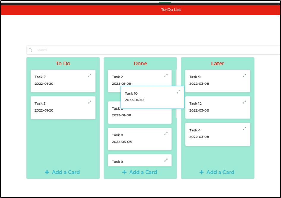
Kanban
The Kanban control is a widely adopted lean workflow management method utilized for organizing and defining service workflows, aiding in service improvement. It consists of two main components: boards and cards. Data is stored in card format across multiple boards, with the number of boards determined by how the cards/data are grouped. Users can easily drag cards from one group to another on the board, facilitating seamless organization and management of tasks and information.
Binding Data Options
Kanban control accepts array of objects in JSON format to display data. There are different ways in which you can bind data to the Kanban control.
Static Data Option
To display static options in the Kanban control, you can use the Bind Data option. The Bind Data option must be specified as an array of objects.
Dynamic Data Option
In this example, we have a Kanban Control that manages project tasks fetched from a database. The data is in JSON format and includes information about each task, such as the task name, assigned group, due date, and task description.
- Set up a Data Query: First, make sure you have a data query configured to fetch the Kanban data from your SQL database. The query might look like this:
SELECT group, name, dueDate, description FROM tasks
This query retrieves the columns group, name, dueDate, and description from the tasks table in your database.
- Configure the Kanban Control:
In the Kanban control, navigate to the Bind Data Options section and select
Quick Select -> Data Queries -> yourDataQueryName.
{{yourDataQueryName}}
By selecting the data query you've set up (e.g., yourDataQueryName), the Kanban control will automatically fetch the data from your SQL database. The fetched data will be used to create cards on the Kanban board, where each card represents a task with the corresponding group, name,dueDate, and description values. Users can then interact with the Kanban board, drag cards from one group to another, and manage their tasks efficiently.
Let's look at the data:
[
  {
    "group": "In Progress",
    "name": "Task 1",
    "dueDate": "2023-07-31",
    "description": "Complete UI wireframes for project"
  },
  {
    "group": "To Do",
    "name": "Task 2",
    "dueDate": "2023-08-05",
    "description": "Gather requirements from the client"
  },
  {
    "group": "Done",
    "name": "Task 3",
    "dueDate": "2023-07-25",
    "description": "Prepare project presentation"
  },
  {
    "group": "In Progress",
    "name": "Task 4",
    "dueDate": "2023-08-15",
    "description": "Develop backend APIs"
  }
]
The Kanban Control in this example is divided into three groups: To Do, In Progress, and Done. Each task is represented as a card within its respective group, displaying the task's name, due date, and a brief description of the task.
For instance, Task 1 is currently in progress and is due on July 31, 2023. The task description is "Complete UI wireframes for project." Similarly, Task 2 is yet to be started, with a due date of August 5, 2023, and its description is "Gather requirements from the client."
With this Kanban Control, project managers and team members can easily visualize the progress of each task, move tasks between different stages, and efficiently manage their project workflows.
Properties
| Property | Description |
|---|---|
| Theme | Here, you can decide on the theme of the cards and customize their appearance. |
| Column Config | In this section, you have two options to determine the grouping property and the display attribute. |
| Group | Select the property by which the cards should be grouped. |
| Item Label | Defines that the attribute of the selected property will be displayed on the cards. |
Boards
Under this section, we get to edit display properties related to height, width, spacing, font-weight and size, color, and text alignment. All these properties are for the boards on the background on which cards are located.
Fit height to screen: Enable to set the height of the Kanban Control to fit the screen. The Kanban control fits the screen and you can scroll within the table within the area.
On grid layout if you have stretched the control height more than page than fit to height will leave some extra wight space before starting the next control.
When fit height to screen is is toggled on, Kanban control will cover the whole screen and if the device height is less than the height specified above, Kanban control will not shrink and maintain the above defined height as minimum height
Card
| Property | Description |
|---|---|
| Theme | Choose the theme of the cards and configure the appearance of the columns. |
| Column Config | Edit display properties related to height, width, spacing, font-weight, size, color, and text alignment for the boards on which cards are located. |
| Fit Height to Screen | Enable to set the height of the Kanban Control to fit the screen. The Kanban control will fit the screen, and you can scroll within the table area if necessary. |
| Display | Customize how the cards are displayed in the app, including the visual aspects with texts and images. |
| Cover Image | Set an image to be displayed as the cover image of the card, adding visual elements to represent the card's content or purpose. |
| Data | Specify the information or content that the card should display, such as text or numbers, providing meaningful information to users. |
| Background | Choose the background color or image of the card, matching the appearance with the app's theme or differentiating cards based on their content. |
| Detailed View | Customize the detailed view of the card that will be displayed when the user interacts with or clicks on the card, showing additional information or presenting the data in a comprehensive manner. |
| Spacing | Define the spacing between cards to ensure a visually appealing and well-organized layout, improving readability and user experience. |
| Group | Select the property by which the cards are grouped in the Kanban Control. |
| Item Label | Define that the selected property's attribute will be shown in the cards. |
Control Output
| Output | Description |
|---|---|
| {{kanban.[attribute_name]}} | Represents the value of the specified attribute (e.g., group, name, dueDate, description) from the selected card in the Kanban control. |
In this updated version, the [attribute_name] is a placeholder that represents the actual attribute name (e.g., group, name, dueDate, description) from the data in the Kanban control. With this placeholder, you can dynamically access and utilize different attribute values based on the data provided.
Events
| Trigger | Description |
|---|---|
| card_select | Occurs when a card in the Kanban control is selected or clicked. This event can be used to trigger actions based on the selected card. |
| card_move | Occurs when a card is moved from one group to another in the Kanban control. This event can be used to perform actions based on card movement. |
| add_card | Occurs when a new card is added to the Kanban control. This event can be used to execute actions when a new card is created. |