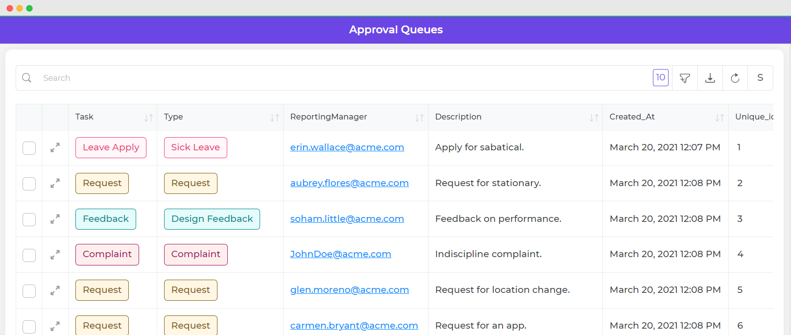
Table Grid
The Table Grid control is a type of Display control that obtains data from a Sheet, connector, or other data source and displays it in a table format. The table can be sorted, filtered, paginated, and downloaded, and includes features like row selection and insertion, server-side pagination, and custom columns.
Content
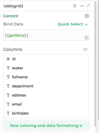
Binding Data Options
Table Grid control accepts array of objects to display data. There are different ways in which you can bind data to the Table Grid control.
Static Data Option
To display static options in the Table Grid control, you can use the Bind Data option.
The Bind Data option must be specified as an array of objects. For example:
[
  {
    id: 1,
    name: 'Carlyn Bartle',
    email: 'Carlyn.Bartle@example.com',
  },
  {
    id: 2,
    name: 'Murry Rowsel',
    email: 'Murry.Rowsel@example.com',
  },
];
Dynamic Data Option
You can dynamically Bind options by fetching data from Data queries, Sheets or Custom functions by binding the
response to the Data Bind option. For example:
Let's fetch data from a configured SQL connector."We have a predefined query, getDetails, that fetches data from the
SQL database using the connector." The SQL syntax for this query:
SELECT * FROM orderdetails
In the Table Grid control, Bind Data Options, select the
Quick Select -> Connector Library -> SQL_Connector -> getDetails
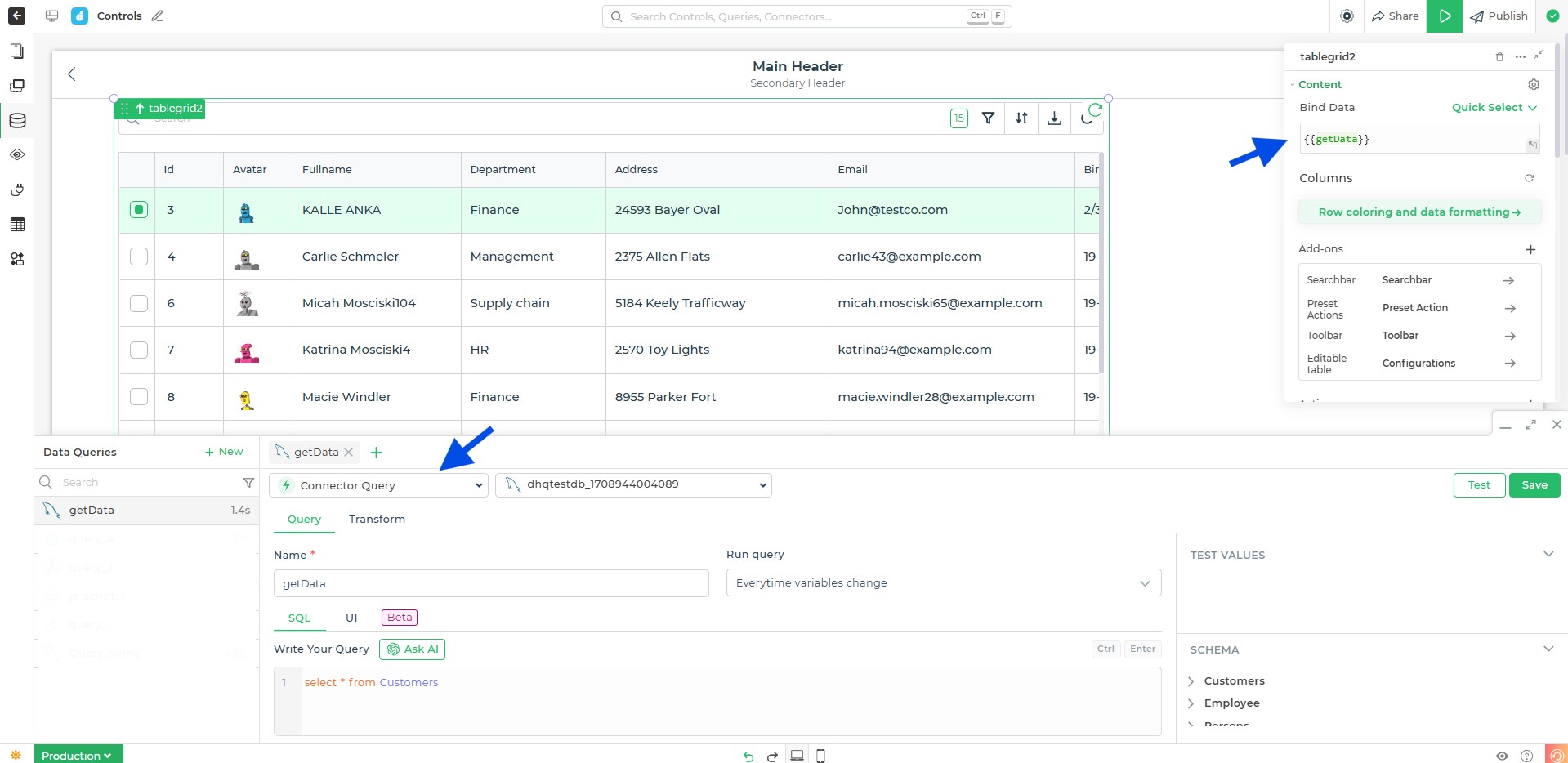
Real-time visualization of table grid control changes in the builder view, with updated data fetched from an SQL database.
Add-ons
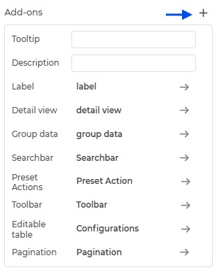
| Add-on | Description |
|---|---|
| Tooltip | Allows you to display additional information or helpful hints when users hover over table cells or column headers. |
| Description | Adds descriptive text beneath table headers or rows to provide better context for users. |
| Label | Enables the addition of labels for specific columns or rows, making the data easier to interpret. |
| Detail View | Lets users expand rows to view more details about a particular record. Useful for showing extended data not displayed in the main table. |
| Group Data | Organizes rows into collapsible sections based on shared column values, improving readability and navigation. |
| Searchbar | Toggle ON or OFF to show the Searchbar. Users can filter table rows dynamically by entering keywords. |
| Preset Actions | Includes built-in actions like Add, Update, and Delete, with respective buttons for quick operations. |
| Toolbar | Provide users with an intuitive interface to control and manage table functionalities such as column visibility, filter queries, sort queries, and more. |
| Editable Table | Allows users to modify table data directly within the table grid. Editable columns and validations can be configured for specific use cases. |
| Pagination | Adds pagination to the table grid for managing large datasets by splitting them into smaller, navigable pages. |
Toolbar
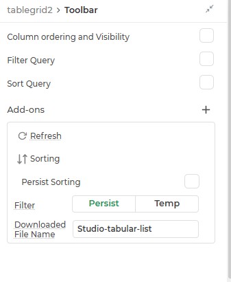
| Feature | Description |
|---|---|
| Column Ordering and Visibility | Allows users to toggle ON/OFF columns to reorder them or change their visibility directly from the app interface. |
| Filter Query | Enables or disables the generation of server-side filter query outputs (filterquery and filterjson). This is useful for filtering data dynamically based on conditions. |
| Sort Query | Generates sort query outputs (sortquery and sortjson) for ordering data by specific columns on the server-side. |
| Add-ons | Additional options that enhance table behavior, such as grouping data, exporting, or displaying tooltips. |
| Refresh | Provides a button to reload the table data, ensuring users can fetch the latest records from the server or data source. |
| Sorting Options | Enables sorting functionality with options to persist sorting state across sessions or reset it when required. |
| Filter Options | Allows temporary filtering, persistent filtering, and the ability to reset filters applied to the table. |
| Downloaded File Name | Sets the default file name for exported data from the table. |
Filter Query and Sort Query
The Filter Query and Sort Query features enable dynamic filtering and sorting of data for both client-side and server-side operations. These functionalities generate outputs in SQL and JSON formats, which can be consumed directly for backend processing or local data manipulation.
Filter Query
The Filter Query feature provides users with the ability to define conditions for filtering data. The conditions can be applied server-side or client-side to retrieve only the relevant data rows.
| Property/Output | Description |
|---|---|
tablegrid.properties.filterquery | Generates the filter conditions as a SQL-compatible string. Example: name = 'John' AND age > 25. |
tablegrid.properties.filterjson | Outputs the filter conditions in JSON format. Example: {"name": "John", "age": {"$gt": 25}}. |
Sort Query
The Sort Query feature allows users to sort table data based on one or more columns, either in ascending or descending order. This can be used for backend processing or client-side table arrangements.
| Property/Output | Description |
|---|---|
tablegrid.properties.sortquery | Generates the sorting criteria as a SQL-compatible string. Example: status ASC, age DESC. |
tablegrid.properties.sortjson | Outputs the sorting criteria in JSON format. Example: {"status": "asc", "age": "desc"}. |
Pagination
Pagination helps manage large data sets by splitting them into smaller, more manageable pages. This ensures optimal performance and easier navigation for users.
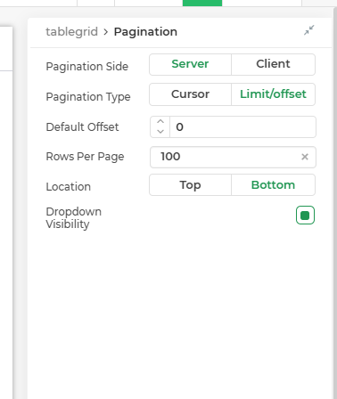
| Property | Description |
|---|---|
| Pagination Side | Determines whether pagination is handled on the server or client side. |
| Pagination Type | Method used for pagination: either Cursor-based or Limit/Offset-based. |
| Default Offset | Starting point for pagination, usually set to 0. |
| Rows Per Page | Default number of rows displayed per page, typically 100. |
| Location | Position of pagination controls (Top, or Bottom). |
| Dropdown Visibility | Controls visibility of the rows-per-page selection dropdown. |
Server-Side Pagination
Server-side pagination is a technique for displaying large data sets in a web application by dividing the data into pages and only sending the current page to the browser. This can improve performance and make the data easier to manage.
Key Benefits
- By only fetching the required data for the current page, server-side pagination reduces the load on both the client and server, leading to faster response times.
- This method handles large data sets efficiently, as it doesn't require loading all data at once.
- Improves the user experience by ensuring quick data retrieval and display, even with extensive data sets.
Client-Side Pagination
Client-side pagination is another method used to manage large data sets in web applications. Unlike server-side pagination, where only the necessary data for the current page is fetched from the server, client-side pagination involves fetching the entire data set upfront and then dividing it into pages locally in the DronaHQ.
Key Benefits
- Since all data is loaded at once, client-side pagination is best suited for smaller data sets. For very large data sets, this can lead to performance issues such as slow loading times and high memory usage.
- Implementation is simpler as it doesn't require server-side changes or multiple requests to fetch data.
- Once the data is loaded, navigation between pages is instant, providing a smooth user experience without additional server requests.
When the pagination is enabled your Filter and the Search features do not work on the columns. However, if you disable pagination you would note that the search provides you with the rows matching the search text. The Filter feature would also allow you specify the filter conditions
To know about implementing pagination in Tablegrid control within DronaHQ, understand the types and configurations necessary for efficient data management. Pagination types include server-side, client-side, and cursor-based, each with unique benefits. Configure properties like pagination bar location and default cursor values to enhance functionality. Additionally, explore how to implement pagination for MySQL, GraphQL, and REST API data sources. For a comprehensive guide, you can read the Pagination in Tablegrid Control article.
Actions
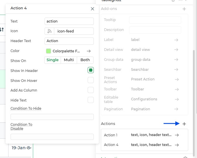
| Property | Description |
|---|---|
| Text | Add the text for the action to be displayed on the button or in the column. |
| Icon | Allows you to select an icon for the action to visually represent it. |
| Header Text | Define the text that will appear in the column header when the action is added as a column. |
| Color | Lets you assign a color to the action or icon for better distinction and customization. |
| Show On | Configure when the action should appear. Options include Single-select, Multi-select, or Both. |
| Show In Header | Toggles whether the action will appear in the table header for easy access. |
| Show On Hover | Specifies whether the action or icon will be visible only when hovering over a selected row. |
| Add As Column | Adds the action as a column in the table grid. The action text will appear in the column, and the position can be adjusted using column settings. |
| Hide Text | Hides the action text while keeping the icon visible. Useful for creating a cleaner look. |
| Condition to Hide | Allows you to define conditions under which the action or icon should be hidden. |
| Condition to Disable | Lets you define conditions to disable the action or icon, preventing it from being triggered under specific scenarios. |
| Add Custom Column Width | Check mark this ON, after opting for "Add as column", to add custom width to the column containing the action. |
| Custom Column Width (in px) | Once you opt for "Add Custom Column Width", you can decide on the required width off the column by providing the exact value. |
Interaction
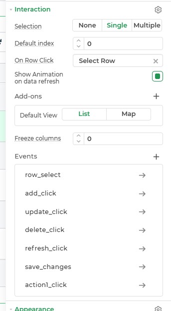
| Property | Description |
|---|---|
| Selection | Configures how rows can be selected in the grid. Options are: |
| - None: No selection allowed. | |
| - Single with checkbox: Allows selecting a single row at a time with visual checkbox. | |
| - Single without checkbox: Allows selecting a single row at a time without visual checkbox. | |
| - Multiple with checkbox: Allows selecting multiple rows at a time. | |
| Default Index | Specifies the index of the row that should be selected by default (e.g., 0). |
| On Row Click | Defines the action to be performed on clicking a row: |
| - Select Row: Selects the row when clicked. | |
| - None: Disables row selection on click. | |
| Show Animation on Data Refresh | Enables or disables animation when data in the table is refreshed. |
| Default View | Sets the default view for displaying data. Options are: |
| - List: Displays data in a tabular list format. | |
| - Map: Displays data in a map view (if applicable). | |
| Freeze Columns | Allows freezing specific columns so they remain visible during horizontal scroll. |
Events
| Trigger | Description |
|---|---|
| row_select | Occurs when a row in the table or a list is selected. |
| add_click | Occurs when the add button for adding new items is clicked. |
| update_click | Occurs when the update button for updating existing items is clicked. |
| delete_click | Occurs when the delete button for deleting items is clicked. |
| save_changes | Occurs when the save button for saving changes is clicked, typically after editing or updating. |
| refresh_click | Occurs when you click the refresh button of the table grid control |
Appearance
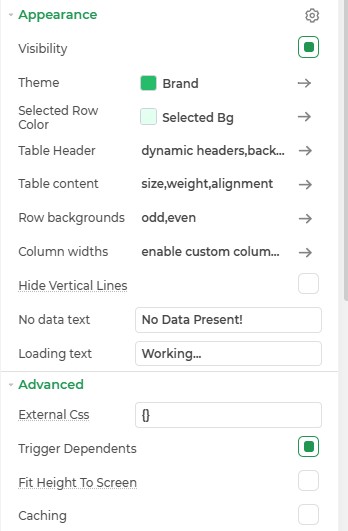
| Property | Description |
|---|---|
| Visibility | Configures whether the table is visible on the screen. Can be dynamically controlled using rules. |
| Theme | Applies a predefined visual theme to the table for styling consistency. |
| Brand | Sets the brand color or accent to align with the application's branding. |
| Selected Row Color | Specifies the color of the text for the selected row. |
| Selected Bg | Defines the background color for the selected row. |
| Table Header | Customizes the table headers. |
| Table Content | Configures the content of the table cells. |
| Row Backgrounds | Sets the background colors for rows. |
| Column Widths | Configures the width of table columns. |
| Hide Vertical Lines | Removes vertical divider lines between columns in the table. |
| No Data Text | Specifies the text to display when no data is present. Default: No Data Present! |
| Loading Text | Specifies the text to display while the table is loading data. Default: Working... |
Advanced Settings
For power users and developers, the advanced settings offer additional control over the Tabbed Container.
External CSS
Inject custom CSS styles for granular control over the design and behavior of the tabs.
Trigger Dependents
Set up dependent actions or triggers based on user interactions with the tabs.
Caching
Enable caching to store data locally and improve app performance.
Control Outputs
These outputs can be referenced in other controls, data queries, or JS functions using the control's unique name.
| Property | Description |
|---|---|
| {{tablegrid.PROPERTIES.SEARCHTEXT}} | The search text that is currently being used to filter the data in the table grid. |
| {{tablegrid.PROPERTIES.OFFSET}} | The offset of the first row that is currently being displayed in the table grid. |
| {{tablegrid.PROPERTIES.LIMIT}} | The number of rows that are currently being displayed in the table grid. |
| {{tablegrid.PROPERTIES.STARTROW}} | The index of the first row that is currently being displayed in the table grid. |
| {{tablegrid.PROPERTIES.ENDROW}} | The index of the last row that is currently being displayed in the table grid. |
| {{tablegrid.PROPERTIES.EDITEDROWS}} | The number of rows that have been edited in the table grid. This keyword sends the whole array of the row data whose columns have been edited. |
| {{tablegrid.PROPERTIES.NEWROWS}} | The number of rows that have been newly created in the table grid. |
| {{tablegrid.PROPERTIES.SELECTEDROWS}} | The number of rows that are currently selected in the table grid. |
| {{tablegrid.PROPERTIES.EDITEDTABLE}} | This property allows users to edit data in a table grid without making any changes to the underlying data source. The altered data can be used by the table grid itself or exported to another data source. |
| {{tablegrid.PROPERTIES.isediting}} | A property that checks whether the table grid is in an editing state. It returns true if any row or cell is being edited. |