List Repeat
The List Repeat control is a type of Container control that emulates a List control behavior for a single list item created by the designer. It allows you to include one item in the list, and it only supports controls created by designers, excluding normal controls.
Binding Data Options
List Repeat control accepts an array of objects in JSON format to display data. There are different ways in which you can bind data to the List Repeat control.
Static Data Option
To display static options in the List Repeat control, you can use the Bind Data option. The Bind Data option must be specified as an array of objects. For example:
[
  {
    "name": "John Doe",
    "age": 30,
    "email": "john.doe@example.com"
  },
  {
    "name": "Jane Smith",
    "age": 25,
    "email": "jane.smith@example.com"
  },
  {
    "name": "Michael Johnson",
    "age": 40,
    "email": "michael.johnson@example.com"
  }
]
By providing the static data in the specified format, the List Repeat control will render the list items accordingly, displaying information such as name, age, and email for each object in the array.
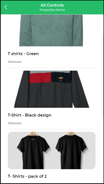
Example: Adding a Product List Control to List Repeat
In this example, we will demonstrate how to use the List Repeat control by adding a Product List control within it. The List Repeat control allows us to create a list of items that can be repeated dynamically by the user. We will walk through the steps of binding data to the controls to display product information effectively.
- Adding Product List Control: To begin, add the
Product Listcontrol to theList Repeatcontrol. This will enable us to showcase a list of products that can be dynamically repeated.
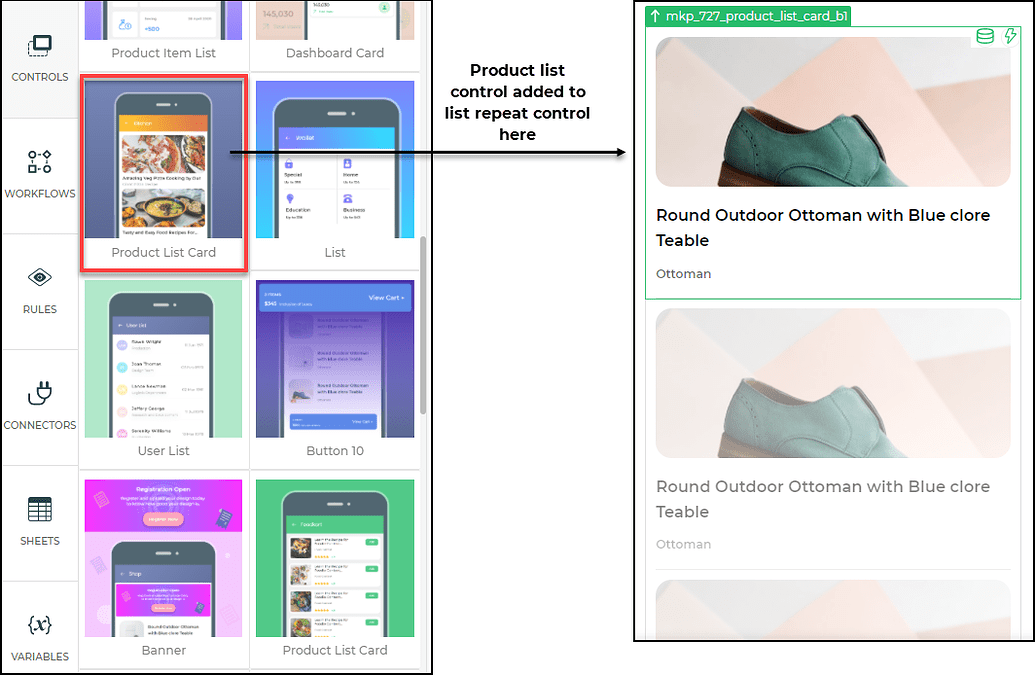
- Binding Data: After adding the controls, the next step is to bind the data. Select the
List Repeatcontrol and click onBind Data -> Quick Select -> Sheetsfrom the available options. From the list of sheets, choose a suitable sheet for this example and select the relevant columns you wish to display. Once the data is selected, clickSaveto proceed.
Binding Columns to Product List Control: Now, focus on the inserted
Product Listcontrol. For this example, we will use theImageandTitlefields to bind to the columns in the selected sheet.To ensure that each data entry is shown individually, under
Bind Data,select theImagecontrol, and underGet Data from parent control,chooseThis.column name(e.g., This.Prod_image for this example).
- Complete Data Binding: Repeat the binding process for all the required columns of the
Product Listcontrol. Once all the necessary data is bound, clickSaveto complete the data binding process.
By following these steps, the Product List control will now display the product information from the selected sheet, and the List Repeat control will allow dynamic repetition of the product list as per the user's interaction.
For further guidance on effectively using the List Repeat control, you can refer to the instructional video linked below:
Properties
| Property | Description |
|---|---|
| Show Divider | Toggle this switch ON or OFF to display the divider in the List Repeat control. |
| Single Select | Toggle this switch button to enable or disable single select functionality in the List Repeat control. |
| Background color | Sets the background color of the List Repeat control. |
Configurations
| Property | Description |
|---|---|
| Show Search | Toggle this switch ON or OFF to display the Search box in the List Repeat control. |
| Show Refresh | Toggle this switch ON or OFF to display the Refresh button in the List Repeat control. |
| Show Download | Toggle this switch ON or OFF to display the Download button in the List Repeat control. |
| Horizontal Scroll | When this option is selected, you can scroll horizontally when you have multiple items in the list. |
| Show Dot | Specifies whether dots indicating multiple items should be displayed in the List Repeat control. |
| Show Arrow on Web | Specifies whether an arrow to scroll to the next item should be displayed. This is for the Web app. |
Limit & Offset
| Property | Description |
|---|---|
| Allow Pagination | Enables or disables pagination for your data in the List Repeat control. |
| Offset | The index value of the record/row. If set to 0 (zero), the records are displayed from the first record as per your visible rows. If set to 10, the 11th record would be displayed first. |
| Page Limit | The maximum number of records shown on the page during pagination. For example, if you set the visible rows as 3 and the Page limit as 10, you can see 3 rows in the list at a time, but there will be 10 records in the list that can be viewed by scrolling down. |
Layout and Children Padding
| Property | Description |
|---|---|
| Layout | You can set the layout for different screen sizes by defining the number of columns to be displayed for each screen type. |
| Children Padding | Allows you to set the padding for the child control items inside the List Repeat control. |
Control Output
| Output | Description |
|---|---|
| {{listRepeat.[attribute_name]}} | Represents the value of the specified attribute (e.g., label, value, image, title) from array of object data in the List Repeat control. |
In this updated version, the [attribute_name] is a placeholder that represents the actual attribute name (e.g., label, value, image, title) from the data in the List Repeat control. With this placeholder, you can dynamically access and utilize different attribute values based on the data provided.
Events
| Trigger | Description |
|---|---|
| selectChangeEvent | Occurs when the selected item in the List Repeat control is changed. This event can be used to perform actions based on the selected item. |