Timer
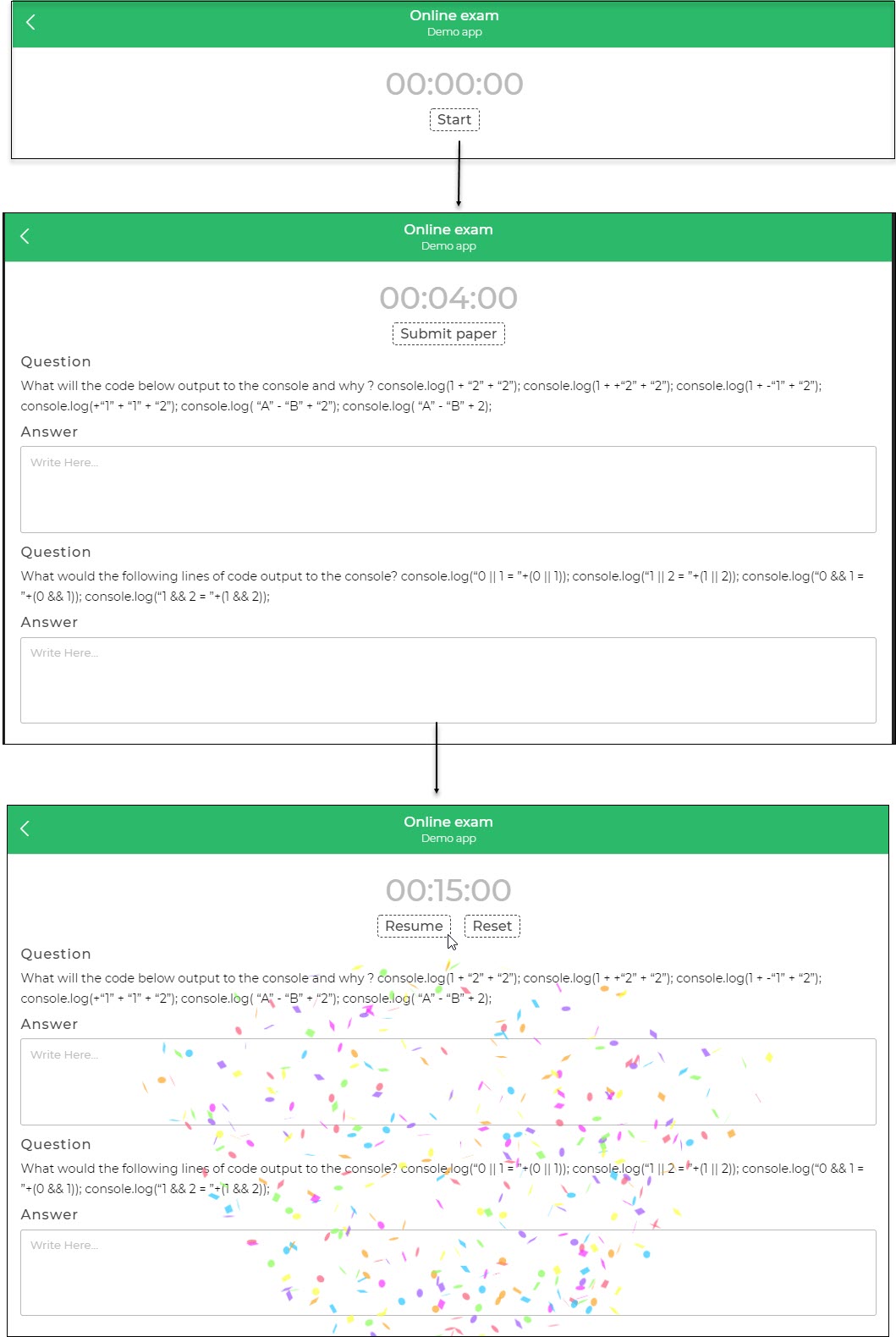
The Timer Control is a specialized custom component designed to offer a stopwatch-like feature within an application, allowing the use of various timer formats. By adjusting the ticker interval settings, you can create captivating functionalities, such as those found in quiz apps, online examination apps, Pomodoro technique timers, and more.

Usecase of Timer control should be limited to short span of time for active usage. OS/Browser restricts the app/web when it goes into inactive state for better battery usage and performance. Also, for longer time frames, you can leverage device time and calculate difference between start time and current time to display it accordingly.
Properties
| Property | Description |
|---|---|
| Auto Start | Toggle switch ON to automatically start the timer when the screen loads. |
| Start / Stop button | Toggle switch ON to display the Start / Stop button for manual control of the timer. Enabling this option will activate the Button Style properties. |
| Ticker interval (ms) | Set the interval in milliseconds for the ticker in the timer. |
| Alarm interval (ms) | Set the interval in milliseconds for the alarm in the timer. |
| Display format | Customize the time display format according to your use case. |
| Timer Properties | Customize the timer label by adjusting the text size, weight (Light, Normal, Bold, Extra Bold, X Extra Bold), alignment (Left, Center, Right, Justified), and color of the label. |
Button
| Property | Description |
|---|---|
| Start Label | Set or change the label for the Start button. |
| Stop Label | Set or change the label for the Stop button. |
| Resume Label | Set or change the label for the Resume button. |
| Reset Label | Set or change the label for the Reset button. |
| Text | Customize the label by adjusting the text size, weight (Light, Normal, Bold, Extra Bold, X Extra Bold), alignment (Left, Center, Right, Justified), and color of the label. |
| Border | Set the border color and the button layout or style as Outlined, Filled, or Dashed Outline. |
Control Output
The outputs from the Timer control, represented by the placeholder {{timer}}, can be referenced in other controls, data queries, or JavaScript functions using the control's unique name.
| Output | Description |
|---|---|
| timer | Represents the time available in the Timer control. |
Events
| Trigger | Description |
|---|---|
| on_start | Event triggered when you click the Start button. |
| on_stop | Event triggered when you click the Stop button. |
| on_reset | Event triggered when you click the Reset button. |
| alarm_interval | Alarm event periodically triggered after the specified time in milliseconds to define the action to be repeated within the alarm interval. |