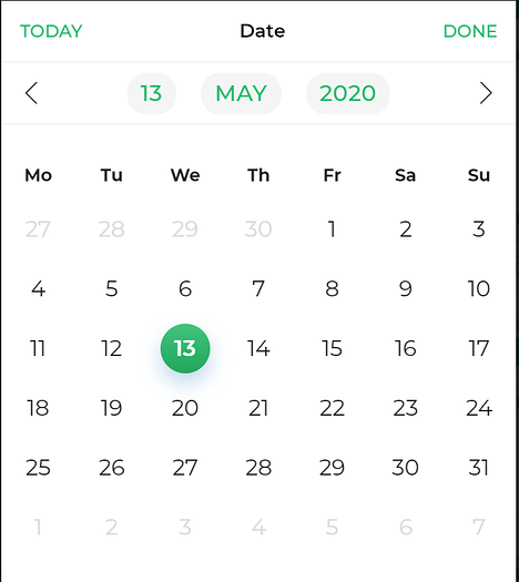
Date Picker
A Date Picker control is used to accept dates into a microapp by selecting a date from a calendar widget. You can set User Device’s date as a default date or can keep the Date picker empty when the date control is displayed to the user. Date picker saves the Date in the Unix epoch time format. For example, it can be used for various purposes like setting due dates for tasks or Start and End dates for an event.
Binding Data Options
There are different ways to bind data to the Date Picker control, providing either a single date or a range of dates.
Static Data Options
The expected formats for binding data to the Date Picker control are either the UNIX timestamp format or the DATE Object.
UNIX timestamps in milliseconds.

Selected Date: 1625198400000
DATE Object format.

Selected Date: new Date(2023, 6, 1)
To illustrate an example, let's consider a scenario where you are creating a hotel reservation system, and you want to set the default date selection to be 10 days from the current date.
To achieve this, you can go to the Bind Data Option, Selected Date -> Quick Select -> Custom JS, and write a JavaScript function to retrieve a date that is 10 days ahead of the current date. Below is an example code that utilizes the Moment.js library:
function JSCode(output) {
  var selectedDate = moment().add(10, 'days').toDate();
  output = selectedDate;
  return output;
}
When binding data to the Date Picker control, consider the format of the data: LOCAL or UNIX timestamp.
Choose the appropriate Submit format in the Input Properties of the control: LOCAL for LOCAL format and
UTC for UNIX timestamp. This ensures accurate handling of dates and times based on the data format.
Properties
| Property | Description |
|---|---|
| Clear Option | When enabled, it allows users to clear the date and set a new date. |
| Theme | Choose the color of the container box by entering a custom hex code or selecting from available themes. |
| Datepicker Theme | Set the color of the Datepicker widget. |
| Date Format | Choose between UTC or Local time for the date format. |
| Display Format | Select the desired format for the date: Friendly format (Month DD YYYY), European format (DD/MM/YYYY), or US format (MM/DD/YYYY). |
Disable dates
| Future Dates | |
|---|---|
| Property | Description |
| Disable All | When toggled OFF, all future dates will remain enabled. When toggled ON, all future dates will be disabled for selection. |
| Disable days | (Visible when Disable All toggle is OFF) Select the number of days you want to disable in the future, starting from the day after. |
| Enable days | (Visible when Disable All toggle is ON) Select the number of days you want to enable for selection in the future, starting from the day after. |
| Past Dates | |
|---|---|
| Property | Description |
| Disable All | When toggled OFF, all past dates will remain enabled. When toggled ON, all past dates will be disabled for selection. |
| Disable days | (Visible when Disable All toggle is OFF) Select the number of days in the past you want to disable, starting from the day before. |
| Enable days | (Visible when Disable All toggle is ON) Select the number of days you want to enable for selection in the past, starting from the day before. |
| Including Disabled Week Days | Toggle ON to include disabled week days in the date selection options. |
| Including Today | When toggled ON, the date functionalities for enabling and disabling dates will include the present date in the count of dates. |
Control Output
The outputs from the Date Picker control, represented by the placeholder {{datepicker}}, can be referenced in other controls, data queries, or JavaScript functions using the control's unique name.
| Output | Description |
|---|---|
| datepicker | Represents the picked date value available in the Date Picker control. |
Events
| Trigger | Description |
|---|---|
| value_change | Occurs when there is a modification in the Date picker control's value. To control the frequency or speed of the change event, you can utilize the debounce property associated with the control. |