Charts & Graphs
The Charts Control is used to provide users with an easy interface to create charts and graphs based on columnar, tabular, or JSON data. The Charts control enables full customization using the Plotly.js library for custom and complex charts. It can be utilized for creating and displaying dashboards or conducting comparative analysis of data.
This document contains all the elements for every available chart control in DronaHQ.
Binding Data Options
The Charts control provides flexibility in binding data to create interactive charts and graphs. You can choose from the following options to bind data:
Static Data Option
To display static data in the Charts control, you can use the Bind Data option. It allows you to specify data as an array of objects, defining X-axis and Y-axis values for various chart types.
Example using Static Data:
[
  {
    "x": [1, 2, 3, 4, 5],
    "y": [10, 20, 30, 40, 50],
    "type": "line"
  },
  {
    "x": ["A", "B", "C", "D", "E"],
    "y": [25, 35, 45, 55, 65],
    "type": "bar"
  }
]
Plotly JSON Data
For advanced chart options, you can use the Plotly.js library and define the chart layout using the Plotly JSON data attribute. This enables you to customize the chart's appearance, titles, axes, colors, and legends based on your data source.
Example using Plotly JSON:
{
  "data": [
    {
      "x": [1, 2, 3, 4, 5],
      "y": [10, 20, 30, 40, 50],
      "type": "line"
    },
    {
      "x": ["A", "B", "C", "D", "E"],
      "y": [25, 35, 45, 55, 65],
      "type": "bar"
    }
  ],
  "layout": {
    "title": "Custom Chart Layout",
    "xaxis": {
      "title": "X-axis Title"
    },
    "yaxis": {
      "title": "Y-axis Title"
    },
    "showlegend": true,
    "legend": {
      "x": 0.5,
      "y": 1
    }
  }
}
By utilizing these data binding options, you can create dynamic and informative charts in your microapp, representing data effectively.
Plotly JSON charts support dynamic values using double curly braces ({{variable_name}}). This allows referencing variables that hold the actual data to be plotted.
Example:
{
  "data": [
    {
      "y": ["Leads", "Qualified", "Closed Deals"],
      "values": [{{leadsSum}}, {{qualifiedLeadsCount}}, {{closedDealsCount}}]
    }
  ]
}
Properties
The Charts Control allows you to define properties for the dataset or choose the data source based on the chart type. Bar and line graphs utilize the X-axis, while Pie charts display aggregated values as labels for each slice.
Data
You can source your data from various options such as Static Data, Sheets, Custom JSON, Custom Formula, and more. Once you fetch the data, you have the flexibility to set it as either a UI Form or a Plotly JSON.
The Charts Control offers options for Line, Bar, Scatter, and Pie Charts using the UI Form. For more advanced customization and the use of other chart types, you can leverage the Plotly JSON format. This empowers you to create custom and complex charts tailored to your specific needs.
UI Form
Once you select the data source, DronaHQ parses the data and enables you to populate it to the selected chart type using the UI Form type.
Before you can set the values for the X-axis and Y-axis you need to make sure that you have added the appropriate source from Bind Data. After you define the Data, then only would you be able to specify the source columns for the X-Axis and the Y-Axis.
- Chart type: Select the type of chart. It can be a Bar chart, Line Chart, Scatter Chart, or Pie Chart.
Properties for Chart Type: Bar / Line / Scatter Chart
| Property | Description |
|---|---|
| Chart Type | Choose the type of chart. Options include Bar chart, Line Chart, Scatter Chart, or Pie Chart. |
| X-axis Column | For Bar Chart, Line Chart, and Scatter Chart, define the column representing the X-axis data. |
| Y-axis Column | For Bar Chart, Line Chart, and Scatter Chart, define the column representing the Y-axis data. |
| Group By | Specify the column to group your data (applied to all categories). |
| Column Configuration | Customize individual category properties, including Name, Aggregation, Type, and Color. |
| Name | Change the name that appears on the legend for each selected column. |
| Aggregation | Aggregate data for individual columns using functions like count, sum, average, etc. Default is Sum. |
| Type | Specify the chart type for each category. |
| Color | Choose the color for the chart under each category. |
Aggregation Method allows you to perform various calculations on specific individual columns. Options include Sum, Count, Average, Median, Mode, Standard Deviation, Min Value, Max Value, First Value, and Last Value.
| Aggregation Method | Description |
|---|---|
| Sum | Sum of all values in the specific individual column. |
| Count | Total quantity or count of items in each group. |
| Average | Average of all numeric values in the specific individual column. |
| Median | Median value of numeric values in the specific individual column. |
| Mode | Mode or most frequently occurring value in the specific column. |
| Standard Deviation | Standard deviation of numeric values in the specific column. |
| Min Value | Minimum numeric value from the specific column. |
| Max Value | Maximum numeric value from the specific column. |
| First Value | The first numeric value in the specific column. |
| Last Value | The last numeric value in the specific column. |
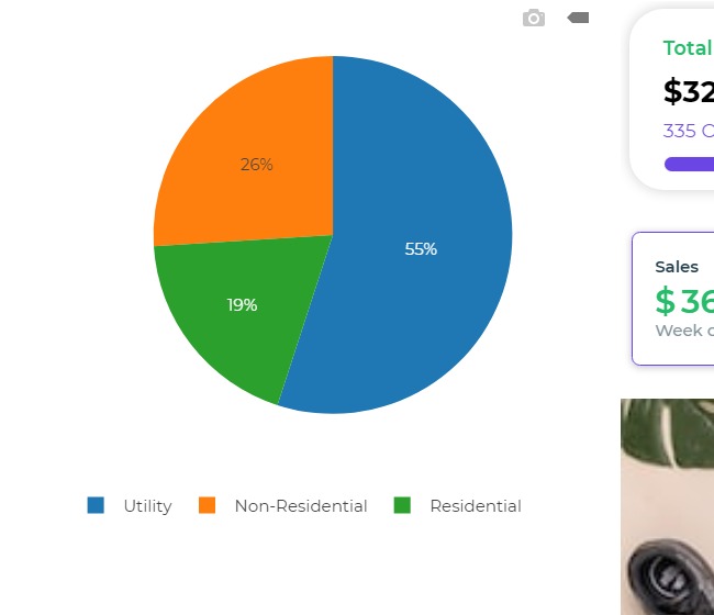
Properties for Chart Type: Pie Chart
| Property | Description |
|---|---|
| Labels | For Pie chart, specify the column containing the aggregated values. |
| Values | Column to be aggregated based on the labels. |
| Color | Define colors for each section of the pie chart. Default colors if not set. |
Plotly JSON
For users seeking advanced chart options, the Charts control offers the flexibility to utilize Plotly.js charts. By working with Plotly JSON data and layout attributes, you can customize and extend your chart capabilities.
To use Plotly JSON, you need to define the schema based on the specific chart type you intend to create. Here's an example of a bar chart using Plotly JSON:
[
  {
    "name": "2011",
    "x": ["Jan", "Feb", "Mar", "Apr", "May"],
    "y": [4000, 8076, 3564, 12098, 7002],
    "type": "bar",
    "marker": {
      "color": "#3c92dc",
      "size": 3,
      "symbol": "circle"
    },
    "line": {
      "color": "#3c92dc",
      "width": 3
    },
    "transforms": [
      {
        "type": "aggregate",
        "groups": ["Jan", "Feb", "Mar", "Apr", "May"],
        "aggregations": [
          {
            "target": "y",
            "func": "sum",
            "enabled": true
          }
        ]
      }
    ]
  }
]
Additionally, you can include dynamic data in Plotly JSON by fetching information from various sources like sheets, connectors, or custom formulas. When UI Form data properties have limitations for representing dynamic data, the Trace property allows you to display it using curly brackets '{{}}' to reference column suggestions from bind data.
This approach empowers you to create diverse chart types beyond bar, line, scatter, and pie charts. Refer to Plotly's Data and Layout attributes documentation for a wide range of chart configurations tailored to your specific data presentation requirements.
Links: Plotly Data Attributes and Plotly Layout Attributes
Layout
Customizing the chart layout is possible with Layout properties, which adapt according to the selected chart type. For Bar Chart or Line Chart, customization focuses on X and Y-Axis data, whereas for Pie Chart, it centers around slices and labels. Furthermore, you can include the Layout attribute in Plotly JSON by specifying the layouts attribute for the respective charts.
Layout for the UI FORM
| Property | Description |
|---|---|
| X-Axis | |
| Visibility | Toggle switch to set the X-Axis Title. |
| Text | Text to be displayed as X-axis Title. |
| Y-Axis | |
| Visibility | Toggle switch to set the Y-Axis Title. |
| Text | Text to be displayed as Y-axis Title. |
| Legends | |
| Visibility | Toggle switch to set the Legends to be displayed. |
| Alignment | Set the alignment of the Legend as top, bottom, left, or right. |
| X Position | Position of the legends with reference to the X-axis. |
| Y Position | Position of the legends with reference to the Y-axis. |
| Angle | Angle at which the legend is positioned, horizontal or vertical. |
Layout for the Plotly JSON
The chart's layout can be customized using the Plotly.js Layout attribute. To configure the layout based on Plotly, switch to Plotly JSON in the Layout properties. These attributes allow you to control the positioning and configuration of chart items, including title, axes, colors, and legend.
You can utilize Plotly JSON Layout to customize charts with various available layouts, regardless of the data source. Even when using Plotly data, adding Plotly Layout is optional. To avoid using the layout, leave the layout attribute blank by passing an empty object "{}" for the layout to be applied accordingly.
Configuration
Size
| Property | Description |
|---|---|
| Auto | Toggle switch on to autosize the height and width of the chart depending upon the device in use. |
| Height | Set the height to the selected number of units to maintain a fixed size on all devices. |
| Width | Set the width to the selected number of units to maintain a fixed size on all devices. |
Spacing
| Property | Description |
|---|---|
| Mode Bar | Toggle switch ON to display the mode bar on top of your charts. These are Plotly actions for the chart. |
| Zeroline | Toggle switch ON to display the X-Axis. |
| Stacked Bars | Toggle switch ON to display the bar chart as stacked bars when there are multiple parameters. |
| Value Tooltip | Toggle switch ON to display the values as a tooltip when hovering over the bars or the pie chart. |
Control Outputs
The outputs from the Charts control, represented by the placeholder {{chart_name}}, can be referenced in other controls, data queries, or JavaScript functions using the control's unique name.
| Output | Description |
|---|---|
| chart_name | Represents the whole data from the Charts control. |
Events
| Trigger | Description |
|---|---|
| data_click | Whenever you click on any point on the chart data, you can define an action flow that would be triggered. |
Using the Plotly JSON to define charts, you can utilize specific key values to enable the click event when a user selects any point on the chart. Without specifying these key values, triggering actions when clicking on any point of the chart will not be possible.
{

"clickmode": "select+event",
"dragmode": "select",

}
In case you are using the type of chart here as the Pie-chart then under the UI Form you need to select the Chart type as Pie Chart so that you can use the click event of the Pie chart.