Select
A Select control can be used when the user needs to be provided the option to select one or multiple options belonging to related groups.
Binding Data Options
The Select control accepts an array of strings for Options and a string for Selected Option. There are different ways in which you can bind data to the Select control.
Options - Data Binding
The Options section allows you to bind data to the Select control to display the available options in the dropdown list. You can provide an array of strings to represent the options that will be shown in the dropdown. For example:
[
  "Red",
  "Blue",
  "Green",
  "Yellow"
]
Selected Option - Data Binding
The Selected Option section allows you to bind data to the Select control to pre-select an option in the dropdown. You can provide a single string value that matches one of the options in the Options list. For example:
"Green"
By using the data binding options for the Select control, you can dynamically populate the dropdown options and pre-select the desired option based on the data provided. In this example, the dropdown will show the colors "Red," "Blue," "Green," and "Yellow," with "Green" being the pre-selected option.
Properties
| Property | Description |
|---|---|
| Flex Control | A toggle used to enable or disable the control as a flexible control. If disabled, the select buttons will be displayed in a single column. |
| Toggle Others | This option allows respondents to provide an answer that is outside of your predetermined list of answer options with the help of a text box. When toggled ON, the "Others" placeholder for a new option is shown. |
| Hide Icon | Toggle switch OFF to hide the select button. |
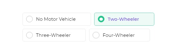
| Selection Type | Specifies whether to allow single select or multi-select. |
| Text Style | Customize the text style by changing the text size, weight (Light, Normal, Bold, Extra Bold, X Extra Bold), alignment (Left, Center, Right, Justified), and color of the label. |
Selected
| Property | Description |
|---|---|
| Text Style | Customize the text style by changing the text size, weight (Light, Normal, Bold, Extra Bold, X Extra Bold), alignment (Left, Center, Right, Justified), and color of the label. |
| Background Color | The background color of the selected option. |
| Border Color | The color of the border for the selected option. |
| Radio Color | The color of the radio or selection button. |
Control Outputs
The outputs from the Select control, represented by the placeholder {{select}}, can be referenced in other controls, data queries, or JavaScript functions using the control's unique name.
| Output | Description |
|---|---|
| select | Represents the user-selected value from given set of options in the Select control. |
Events
| Trigger | Description |
|---|---|
| value_select | Occurs when there is a change in the value of the respective control, typically triggered by selecting another option or inputting a new value. |