Rating
The Rating control is a simple control that allows users to view and set ratings, commonly used to indicate the level of satisfaction in various scenarios.
Binding Data Options
The Rating control accepts whole numbers as data to display the ratings. There are different ways in which you can bind data to the Rating control.
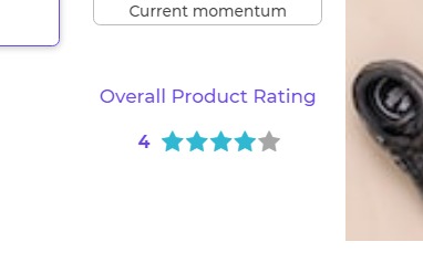
Static Data Option
To display static ratings in the Rating control, you can directly provide the rating value as a whole number.
4
Dynamic Data Option
In this example, we have a Rating Control that displays ratings fetched from a database. The data is in whole number format and includes ratings for different products.
- Set up a Data Query: First, make sure you have a data query configured to fetch the ratings data from your database. The query might look like this:
SELECT product_name, rating FROM product_ratings
This query retrieves the product_name and rating columns from the product_ratings table in your database.
- Configure the Rating Control:
In the Rating control, navigate to the Bind Data Options section and select
Quick Select -> Data Queries -> yourDataQueryName.
{{yourDataQueryName.rating}}
By selecting the data query you've set up (e.g., yourDataQueryName), the Rating control will automatically fetch the rating data from your database. The fetched ratings will be used to display the ratings for different products. Each product's rating will be represented by the corresponding whole number value.
Let's look at the data:
[
  {
    "product_name": "Product A",
    "rating": 4
  },
  {
    "product_name": "Product B",
    "rating": 3
  },
  {
    "product_name": "Product C",
    "rating": 5
  },
  {
    "product_name": "Product D",
    "rating": 4
  }
]
In this example, the Rating Control displays the ratings for different products. Product A has a rating of 4, Product B has a rating of 3, Product C has a rating of 5, and Product D has a rating of 4.
With this Rating Control, users can easily view the whole number ratings of various products, helping them make informed decisions while choosing products based on their ratings.
Properties
| Property | Description |
|---|---|
| Icon type | Specifies the type of icon used for selecting the ratings. Options include star, heart, thumb, circle, or flag. |
| Rating size | Sets the size of the rating icons as a whole. Options are tiny, small, medium, large, or huge. |
| Icon Color | Determines the color of the icon used for ratings, such as the star icon or heart icon. |
| Alignment | Allows you to align the rating block within the layout. |
| Max Rating | Specifies the maximum rating value that can be selected. |
| Text | Provides properties for the text that appears next to the rating icons, representing the rating count. |
Control Output
The outputs from the Rating control, represented by the placeholder {{rating}}, can be referenced in other controls, data queries, or JavaScript functions using the control's unique name.
| Output | Description |
|---|---|
| rating | Represents the rating available currently in the Rating control. |
Events
| Trigger | Description |
|---|---|
| value_select | Occurs when there is a change in the value of the respective control, typically triggered by selecting another option or inputting a new value. |