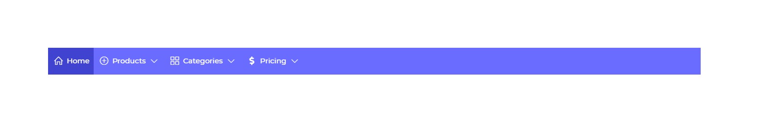
Nav Bar
The Nav Bar Control is a navigational tool that provides users with a set of menu items. Each menu item in the control is equipped with trigger action functionality, allowing users to perform specific actions such as executing queries or navigating to other pages or screens.
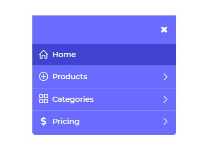
The control is designed to be mobile responsive, featuring a burger menu icon. When the page layout switches to a mobile view, the entire navbar transforms into a block format with the burger menu item. Upon clicking the burger menu, all the menu items are displayed for easy navigation.
Binding Data Options
Nav Bar control accepts array of nested objects in JSON format to display data. There are different ways in which you can bind data to the Nav Bar control.
Static Data Option
To display static options in the Nav Bar control, you can use the Bind Data option. The Bind Data option must be specified as an array of objects. For example:
[
    {
        "label": "Home",
        "value": "home",
        "icon": "icons icon-home",
        "isActive": "true"
    },
    {
        "label": "Products",
        "icon": "icons icon-plus",
        "options": [
            {
                "label": "UI Builder",
                "value": "builder",
                "description": "Interface design",
                "color": "pink",
                "isActive": true,
                "image": ""
            }
        ]
    },
    {
        "label": "Categories",
        "icon": "icons icon-grid",
        "image": ""
    }
]
Different Variations
- Simple Nav bar
- Icon Nav Bar
- Image Nav Bar

Properties
| Property | Description |
|---|---|
| Menu properties | Allows customization of menu items in the Nav Bar control, including coloring, styling, positioning, and font attributes. |
| Burger Menu Alignment | Fixes the position of the burger menu in mobile responsive view. |
| Open dropdown on | Sets the action (Hover or Click) on which the dropdown is visible. |
| Item Max height | Sets the maximum height of each dropdown menu. |
| Menu alignment | Aligns menu items within the Nav Bar control. |
| Selected Item | Sets the background and font color of the active menu item in the Nav Bar control or menu data with isActive set as true. |
| Dropdown color | Sets the background and font color of submenu items in the Nav Bar control or menu items under the options property. |
Control Outputs
The outputs from the Nav Bar control, represented by the placeholder {{navbar}}, can be referenced in other controls, data queries, or JavaScript functions using the control's unique name.
| Output | Description |
|---|---|
| navbar | Represents the selected value from the Nav Bar control, indicating the user's chosen menu item. |
Events
| Property | Description |
|---|---|
| value_select | Occurs when there is a change in the value of the respective control, typically triggered by selecting another option or inputting a new value. |