Split Button
The Split Button control is a versatile dropdown menu that enables users to trigger queries and perform various actions. It supports manual configuration or mapped evaluation of options, and provides options for handling loading and disabled states. The Split Button control also offers solid and outline styles for customization, allowing for a visually appealing and interactive user experience.
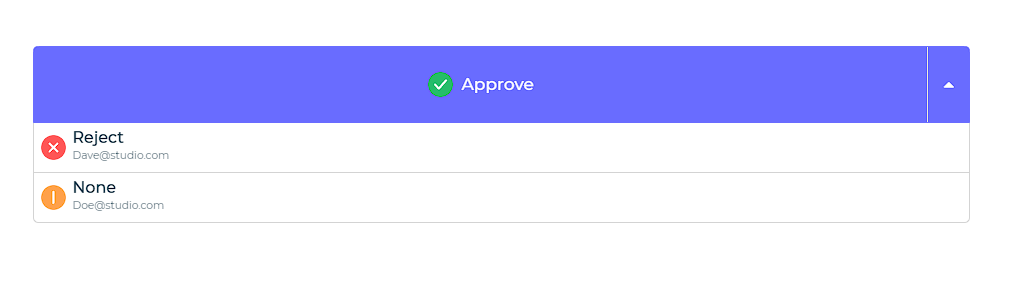
The split button control consists of an arrow and a label; A default action is chosen by clicking on the label, and a list of other possible actions is displayed by clicking on the arrow. Users can pass different values and attributes in the control data and set them as various properties for the control.
Binding Data Options
Split Button control accepts array of objects in JSON format to display data. There are different ways in which you can bind data to the Split Button control.
Static Data Option
To display static options in the Split Button control, you can use the Bind Data option. The Bind Data option must be specified as an array of objects. For example:
[
    {
            "value":"approve",
            "label":"Approve",
            "description":"John@studio.com",
            "image":"https://dronamobilepublic.s3.amazonaws.com/DRONA5_Team108/content/app/images/public/Tick_c5Abe.svg"

        },
        {
            "value":"reject",
            "label":"Reject",
            "description":"Dave@studio.com",
            "image":"https://dronamobilepublic.s3.amazonaws.com/DRONA5_Team108/content/app/images/public/Close_L8P9q.svg"

        },
        {
            "value":"none",
            "label":"None",
            "description":"Doe@studio.com",
            "image":"https://dronamobilepublic.s3.amazonaws.com/DRONA5_Team108/content/app/images/public/Info_BCFfd.svg"
    }
]
Properties
| Property | Description |
|---|---|
| Title Column | This property determines the title of each option in the dropdown menu from bounded data columns. |
| Description Column | This property displays data from a column as a description below the title. |
| Value Column | This property retrieves the value of a specific column from the selected dropdown option. |
| Image Column | This property selects a column containing image details for displaying images in the dropdown. |
| Border Radius (Image) | This property applies a border radius to the images in the options. |
| Button properties | This property section allows you to apply styling properties to the button function of the control, including text, background, color, size, weight, and more. |
| Dropdown properties | This property section enables you to apply properties to the dropdown menu functionality of the split button control, including title, description, background, color, size, weight, and more. |
Control Outputs
The outputs from the Split Button control, represented by the placeholder {{split_button}}, can be referenced in other controls, data queries, or JavaScript functions using the control's unique name.
| Output | Description |
|---|---|
| split_button | Represents the selected value from the Split Button control, indicating the user's chosen menu item. |
Events
| Output | Description |
|---|---|
| button_click | Represents the event triggered when the Button control is clicked, indicating the button click action. It provides a way to handle user interactions and perform desired functionality. |