Compact Card
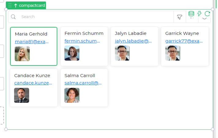
The Compact Card control is designed to display a set of compact cards containing information such as fullname, email, and avatars. Users can interact with these cards by selecting or performing actions.
Binding Data Options
The Compact Card control accepts data in an array of objects, each representing a card's information. Here's an example of the data bind format:
[
  {
    "fullname": "Maria Gerhold",
    "email": "maria81@example.com",
    "avatar": "https://dronamobilepublic.s3.amazonaws.com/DRONA5_Team2050/content/app/images/public/Maria_T4j7j.jpg",
    "_isSelected": false
  },
  {
    "fullname": "Fermin Schumm",
    "email": "fermin.schumm51@example.com",
    "avatar": "https://dronamobilepublic.s3.amazonaws.com/DRONA5_Team2050/content/app/images/public/Fermin_6ZIef.jpg",
    "_isSelected": false
  },
  // ... (additional card data)
]
Properties
| Property | Description |
|---|---|
| Theme | Border color of the control. |
| Layout | Choose between "Card" or "List" layout. |
| Max Width | Maximum width of the control (percentage). |
| Spacing | Spacing between cards (in pixels). |
| Cards In Row | Number of cards displayed in a row on different devices. |
Display
| Property | Description |
|---|---|
| Headers | Display options like cover image, title, detailed view. |
| Cover Image | Shows the image column as Cover Image |
| Title | Is the column name selected as Title for the card. |
| Detailed View | Shows the detailed view icon that opens the Detailed view of the selected row. |
Data
| Property | Description |
|---|---|
| Font Size | Font size of the data. |
| Font Weight | Font weight of the data. |
| Font Color | Font color of the data. |
| Spacing Between Properties | Spacing between different properties. |
| Visible Columns | Number of visible columns. |
| Fit to Screen | Option to fit data to the screen. |
Pagination
| Property | Description |
|---|---|
| Allow | Option to enable or disable pagination. |
Actions
| Property | Description |
|---|---|
| Searchbar | Option to show or hide the search bar. |
| Placeholder | Text for the search bar placeholder. |
| Buttons | Available action buttons (e.g., Download, Refresh). |
| Filters | Option to persist filters. |
| Quick Filter | Option to enable quick filter. |
| Sorting | Option to enable sorting. |
| On Card Click | Action to perform when a card is clicked. |
| Select Card | Option to enable single card selection or multiple or navigation with selection. |
| Action | Options to show or hide specific action buttons. |
Control Outputs
The output from the Compact Card control is represented in the following table:
| Output | Description |
|---|---|
| compactcard | Data associated with the whole list in the control. |
| compactcard | Selected card's data, including fullname, email, avatar, etc. |
Events
| Trigger | Description |
|---|---|
| selection_change | Triggers when there is a change in the selected card(s). |
| action1_click | Triggers when the first custom action button is clicked. |