Grouped Menu
The Grouped Menu Control is a versatile navigation component that allows the creation of a well-organized menu. It effectively groups navigation items together based on shared categories, providing an organized and seamless user experience.
The Grouped Menu control simplifies the process of creating a navigation menu by automatically organizing menu items into logical groups. Instead of designing the groups separately, you can easily assign each menu item to its corresponding group, and the control will handle the rest. This allows for a seamless and efficient creation of the menu, streamlining the user interface development.
Utilizing the Grouped Menu Control
The Grouped Menu Control will then appear on the screen in the builder, you can then set all the above properties as per your requirements.
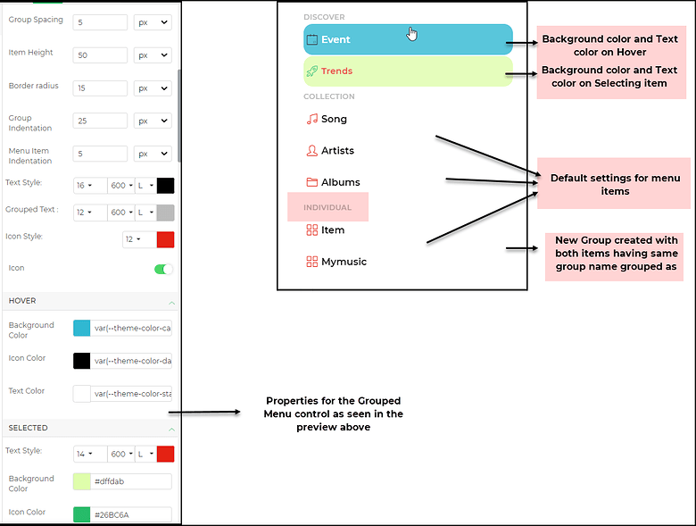
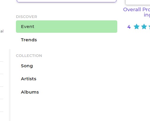
The Grouped Menu is mainly a navigation control and does not have any data binding. You simply specify the Page to navigate to and specify whether the screen would be validated on navigation. You need to make sure that you link the right screen based on the menu item. You would already be setting the properties for color settings on hovering the mouse over an item and color settings on selecting an item.
Properties
| Property | Description |
|---|---|
| Group Spacing | The spacing between the two groups. |
| Item Height | The height of each individual item. |
| Border Radius | The radius of the borders of each item. The border will have curved corners based on the radius. |
| Group Indentation | The indentation of the entire group, including its title and menu items. |
| Menu Item Indentation | The indentation of the menu items only. This is in addition to the Group Indentation property. |
| Text Style | Customize the size, weight (Light, Normal, Bold, Extra Bold, X Extra Bold), and color of the text of each menu item. |
| Grouped Text | Customize the size, weight (Light, Normal, Bold, Extra Bold, X Extra Bold), and color of the text of the title of each group. |
| Icon Style | Set the size and color of the icon of each menu item. |
| Icon | Toggle switch to display or hide the icon of each menu item. |
Hover
| Property | Description |
|---|---|
| Background Color | The background color that appears when you hover on a menu item. |
| Icon Color | The color of the icons that appears when you hover on a menu item. |
| Text Color | The color of the text that appears when you hover on a menu item. |
Selected
| Property | Description |
|---|---|
| Text Style | The size, weight (Light, Normal, Bold, Extra Bold, X Extra Bold), and color of the selected text. |
| Background Color | The background color that appears for the selected text. |
| Icon Color | The color of the icon for the selected text. |
Item List
| Property | Description |
|---|---|
| Item | Actions to add or delete items from the menu list. |
| Item Label | The label of the item added to the list. |
| Group | The name of the group to which the item belongs. Items with the same group name will be automatically displayed under that group. |
| Action | The action to navigate with or without validation of the selected form in the "Navigate To" property. |
| Navigate To | Allows you to select the screen to navigate to upon selecting the action. |
| Transition | The type of transition on navigation, such as Slide to Left, Slide to Right, Slide to Bottom, or Slide to Top. |
| Nav Icon | The icon to be used for the menu item. |
| Selected | A toggle button to enable the item to be selected by default. |
| Reset Target Screen | A toggle to enable or disable resetting of target screens. |