Image
The Image control serves the purpose of showcasing images within a microapp. As a media control, it is solely dedicated to viewing and displaying images, devoid of any involvement in submission tasks.
Binding Data Options
The Image control offers different methods to bind data for displaying images. You can provide a URL to fetch images from various sources or use Base64 strings to directly include image data. Below are the two options:
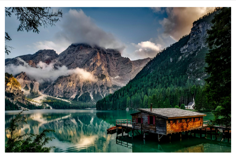
Using a URL
You can provide a URL to the Image control, which can be sourced from a sheet, a connector row, or provided directly as a Static URL. Ensure the URLs are accessible and correctly formatted.
https://images.pexels.com/photos/147411/italy-mountains-dawn-daybreak-147411.jpeg
Using Base64
The Image control supports Base64 strings. You can directly include the image data in Base64 format using the syntax data:image/<type>;base64, where <type> corresponds to the image file format (e.g., 'png', 'jpeg', 'gif', etc.).
data:image/png;base64,iVBORw0KGgoAAAANSUhEUgAAAB4AAAA0CAYAAACdB4jyAAADfElEQVR4AeyYSUo0QRCF45WzguKwciHeQgURBI/hyjOIp/EEiuLejRdwK4jgwgEnRHCe/euL+ssaurvsaodeaGFUTpHxIl5GZDUGe3t7b82QoLOz09LS1dVlPyGBNen5A/4x4n8h1W9vb5aW19dXqyVpvc/2fyHVP5bGOaA/qnOEfN8wyJdFEZQka21t9fKj5Nrb212dft5OeuxKuVfpM35+fraWlhb/lN7f3xvS1taWM/vxsBRwDEp7c3Pj1nt7e+3u7s77ZV6lgKEZEGiUZDgAzTBQBhTdUsAvLy/W0dFhR0dHtrq6apubm/bw8ODnjrEyUhqYqAFeW1uz7e1te3x8tG8/YyjlbC8uLuzk5MR/m+EITJSJFt1AkkmJMFlLJNnp6amtr6/b7u6uBUFE2NPTU60tPk9O5CUgOeoVaD0/P7etrS0/2+PjYy+t29tbI+paUs1+xQWS9yw9xvDh4aHt7Ox4RhM91Hd3d2dYkxIGJXnU+VfAudUr/P4G/Pr62hPq7OzMiJZ5SYXgUnY9OqS8OwVjnBwZGXGN2AGipqZrSVWqiaBeAYDSGR8f9+h6enqccgynjyTfZz0vQb2g6JHFo6Oj1t/fbwMDA55QV1dXHr2UpVJKxq6Qe1UtJ0muhud4ygBQhKw+ODiwubm594yGftYQSc6GlLTMVwhG0wIQ0QGKcmyU8f7+vi0uLtrMzIzNzs5aX1+f1zN7YhtSAihF/Xgt3VaUE2AoSPILQpJxQVxeXtry8rINDw/b9PS031r0uT45dxxD7P8jyfdjT4ockJI2A2zhQ4RI2PUPPsbIVspmY2PDxsbGbGhoyKjdqakpW1paspWVFdeN90gRAGMp6kvZNnQoePcMRWiOqQOUOSKC1oWFBQekjJDBwUGbnJw0slsSqm5LivpS1Jr5UuZVcYFI8s2hR54ktHwIiHBiYsIj5icPn0eA5+fnjfJCD5ESsNhxSW5LStpMVrMRmtPCHGLhQ+RERxs7w38PKC0pMhqqZf5i8MxkOAhtJlRLykQrRcYkeekAwlFIMh5J/iOAo5H0HhVrH0nmypSSzVLSD71zh2JQKVqrZVyK1qWoraaXyWpoKZJqBhqdy0TcqJFG9v3CiBuh6Sv2lDrjosQru1YKuCjSpgEXOVVt7csirma8aO4P2D/otRKliLqya82jOh9dked53c+M/wEAAP//v7J7UgAAAAZJREFUAwDVQg6Zw6Z9BQAAAABJRU5ErkJggg==
Ensure the Base64 string corresponds to the correct image format specified.
By utilizing these options, you can effectively bind data to the Image control and display images from various sources in your microapp.
Content
- Select Image: Allows you to pick an image from the gallery or upload it from a source location.
- Image URL: Specifies the URL of the image to be displayed in the control.
- Alt text: Specifies the alternative text of the image to be displayed in the control.
Add-ons
| Property | Description |
|---|---|
| Label | Displays label for specific options or sections. Configurable with size, weight, and color. |
| Tooltip | Provides helpful hints or extra information on hover. |
| Description | Adds descriptive text beneath options or sections. |
Interaction
- Image Caching: Enables image caching to improve loading speed by storing the image in cache for future use.
- Magnify: Toggles the magnify feature, adding an eye icon to the image control for zooming in and out.
- Image Fit: Chooses between
ContainandCoverdepending upon the UI requirement of the image to be displayed.
Events
| Trigger | Description |
|---|---|
| image_click | Triggered when the image in the control is clicked. |
Appearance
- Visibility: Toggles the visibility of the control at runtime.
- Opacity: Controls how transparent or opaque the image would be.
- Alignment: Controls the position of the image to be displayed.
- Color: Specifies the color of the margins.
- Width: Specifies the width of the margin.
- Style: Specifies the style of the margin, such as none, solid, dashed, or dotted.
- Radius: Provides rounded corners to the image. You can specify the value for top-left, top-right, bottom-left, and bottom-right corners accordingly.
- Spacing: Specifies padding and margin on the image to be displayed.
Advanced
- External CSS: Add custom styles to the control.
- Trigger Dependents: Automatically invoke linked controls or workflows.
- Caching: Enable caching to store frequently used inputs.