Footer Tabs
The Footer Tabs Control is a Selection control similar to tabs control which is used to provide the user a way to easily implement in-page tabs. The only difference is that the Footer tabs control allows you to add a relevant icon as well.
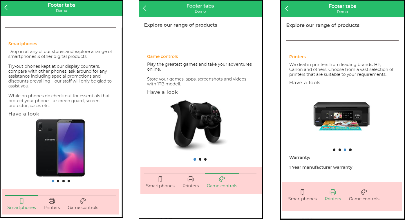
Footer Tabs are usually preferred in scenarios where you do not want to access page content simultaneously. Like say for example, on e-commerce websites, there are product descriptions that may be categorized as technical specs, product specs, warranty info, and so on. The Footer Tabs control allows you to add tabs as required and display content based on rules depending upon the selected Tab. With Footer tabs, you can set the State of the Selected tab by changing the background color, font color, border colors, and so on.
Properties
| Property | Description |
|---|---|
| Minimum Tab Width | Determines the spacing between the tabs. |
| Icon Size | Adjusts the size of the icon, allowing for increasing or decreasing the size. |
| Border Color | Specifies the color of the borders of the tabs. |
| Font Properties | Includes settings for text size, weight (Light, Normal, Bold, etc.), alignment, and color of the tab labels. |
Selected State
| Attribute | Description |
|---|---|
| Border | Selects the borders to be displayed on selection. |
| Width | Specifies the width of the selected border. |
| Style | Sets the style of the selected border line (solid, dashed, dotted, or none). |
| Color | Defines the color of the border of the selected tab. |
| Font Color | Specifies the color of the font of the selected tab. |
| Background | Specifies the background color for the selected tab. |
Control Outputs
The outputs from the Select Bar control, represented by the placeholder {{footer_tab}}, can be referenced in other controls, data queries, or JavaScript functions using the control's unique name.
| Output | Description |
|---|---|
| footer_tab | Represents the user-selected values from the Footer Tab control. |