Collapsible Menu
The Collapsible Menu control, offered by the DronaHQ, enables the creation of an appealing and modern menu with collapsible functionality.
Users can effortlessly create multiple menu items, each with the option to have child menus. This allows for the creation of multilevel menu structures. Additionally, users have the flexibility to assign icons to each menu item and utilize properties such as tags and active menu items for enhanced customization and navigation.
Binding Data Options
The Collapsible Menu control accepts an array of nested objects in JSON format to display data. You can bind data to the Collapsible Menu control in various ways, allowing for flexible customization and presentation of menu items.
Static Data Option
To display static options in the Collapsible Menu control, you can use the Bind Data option. The Bind Data option must be specified as an array of objects. For example:
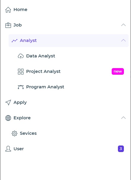
[
  {
    label: 'Home',
    value: 'home',
    icon: 'icon-home',
  },
  {
    label: 'Job',
    value: 'job',
    icon: 'icon-briefcase',
    children: [
      {
        label: 'Analyst',
        children: [
          {
            label: 'Project Analyst',
            value: 'project_analyst',
            icon: 'icon-grid',
            tag: {
              color: '#FF00F5',
              value: 'new',
            },
          },
          {
            label: 'Program Analyst',
            value: 'program_analyst',
            icon: 'icon-vector',
            active: true,
          },
        ],
        value: 'analyst',
        icon: 'icon-graph',
      },
    ],
  },
  {
    label: 'User',
    value: 'user',
    icon: 'icon-user',
    image: '',
    tag: {
      color: '#5C3BE2',
      value: '3',
    },
  },
];
The provided menu data represents a hierarchical structure of menu items. Each menu item is an object with properties
such as label, value, and icon. These properties define the display text, unique identifier, and associated icon
for each menu item. Additionally, menu items can have nested sub-menus defined by the children property.
For example, the menu data includes menu items like "Home", "Job", and "User". The "Job" menu item has a sub-menu called "Analyst", which further contains nested menu items such as "Project Analyst" and "Program Analyst". Each menu item can have its own unique properties like icons, tags, and images, enabling customization and visual enhancements.
This hierarchical structure allows for the creation of multi-level menus, providing a flexible and organized navigation system for applications or websites.
Properties
| Property | Description |
|---|---|
| Background | Allows you to change and select the background color of the collapsible menu control. |
| Indentation | Provides space at the beginning or start of each menu item and its child menu items. |
| Spacing | Provides space between menu items and child menu items vertically. |
| Default State | Sets the initial default state of the collapsible menu. Choose from Collapse All, Expand First, Expand Only Selected, or Expand All. |
| Arrow Type | Choose the icon style to depict a collapsible menu: up/down arrow or plus/minus arrow. |
| Expand Type | Set whether a single menu with child items remains expanded or multiple menus can be expanded. |
| Menu Items | Set visual properties for the menu items. |
| Active Menu Items | Set visual properties for menu items with the active property set as true. |
| Menu Item Hover | Set visual properties for menu items on hover. |
| Tag | Set visual properties for menu items with a tag property present in the data. The tag property can be added while binding the data to the control. |
Control Outputs
The outputs from the Collapsible Menu control, represented by the placeholder {{collapsible_menu}}, can be referenced
in other controls, data queries, or JavaScript functions using the control's unique name.
| Output | Description |
|---|---|
| collapsible_menu | The outputs from the Collapsible Menu control, represented by the placeholder {{collapsible_menu}}, can be referenced in other controls, data queries, or JavaScript functions using the control's unique name. |
Events
| Property | Description |
|---|---|
| value_select | Occurs when there is a change in the value of the respective control, typically triggered by selecting another option or inputting a new value. |