Dropdown
The Dropdown control is very similar to dropdown control but with additional extensive properties like image support, color property, return value selection, and more.
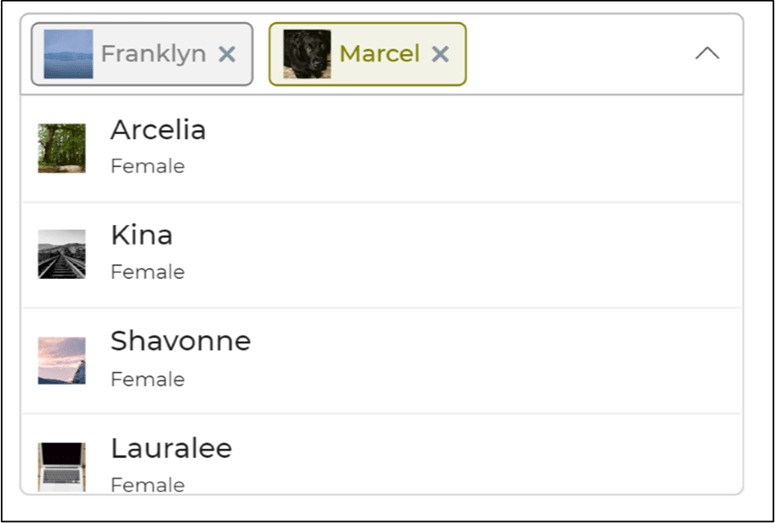
The Dropdown control helps users to view much more details in the dropdown itself. You can view different columns of the data along with different colors as well as images with respect to each column. You easily assign a color, image, icon, and prefix text to each option.
Content
Mode
The Dropdown control provides two modes for data binding:
- Manual: Enter static data manually.
- Mapped: Bind data dynamically using connectors or controls.
If Label is empty, the system will use the Value as the label. The Value field placeholder will display the same text as the label for clarity. This improves usability by allowing users to modify values without changing or defining a separate label.
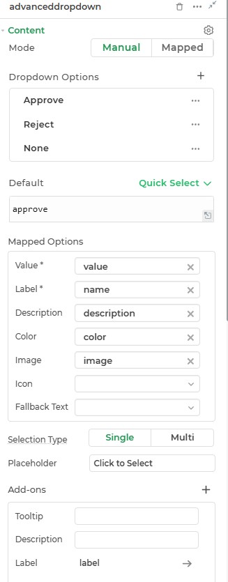
Default
This is where you can provide the default selected item for the dropdown control.
Binding Data Options
The Dropdown accepts an array of objects in JSON format.
Static Data Option
To display static options, bind data using an array of strings or objects.
Example: Array of Strings
[
  "File",
  "Folder",
  "Control"
]
Example: Array of Objects
[
  {
    "name": "Approve",
    "description": "John@studio.com",
    "value": "approve",
    "color": "#26bc6a",
    "image": "https://dronamobilepublic.s3.amazonaws.com/DRONA5_Team108/content/app/images/public/Tick_c5Abe.svg"
  },
  {
    "name": "Reject",
    "description": "Dave@studio.com",
    "value": "reject",
    "color": "#FF5656",
    "image": "https://dronamobilepublic.s3.amazonaws.com/DRONA5_Team108/content/app/images/public/Close_jCmgk.svg"
  },
  {
    "name": "None",
    "description": "Doe@studio.com",
    "value": "none",
    "color": "#F5AB00",
    "image": "https://dronamobilepublic.s3.amazonaws.com/DRONA5_Team108/content/app/images/public/Info_BCFfd.svg"
  }
]
Mapped Mode
In this mode, you can bind dynamic data by mapping fields such as value, name, description, etc. The required JSON structure looks like this:
[
  {
    "value": "approve",
    "name": "Approve",
    "description": "Approval process",
    "color": "#26bc6a",
    "image": "https://example.com/approve-icon.png"
  },
  {
    "value": "reject",
    "name": "Reject",
    "description": "Rejection process",
    "color": "#FF5656",
    "image": "https://example.com/reject-icon.png"
  }
]
Selection Type
You can configure the dropdown to allow either a Single or Multi selection based on your requirements.
Placeholder
Provide a placeholder text to guide the user, e.g., "Click to Select."
Here's the revised content arranged in a table format based on the structure and details from your provided information:
Mapped Options
| Field | Description |
|---|---|
| Value | The unique identifier returned when an option is selected. |
| Label | The name or title displayed for the dropdown option. |
| Description | Additional details displayed under the label. |
| Color | Assign a color to each dropdown option for better distinction. |
| Image | Add an image to represent each dropdown option visually. |
| Icon | Attach icons for a compact and recognizable representation. |
| Fallback Text | Text to display if no data is available for the dropdown option. |
Add-ons
| Add-on | Description |
|---|---|
| Tooltip | Provides helpful hints or extra information on hover. |
| Description | Adds descriptive text beneath options or sections. |
| Label | Displays labels for specific options or sections. |
| Search Bar | Adds a search bar to quickly locate dropdown options. |
| Pagination | Enables pagination for dropdown options. |
Interaction
| Property | Description |
|---|---|
| Validation | Enables input validation, such as marking the field as Required. |
| Read Only | Marks the dropdown as non-editable, allowing users to view but not interact with it. |
| Submit Data | Defines whether the dropdown's value should be submitted, with options like Always, Never, and Not when Hidden. |
| Maintain Searched Text | Retains the search text entered by the user in the dropdown even after selection. |
| Others Option | Allows users to input a custom value not present in the predefined options. |
| Clear Option | Adds a clear button to reset the selected value in the dropdown. |
| Events | Enables triggering of specific actions when an interaction occurs, such as value selection. |
Events
| Trigger | Description |
|---|---|
| value_select | Triggered when the dropdown value is changed. |
Appearance
- Visibility: Toggle control visibility.
- Default Theme: Apply predefined themes.
- Border Radius (Image): Default
1rem.
Advanced
- External CSS: Add custom styles.
- Trigger Dependents: Invoke linked workflows.
- Caching: Store frequently used selections.
Control Outputs
| Output | Description |
|---|---|
{{advanceddropdown}} | Captures the user-selected value from the Advanced Dropdown control. |