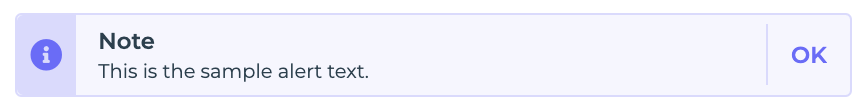
Alert Control
The Alert Control provides a mechanism to display important messages or notifications to users. It allows for customization of the alert type, title, description, action text, and more, enabling versatile use cases for various notifications.
Content
Add-ons
| Add-on | Description |
|---|---|
| Tooltip | Provides helpful hints or extra information on hover. |
| Description | Adds descriptive text beneath options or sections. |
| Label | Displays labels for specific options or sections. Configurable with size, weight, and color. |
Binding Data Options
The Alert Control facilitates the display of dynamic content using the Bind Data option. It accepts several data inputs.
Alert Type
It indicates the type of alert. There are four types of alert available:
InfoSuccessWarningError
Title
It represents the title of the alert.
Description
It specifies the detailed description or message to be conveyed. Description supports both Markdown and Plain text format to be selected as Description Type.
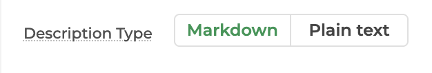
- Markdown: It is a lightweight markup language used to format text with plain syntax. It converts easily to HTML for styled content.
- Plain text: You can utilize this feature to present fixed text content directly within the control, without any styling or structure. For instance, if you wish to exhibit a predefined piece of text within the Alert control, you can simply input the desired content into this section.
Action Text
It defines the text label for the action button.
Interaction
Events
| Property | Description |
|---|---|
| Action_Click | Occurs when the action button in the alert control is clicked, typically triggering an action. |
Appearence
- Visibility: Toggles the visibility of the component in the app interface.
- Icon: Used to set the alert icon to be displayed.
Advanced Settings
- External CSS: Add custom styles to the control.
- Trigger Dependents: Automatically invoke linked controls or workflows.
- Caching: Enable caching to store frequently used inputs.
