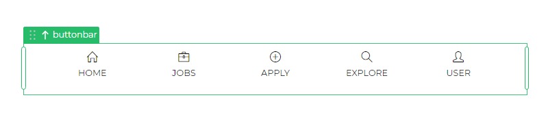
Button Bar
The Button Bar Control is a navigation component that features a bar containing navigation buttons, typically located at the bottom of a microapp, serving as the primary menu.
Properties
| Property | Description |
|---|---|
| Icon | Size and color configuration for icons in the Button Bar menu. |
| Text | Font customization options for menu text. |
| Selected Item | Color configuration for the selected icon. |
| Selected Background | Background color for the selected option. |
| Card width | Width of the card in the Button Bar menu (pixels or percentage). |
Item List
For each menu item, the following properties define navigation and appearance:
| Property | Description |
|---|---|
| Item Label | Name of the menu item. |
| Action | Validation requirement for navigation. |
| Navigate To | Screen destination upon selection. |
| Transition | Transition direction of the new screen. |
| Icon | Icon selection for the menu item. |
| Selected | Toggle for selecting an item and applying specific properties. |
| Reset Target Screen | Reset option for the target screen upon navigation. |